By RJS, a rural swamp denizen from Northeast Ohio, and a long-time commenter at Naked Capitalism. Originally published at MarketWatch 666.
This week we’ll cover the first quarter GDP revision, personal income and spending for May, April’s Case-Shiller report, and May’s new home sales…. We’ll see how the annual growth rate for the US was revised from 2.4% to 1.8%, and how farm inventory growth managed to equal almost half of the 1st quarter GDP change. We’ll see that personal income and spending rebounded from the contraction reported for both in April, and that the core price index for personal consumption expenditures, which the Fed is supposed to be pushing higher, has continued to hover at record lows…. We’ll also see why the change in new home sales cannot be determined from the Census report, and why all census reports on new construction should be taken with a rather large grain of salt. We also have FRED graphs with the 20 Case-Shiller metro areas, that you can edit and change interactively, so there’s also something here everyone can play with….
First Quarter GDP Revision
The economic surprise of last week was that the economy grew a whole lot slower in first quarter of this year than previously reported, and it looks even uglier on closer examination of the factors that contributed to that "growth". Based on more complete source data than was earlier available, the Bureau of Economic Analysis revised the GDP for the 1st quarter of this year to show that the national output of goods and services grew at a seasonally adjusted annual rate of 1.8%, which is to say that if the pace of economy continued at the rate it grew during the first quarter, it would achieve an expansion of only 1.8% in one year over the level of year end 2012. This new figure revises the 2.4% growth rate reported a month earlier, and the 2.5% rate reported by the 1st estimate in April, and would now work out to an annual GDP of $15,984 trillion, or $13,725.7 in chained 2005 dollars, the inflation adjustment benchmark used for GDP.Be aware that all quarterly GDP data is reported at an annual rate, so the actual amounts for the quarter are approximately one-fourth of those reported..
Lower than initially reported personal consumption expenditures (PCE) accounted for most of the change.The annual rate of growth in PCE, reported at a 3.4% increase last month, was revised down to 2.6% annualized; as seasonally adjusted expenditures rose from an annual rate of $11,249.6 billion in the 4th quarter to $11,350.3 billion in the 1st quarter. Since PCE is roughly 70% of GDP, this changed it’s contribution to the final GDP figure from 2.40% to 1.83%; which means that without consumer spending, 1st quarter GDP would be slightly negative.. Of the 1.83% contribution from PCE, .58% was from an increase in durable goods purchases, which were 7.6% higher in the quarter, .45% was from a 2.8% increase on purchases of non-durable goods, and .80% resulted from a 1.7% increase in expenditures for services…
The revised overall contribution to GDP from $2,144.4 billion of gross private investment was down a bit from last month’s report, and there was some shifting of the component’s weighting; residential investment increased at a 14.0% annual rate rather than the 12.1% previously reported and added .34% to GDP, while investment in non-residential structures declined 8.3% from Q4 2012 to Q1 2013, well more than the 3.5% decline reported last month, which subtracted .26% from the annual rate of GDP increase.. Investment in equipment and software was up 4.1% over the quarter, and added .31% to reported GDP.
Private inventories increased by $36.7 billion of chained dollars in the first quarter and added .55% to the annualized change.. The change in business inventories from $34.8 billion in the 4th quarter to $26.8 in the first quarter subtracted .26% from reported GDP, but that was more than offset by the increase in farm inventories, from a subtraction of $15.2 billion in Q4 2012 to a seasonally adjusted increase of $8.0 billion in Q1, which by itself added .83% to first quarter GDP..In other words, were it not for increase in winter farm inventories, at least some of which appears to have been a seasonally adjusted reversal of the drought’s effects (which devastated normal summer farm inventories to the tune of $19.2 billion and fall inventories by 15.2 billion), 1st quarter GDP would have increased by less than a 1.0% annual rate.To put that +.83% first quarter impact from farm inventories in perspective, the total impact of the change in farm inventories on GDP over the three preceding years was minus 0.04% in 2010, plus 0.02% in 2011; and minus 0.06% in 2012. This strongly suggests that farm inventories will be a drag on GDP for the remainder of the year, as that 1st quarter seasonal adjustment aberration reverses itself and inventories return to normal..
The impact of net exports (ie, exports minus imports) on GDP in the first quarter was negative and hence subtracted $387.7 billion from gross GDP, an impact from trade deficits that’s been negative since the 70s.. However, GDP as reported measures the change from quarter to quarter, so in those quarters when our trade deficit is shrinking, that smaller negative increases GDP relative to the previous quarter, such as the 4th quarter of 2012, when the change in negative net exports added .33% to GDP, mostly due to much lower imports.In the 1st quarter, exports decreased 1.1% vis-a-vis the the 4th; that reduced GDP by .15%; however, imports are now also reported to have decreased by 0.4% in the first quarter, and since they’re a negative in the GDP equation, they were less negative compared to the previous quarter, and hence added 0.06% to 1st quarter GDP, which left the net influence of the changes in international trade on GDP at negative .09 for the quarter..
Reduced government spending and investment continued to be a drag on GDP; federal government outlays of $1,177.4 billion decreased from the 4th quarter at an annual rate of 8.7% in the first quarter, after being down 14.2% in the fourth quarter…most of this was due to lower defense spending, which fell at a rate of 12.0% in the quarter after falling at a rate of 22.1% in the last quarter of last year; by itself, this reduced GDP by .63%; meanwhile, non-defense federal spending fell 2.1% after increasing 1.7% in the 4th quarter and knocked another 0.06% off the quarter’s growth…note that this does not yet reflect the full impact of the sequester, which started March 1st and will further reduce federal contributions in the next 2 quarters, as defense department furloughs kick in…also note that government transfer payments, ie, social security, medicare, unemployment comp, etc. are not included in these figures, but rather appear as part of personal consumption expenditures…state and local spending and investment continued to fall as well, down 2.1% to $1,848.0 billion from Q4, and subtracted .25% from 1st quarter GDP…

The bar graph included above is from Doug Short and it shows the impact of each of the major components on the final estimate of GDP for every quarter back to the the beginning of 2007, the year before the recession.Those components that are additions to each quarter’s GDP appear above the solid line, and subtractions from GDP appear below it, and the final GDP for each quarter is trace by the dashed blue line..It’s obvious that PCE (consumer spending) in blue has been the most consistent positive influence to GDP over the period, and despite being over estimated in the earlier 1st quarter estimates, at a contribution of 1.83% it still accounts for more that the 1st quarter change of 1.78% by itself. The contribution of gross private investment, shown in red, has typically also been positive throughout the recovery, save for the inventory retrenchment in the 4th quarter of 2010, and the small decline in investment in the 1st quarter of 2011. In chartreuse, we have net exports, which has long been a negative number. But when they increase, or become less negative, it adds to GDP and appears above the line, while when they decrease, the chartreuse is below the line & subtracts from the GDP change. Lastly, we have government spending and investment in purple, which except for the 3rd quarter of 2012, has been a drag throughout the recovery; and remember, each of these changes is from the previous quarter, showing that shrinkage of the government sector is cumulative throughout.
Income and Outlays for May
The key monthly release of the past week was on Personal Income and Outlays for May from the BEA, which gives us several important metrics, including PCE (personal consumption expenditures), which accounts for 70% of US economic activity, and the PCE price index, targeted by the Fed in recent rounds of quantitative easing. The BEA reported that personal income rose $69.4 billion, or 0.5%, from a seasonally adjusted annual rate of $13,695.0 billion in April to $13,764.4 billion in May; moreover, the reported 0.1% decline in income in April was revised to show a 0.1% increase.. However, May’s level is still below the annual income rate of $14,104.1 billion in December of last year, when incomes were boosted by accelerated bonus and special dividend payments and other manipulation of salaries to avoid the year end upper income tax hikes…May disposable personal income (DPI), or income after taxes, also increased by 0.5%, from a seasonally adjusted annual rate of $12,059.6 billion to $12,116.6 billion in May; which is also lower than the $12,539.1 billion DPI figure logged in December, before the payroll income tax cuts expired. Note that just like for GDP, BEA extrapolates the monthly figure into an annual rate, and that the actual monthly totals herein are roughly one-twelve of those reported; as BEA notes this in a footnote in its press release, this is often misreported…
Among sources of income gains in May was a $19.7 billion increase rate in wages and salaries, up from $6.5 billion last month; employer contributions to insurance and pensions increased at an annual rate of $3.4 billion, up from $2.5 billion in April.Business proprietor’s incomes increased $5.4 billion and farmers saw their incomes fall at a $6.7 billion annual rate, the same they fell in April.Personal rental income decreased at a $0.7 rate billion in May, while interest and dividend income increased $31.2 billion; meanwhile, transfer payments from government programs increased by $19.4 billion, the largest of which was an $11.8 billion increase in social security benefits, reversing the $9.6 billion decline in April..
May data for personal consumption expenditures (PCE) showed a 0.3% monthly increase, from an adjusted annual rate of $11,351.0 billion in April to $11,380.0 billion in May, reversing the 0.3% spending decrease in April. Spending for durable goods rose $11.3 billion to $1,279.8 billion, spending for non-durables rose $7.3 billion to $2,573.7 billion and spending for services rose $10.5 billion to a $7,526.5 billion seasonally adjusted annual rate.. Total personal outlays, which includes interest and transfer payments in addition to PCE, rose $28.5 billion to a $12,116.6 billion annual rate. Personal savings, which is disposable personal income minus total outlays, was at $387.6 billion in May, the highest yet this year. The personal savings rate, which is savings as a percentage of disposable personal income, was at 3.2% in May, also the highest savings rate this year.You can see that uptick in the savings rate in green on our FRED graph below, with the scale for the saving rate on the right..

BEA also generates a price index for PCE with this report, which as we’ve noted, is the Fed’s preferred inflation gauge. In contrast to a 0.3% decrease in that price index in April, it showed less than a 0.1% increase in prices paid for goods and services in May, as the index based on 2005=100 rose from 116.467 to 116.563; the core PCE price index, which excludes food and energy, was also up 1.0% for the month and now shows a year over year increase of 1.06%, barely higher than the all time low of 1.05% core PCE inflation set in April. The overall PCE price index shows a 1.02% inflation rate, which is up from the 0.73 year over year inflation shown in the April report…
It is common practice to adjust both PCE and DPI for inflation using the PCE price index as a deflator. By that metric, real disposable personal income increased by 0.4% in May and 0.3% in April,while real personal consumption expenditures increased 0.2% in May after decreasing 0.1% in April; it is those inflation adjusted metrics that are charted on our FRED graph above; real disposable income in 2005 dollars is in blue, while monthly real spending in 2005 dollars is tracked in red, with the scale for both on the left of the graph (btw, the income spike you see in 2008 was the Bush tax rebate).On our FRED graph below, we have a close up of nominal disposable personal income per capita since 2007 in blue, which has now reached a level of $38,317 per person; on the same chart in brown we also have inflation adjusted disposable income per capita in chained 2005 dollars, which gives us a truer picture of how incomes have risen (or not) for the average individual since the recession. In the chained 2005 dollars used by the BEA, per capita income has barely budged since 2007 and is now at $32,875, up just 0.43% over a year earlier and just 14.8% since the turn of the century…

April Case-Shiller Indices
As it was the last Tuesday of the month, the popular Case-Shiller home price indexes for April (pdf) were released this week, with the results showing the success of the Fed’s attempt to reinflate the housing bubble.. Both the 10 city and 20 city April indexes, which are averages of repeat home sales prices that sold over February through April period, scored the highest one month gains in the history of the S&P/Case-Shiller Home Price Indices, with the 10 city index up 4.24, or 2.63%, to 165.63, and the Composite 20 up 3.75, or 2.52%, to 152.37; both composites, the national index, and each city index was set to equal to 100 in January 2000…Metro areas showing the largest one month prices increases include San Francisco, where prices rose 4.9%, Atlanta, where prices were up 3.8% since the previous report, San Diego, which saw a home prices increase 3.7%, and Los Angeles, where home prices rose 3.4% in April…laggards for the month included Tampa and Phoenix, which saw home prices rise 1.7%, New York, where prices rose 1.1%, and metro Detroit, where April home prices were unchanged…
Both Composite indices registered double digit year over year prices increases in April; average home prices over the 10 original cities increased 11.6% since last April’s report, while the Composite 20 was up 12.1% in the year ending April.These are the largest price index jumps in 7 years, and all 20 cities saw year over year home price gains for each month so far this year..Metro areas which saw the largest year over year home price gains included San Francisco, where prices rose 23.9%, Las Vegas, which saw home prices 22.3% higher, Phoenix, where prices rose 21.5% and Atlanta, where home prices were up 20.8%…those metro areas showing the least annual price appreciation were New York, where prices rose 3.2%, Cleveland, where prices rose 4.8%, Washington DC, which saw home prices 7.2% higher, and Charlotte, where prices rose 7.3% in the year ending April…
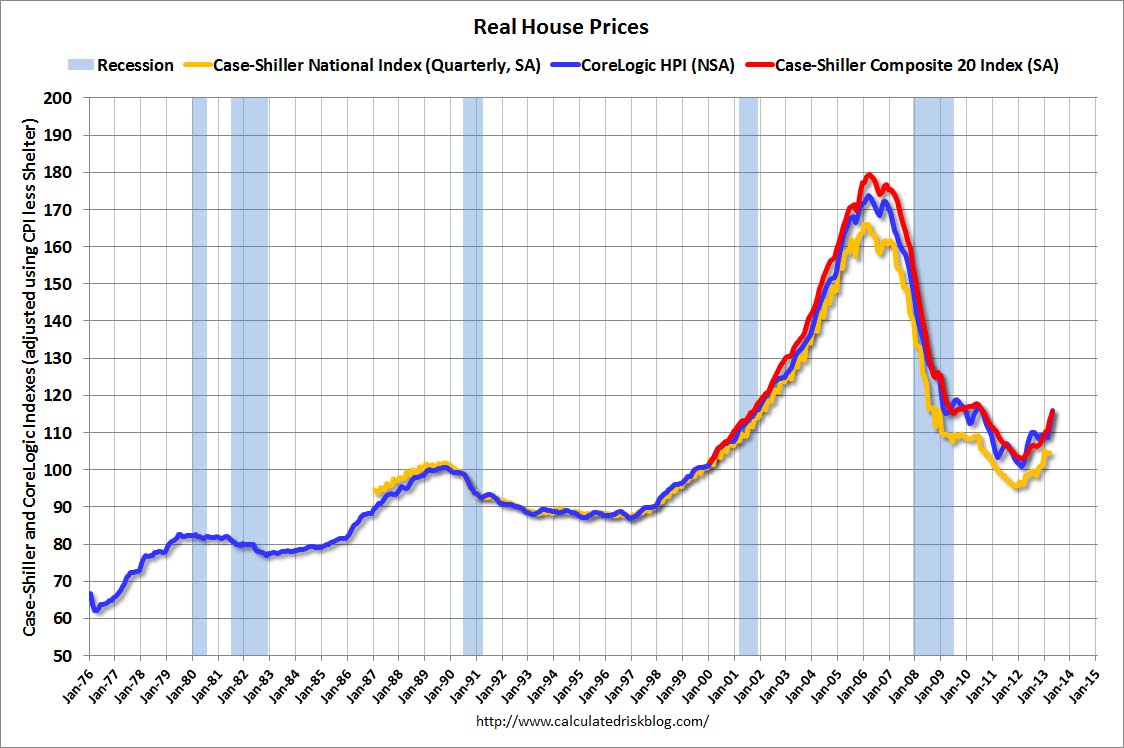 Just to put this all into perspective, we’re going to again look at Bill McBride’s chart wherein he adjusts these price indexes for inflation, using the CPI less shelter…in the chart to the right, the monthly Case-Shiller Composite 20 prices adjusted for inflation are shown in red, the inflation-adjusted Case-Shiller National index is shown in yellow, and the real prices indicated by the national CoreLogic Index are shown in blue; even with the large home price run-up of the past year, we have just recovered to the price levels of September 2001 for the Case Shiller 20 in today’s inflation adjusted dollars; by the same metric, the National index is back to prices levels of the 2nd quarter of 2000, and the CoreLogic index back to October 2001 prices.As we’ve pointed out before, homes are not an appreciating asset any more than a car or other durable is, & they are no more like to "recover" to their former high prices than tulip bulbs are going to recover to the prices they sold for in 1637. Houses deteriorate over time & eventually are torn down, just as automobiles deteriorate & are eventually junked.Originally, the reason houses seemed to appreciate in value was the inflation of the 70s; because money depreciated faster than houses, houses went up in price; but if inflation was 100% per year, cars would appear to go up in price every year too; you could then buy a car & drive it three years & sell it for more than you bought it for.With disposable personal income stagnant, core inflation at record lows, and inflation expectations falling below 2% on the possibility of QE withdrawal, there is no reason for homes to go up in price…
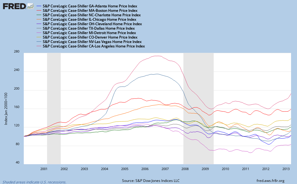
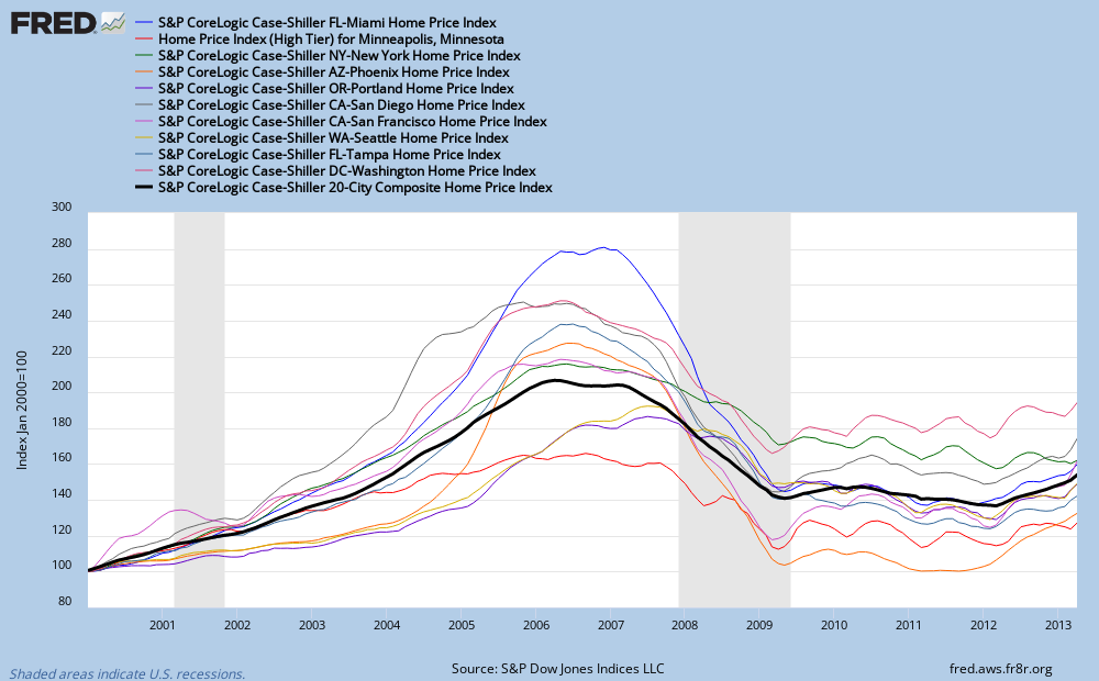
In two FRED graphs below, we have the track of all twenty cities in the Case-Shiller Composite 20 since the origination of the 20 city index in January 2000 (FRED has a limit of 12 lines per graph)…In the first FRED graph, we have the tracks of home price indexes Atlanta, Boston, Charlotte, Chicago, Cleveland, Dallas, Detroit, Denver, Las Vegas, and Los Angeles; in the 2nd FRED graph, we show the Case-Shiller metro indexes for Miami, Minneapolis, New York, Phoenix, Portland, San Diego, San Francisco, Seattle, Tampa and Washington DC, along with the Case-Shiller Composite 20 shown as a heavier black lineTo more clearly view the exact track of any or several cities in these busy graphs, click on the graph or graphs with the metro area you want to view, and it will expand to a 1000 pixel graph at the St Louis Fed web site.Each metro area will be represented by a line under it’s graph as follows: Line 1: Home Price Index for Atlanta, Georgia (ATXRNSA); click on the line or lines of the cities you want a better view of, change the Line Width in the drop down box, and click "Redraw Graph"; for example, in the 2nd graph below, the Composite 20 line width is three, while all other lines are one px wide; a line wide of 3 or 4 is adequate to have your chosen city’s line stand out from the rest; to compare two metro areas that are on different graphs, go to the bottom of the list and click on "Add Data Series"; a search box will open, in which you will type the FRED code for the city you want to add to that graph (for instance, ATXRNSA for Atlanta), hit enter, and the line will appear on the graph. For some cities, you’ll also have to adjust the Observation Date Range to read 2000-01-01. Play with it; you cant screw up, if you want to start over, refresh the page, and the graphs will revert back to those below….
May New Home Sales
On the same day that the Case-Shiller index was released, the Census Bureau released its report on New Home Sales for May (pdf); as you should all know by now, these census housing reports, with just a small sample of data collected in person by census field reps, have such a large margin of error as to render the monthly results useless for any serious analysis, and this one is the worst, being subject to larger revisions than other census residential series; however, as long as economists and the media continue to give these reports credence and report them as exact, we’ll continue to explain what they really reflect…

Reporting on single family homes only, Census estimates new home sales in May were at a seasonally adjusted annual rate of 476,000 homes, which was "2.1 percent (±16.6%)* above the revised April rate of 466,000" and "29.0 percent (±17.5%) above the May 2012 estimate of 369,000"; translating that, ±16.6% means that, were the estimated pace of new home sales in May extrapolated throughout a year, Census is 90% confident that somewhere between 398,430 and 553,142 homes would be sold…the asterisk in the text directs us to a footnote which relates "the change is not statistically significant; that is, it is uncertain whether there was an increase or decrease" in new homes sold.. Furthermore, the 90% confidence interval for the number of new homes sold in May over those sold a year ago is between 11.5% and 46.5%…Checking table 3 in the release, we see the actual estimate of homes sold in May from field rep data was 45,000, of which 15,000 were under construction, 14,000 were completed, and 16,000 we not yet started…April’s sales have been revised to show 46,000 homes sold; the original estimate for April was 45,000, and April’s sales were originally estimated at 454,000 annual rate…
An estimated 161,000 new homes remained up for sale at the end of May; by Census calculations, that’s a supply of 4.1 months at the current sales pace…from their sample, Census finds that the median price of a new home sold in May was $263,900, that’s down from $271,600 last month, and the average May sales price was $307,800; down from $330,800 reported in April, when their sample included 4,000 homes sold for over $750,000; that April figure has now been revised to 2000 new homes sold for over $750,000 in April, and just 1000 over that price sold in May…Our FRED graph shows the median monthly new homes sales prices in green, and the monthly track of average sales prices in red; the dollar scale for both is on the right margin; it also shows the monthly track of new homes reported sold at a seasonally adjusted annual rate since 2000 in blue, with the scale in thousands on the left of the graph…


I was curious if you ever considered changing the
page layout of your blog? Its very well written; I love what youve got to say.
But maybe you could a little more in the way of content so people could connect with it
better. Youve got an awful lot of text for only having 1 or 2 pictures.
Maybe you could space it out better?
“Before they read words, children are reading pictures.” Wiesner
ya cant win…i originally had doug short’s chart before the second paragraph, but moved it down to where i described it…
Now you understand the antidote du jour! S’fine, rjs, thanks for all this, I am dealing, although I have to chew before I can swallow. But a cute kitten in 1st para would be ok.
I believe this is spam of a form that’s been slipping through the filters… So I zapped the URL and the mail.
That said, comment on the layout useful…
“So I zapped the URL and the mail.”
and now we all wonder what we missed…
“homes are not an appreciating asset any more than a car or other durable is, & they are no more like to “recover” to their former high prices than tulip bulbs are going to recover to the prices they sold for in 1637″
Homes may be a depreciating asset, but the land they are sitting on most certainly can (and often does) increase in value. Not every market in the U.S. is as moribund as you describe, certainly not here in Texas. I love what you do Lambert, but it would be helpful to clarify that all real estate is local. Take our market in Katy, West Houston for instance.
What we witnessed following the financial crash was only a slight dip in prices of roughly 5 percent, while volume of course fell off a cliff. During the last 5 years, the manipulation in the housing market has coupled with already solid demand (as well as above-average income and wage growth) to push prices well above the pre-crisis peak. Home prices during the past 6 months have gotten ahead of themselves, but I don’t expect a huge pullback barring another major catastrophe (certainly in the cards).
Here’s some data for you on the locality of the housing market. In Cinco Ranch, builders started 981 homes in just the last 12 months ending March 2013. That’s just ONE community in a town of roughly 300,000. Granted, it happens to be one of the top residential neighborhoods in the country, but the fact remains there are most certainly valid reasons for home prices to go up. 2013 numbers in our area will show continued price gains. You just have to have all the necessary ingredients to sustain those price gains. As they say, all real estate is local!
http://aaronlayman.com/cinco-ranch-home-prices/
assuming nothing has changed in the vincinity of a vacant parcel of land, had the fundamental nature of that parcel of land changed over time?
it’s still the same soil sitting on the same bedrock as it was 20 years ago…if the price of it in dollars has gone up, it’s because either the value of mutuable dollar has gone down, or because the number of people who want to own that land has increased…the land itself did not change; land does not appreciate or depreciate…
My dear RJS, thanks so much for this. It helps greatly to put the #’s into perspective. I am trying to match whthe stats to what I see on the ground, and I have to wonder, WHO the heck is saving, WHO the hack is investing, ‘coz from my perch, looks like nobody I know. Could it be that goldarned inequality happening again?
a lot is not revealed by gross amounts & averages…
Are there ways to disaggregate the averages?
not in these reports; all the totals are aggregates…
there’s a Fed report on household finances that breaks out a lot of data by quintiles (covered here), from which you’d get the impression that the bottom four dont matter much; then there are the annual census poverty stats which give you percentages below certain thresholds..i also think gallup does polling on dollar amounts of household spending which are reported fairly often but get little coverage…
im sure the data is out there, but it just doesnt show up in these regular monthly reports…
The way they are “adjusting” the housing stats I don’t know how they can even use them. Only to make us think this is not a depression.
I think the data would be more interesting if it said something about those on the receiving end of these income items. Interest and dividend income up $31 billion? My interest and dividend income has gone from quite sufficient in 2008 to $86.79 in 2012.
I haven’t noticed an uptick this year, either.
interest & dividend income 2011: $1,685.1 billion
2012: $1,749.7 billion
1st quarter 2013: $1,737.9 billion; at a seasonally adjusted annual rate…
the first quarter payouts were artificially low because much was paid early in the last qtr of 2012 to dodge higher 2013 taxes…so they’e rising slowly now (remember, the $31.2 billion figure given is at an annual rate)
Lots to chew here (and swallow). I’d like this to be a regular feature. Thanks.
Everyone loves what you guys are up too. This sort of
clever work and reporting! Keep up the excellent works guys I’ve incorporated you guys to my blogroll.