It turns out you have every reason to be confused. Even the data watchers can’t agree, which makes one wonder how the Fed can make sense of our situation.
Barry Ritholtz at Seeking Alpha give us this recap:
Over the years, we’ve looked at — and coined one or two — terms for the current inflationary environment. We have reviewed such phrases as:
Stagflation: The classic 1970s term for high inflation (+6%), very anemic growth (0-2%)
Blahflation: Street Insight’s Doug Kass term circa 2006 (video)
Stagflation Lite: was what NYU’s Nouriel Roubini called it in June 2006;
Demi-Stagflation: My own term for elevated inflation and soft growth (May 2005)
Inflastagdeflation: Minyan Keven Depew’s term for understated Inflation, stagnant wages and incomes, and price cuts in markets that are either highly competitive or experiencing weak demand.
To this list of clever wordsmithing, we add one more phrase, courtesy of Raymond James Chief Strategist, Jeff Saut.
That word is Agflation:
“These inflationary leanings were reflected in last week’s headline CPI figures (+0.7% in May), which were the second highest in 16 years, that is still not being reflected in the laughable “core figures” (+0.1%), begging the question, “Can this particular ‘conundrum’ continue?!”
Again, commonsense says NO, since the 25% increase in the Goldman Sachs Commodity Index over the past five months suggests that eventually commodity prices will bleed into the core readings.
This “agflation” has left grain prices at 10-year highs, stoking inflation fears in Europe and putting central bankers there on alert. Also adding to the agflation-agitations has been worldwide drought conditions, a fact that has not been lost on China, where foodstuff consumption accounts for a large portion of disposable income. Consequently, China has raised interest rates substantially over the last 12 months. Even Japan may have to join the international rate-rape since Japan’s 1Q07 GDP was revised recently to +3.3%, from 2.6%, implying that growth there is stronger than both here and Europe. If Japan raises rates, it would have wide ranging implications for the ubiquitous “carry trade” that drove usage of currency and stock derivatives up 24% in the first quarter of this year to an astounding $533 trillion, but that is a discussion for another time.”
As we noted this past weekend, the prices for commodities in general, and agricultural commodities in particular, had reached all sorts of highs: Wheat prices hit 11-year high; Oil Rises to Nine-Month High; Copper Gained; Gold, Silver Rise; Corn, Soybeans Rise; Cotton Extends Rally to Three-Year High; Cost of Gas and Food Rose Sharply Last Month;
The absurd list of what doesn’t go into “core” inflation is long, and ever more ridiculously, getting longer: Wheat, Oil, Copper, Gasoline, Gold, Silver, Corn, Soybeans, and Cotton.
Oh, and education and medical care never seems to have much impact, regardless of the extraordinary price gains they have seen over the previous decade — the past 5 years in particular.
Then there is the actual cost of Housing, not properly reflected in the BLS Consumer Price Index [CPI].
But other than all these items going up in price, there is no inflation.
Michael Shedlock elaborates on the theme of Inflastagdeflation, and it is actually pretty scary, since depending on which version of money supply you look at, you get a very different answer (which is why I have said for a very long time that the Fed ought to be using its considerable intellectual capital to understand what money supply means these days):
It occurred to me that inquiring minds might be wondering “Is it possible to chart inflastagdeflation?” Believe it or not I think it can be done. For that I turn to a series of charts that “Bart” at NowAndFutures updates monthly for me. Here they are in Kevin’s order of importance.
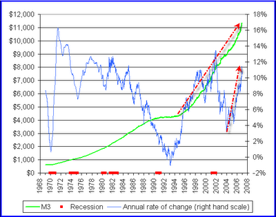
Inflationists like to point to M3. Is it any wonder? Pick your poison. Not only is the actual number soaring, the rate of change is soaring as well. Clearly the Fed has lost control of monetary expansion the inflationists say. Here is a chart to prove it.
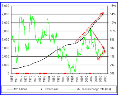
Stagflationists point to any number of things to prove their point. They think this is a repeat of the 70’s and typically point to oil. That won’t work for true inflastagdeflationists who will want to see the case state the case based on money supply. Given that the Fed has conveniently tossed aside M3, let’s turn our attention to M2.There you have it. M2 is clearly soaring but the rate of change is either falling or rising depending on where you want to draw the trendline. And what are we getting out of it? Certainly not jobs or houses but we are seeing rising interest rates in spite of miserably weak housing. If that combination does not describe “Stagfla” what does?
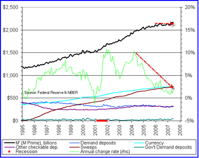
Deflationists like to state the case based on the upcoming monetary collapse of credit. Once again that will not cut the mustard with true inflastagdeflationists who want to see it in pictures right here right now. Tomorrow is not good enough.For that we have to look at base money supply or better yet M’ (pronounced M Prime) which is based on an Austrian definition of money. Typically (but not necessarily) deflationists come from an Austrian school of thinking. Please see Money Supply and Recessions for the theory behind M’.
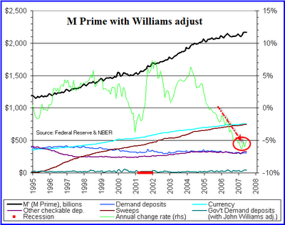
Here are two charts of M’ (with a third bonus chart following).
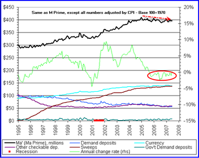
The chart shows that M’ is barely growing. A chart of base money supply would look similar. This contradicts what the inflationists are saying about money supply soaring. Heck it’s barely budging. And the rate of growth has been falling like a rock since mid-2004. Inflationary? Hardly… at least not to deflationists.But lets dig deeper and take a look at inflation adjusted M’ (Real M’).
Well how about that? Real M’ has been falling and the rate of growth has been under or near 0% since mid-2005.Bear in mind that most inflationists (and many deflationists) think that the CPI is horrendously understated. For those folks, John Williams offers an alternative measure of the CPI on Shadow Government Statistics.
The third (bonus chart) deflates M’ by that alternate measure of CPI.
That last chart shows “Williams’ Real” M’ growing at negative 5%. Thus creative deflationists can use creative inflationists own measures of the CPI to state the case for “defla”.Eyes of the Beholder
Well there you have it: Inflastagdeflationists can all use money supply charts to state their case. The only problem I have in all of this is the name inflastagdeflation.
I think inflastagfladefla is a much catchier name with an additional huge advantage of sounding more like a disease. You have to admit, this economy sure seems sick no matter which “fla” (or combination thereof) it has.
So where are we and where are we headed? To paraphrase Kevin: “Here we are …. smack in the middle of inflastagfladefla… with only the last remaining vestiges of this credit cycle allowing us to cling, somewhat desperately, precariously, to the inflastagfla part of the story.”