A new paper by Stephen Rose of George Washington University that was picked up by the New York Times created a stir by claiming that inequality fell after the crisis. While the crisis proper did hit the well-off hard, and past accounts allow for that, a large range of analyses had found that income and wealth inequality rose after the crisis. That mean the Rose paper was potentially important, and even if not, it was useful to those who’d like to claim that the new normal is benign, even virtuous, so it has gotten quite a bit of attention.
This article by Lance Taylor goes through the Rose paper and other data and finds the “lower inequality” hypothesis to be sorely wanting.
By Lance Taylor, formerly a professor in the economics departments of Harvard and the Massachusetts Institute of Technology and now the Arnhold Professor of International Cooperation at the New School for Social Research. Originally published at the Institute for New Economic Thinking website
Back in early 2009, commentators starting seeing “green shoots” of economic recovery. More than five years later they may finally be growing into GDP and employment.
Writing recently in the New York Times David Leonhardt saw green shoots of falling income inequality based on work by Stephen J. Rose of George Washington University. Rose in turn draws on the Berkeley economist Emmanuel Saez and the Congressional Budget Office. A closer look suggests that Leonhardt’s shoots will not sprout into sustained shared income growth very soon.
The CBO study is of particular interest because it presents estimates of income from different sources for groups of households all across the distribution, from 1986 through 2011. One can see how distributive slices have changed. In a project sponsored by the Institute for New Economic Thinking at the New School for Social Research we have rescaled the CBO numbers to be consistent with the national income and product accounts, to give insight into their macroeconomic significance.
Let’s look first at households in the top one percent of the income size distribution. These people generate most household saving and hold substantial wealth, including equity which produces capital gains. Figure 1 shows their mean income levels per household over time – late in the decade it was more than $2 million per year. The green segments toward the bottom of the bars show that the well-off do receive pre-tax income from labor compensation. But bigger chunks come from interest and dividends along with proprietors’ incomes, like lawyers’ fees and big farmers’ subsidies and sales.
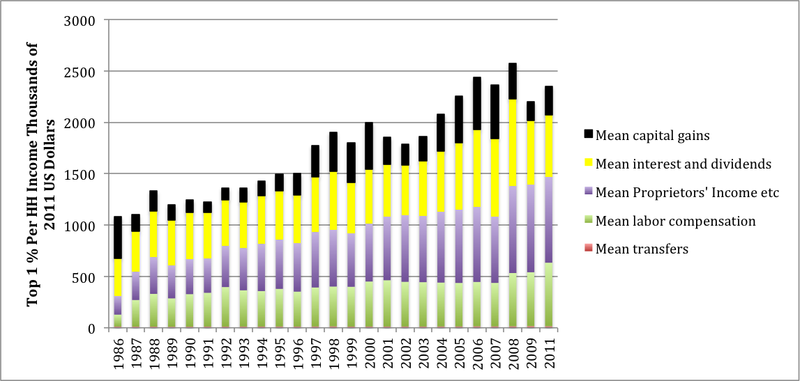
The chart indicates that rich households steadily gained income until 2010. Over two decades their share of the household total rose by around 10% – a very large change for such an indicator. Thereafter their income growth dropped off for a couple years due to low interest rates and reduced capital gains. Figure 2, presenting indexes of incoming income flows per household, centered on levels of 100 in 2007, shows what happened. Financial returns declined, but at the same time labor compensation including wages and benefits from employers as well as proprietors’ incomes kept climbing.
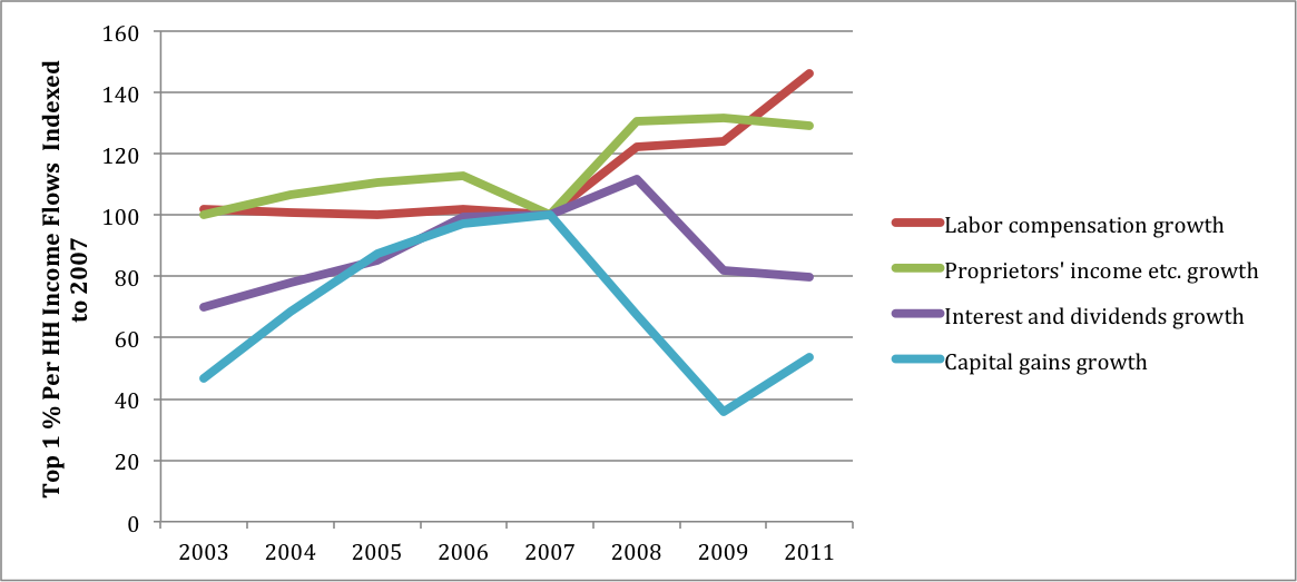
What about the period following 2011? Interest rates have remained low, but sooner or later they will rise. The S&P 500 stock market index, meanwhile, has gone up by 65% since early 2012, presumably generating substantial realized capital gains.
After Federal taxes, income disparities remain large. The top one percent pay somewhat higher overall rates (23% of pre-tax income as opposed to 18% for all households). Their direct taxes are more progressive (rates of 24% and 10.5% respectively) but they are scarcely touched by regressive FICA employment taxes.
In 2011 there were 1.1 million households in the top one percent with a mean pre-tax income of $2.073 million, not including capital gains, for a total of $2.28 trillion. GDP (which does not include capital gains) was $15.52 trillion so the top group absorbed 14.7% of total output. Including capital gains, in 2014 they probably got close to three trillion. Fifteen percent of GDP represents enormous economic power.
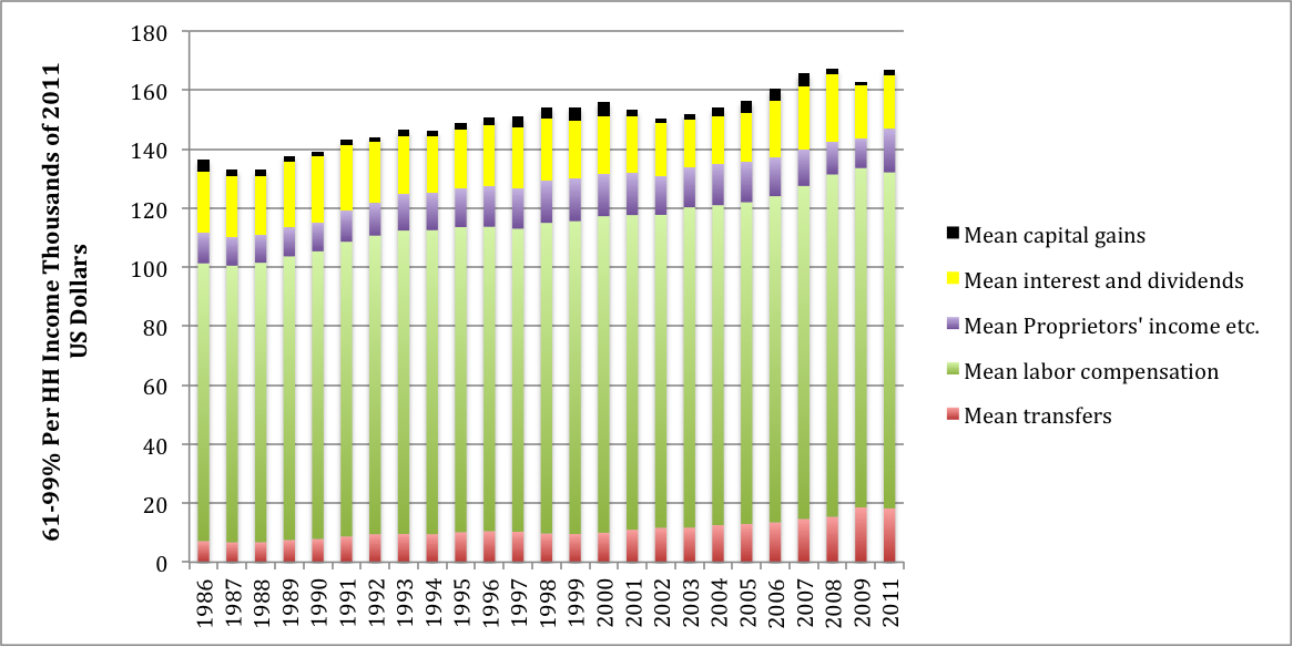
The “middle class” broadly comprises households between the 60th and 99th percentiles of the size distribution. Figure 3 shows their income sources. Note the difference in the scales between Figures 1 and 3. The top one percent’s income is a factor of ten higher than the middle class’s. It simply does not fit with flows to the other 99% of households.
Middle class mean income is around $160,000, concentrated in the group’s top decile. These households have positive saving rates and visible net worth, largely concentrated in housing. Figure 3 shows that labor compensation makes up almost 70% of their total income. The pre-tax level increased from around $95,000 per household in 1986 to $110,000 in 2011 – a modest growth rate of half a percent per year. In the USA, of course, around seven percent of compensation is absorbed by FICA, explaining the 21% tax rate that these households pay (their direct tax rate is 11%).
Other significant income sources are interest and dividends, proprietors’ incomes and government transfers such as Social Security, Medicare, unemployment insurance, and (at lower income levels) food stamps and Medicaid.
After 2007, Figure 4 shows that middle class labor income continued to stagnate. Financial incomes went down and transfers went up, as is to be expected in a recession. Both will probably revert toward pre-recession levels, leaving overall income for these households dominated by trends in real wages.
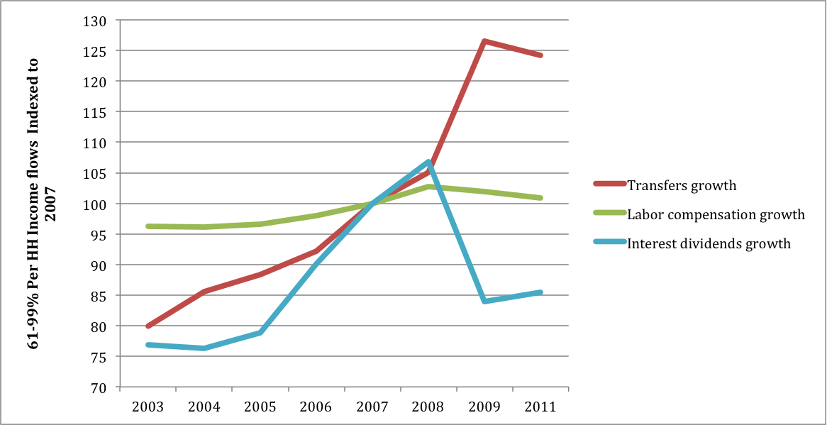
Figure 5 shows that households in the bottom 60% are highly dependent on labor income for their mean level of $55,000. In 2011, transfers were around two-thirds of wages. In reported consumer expenditure data, this group has a negative savings rate, meaning that people spend more than they receive. Their average wealth is close to zero, so that financial incomes are very small.
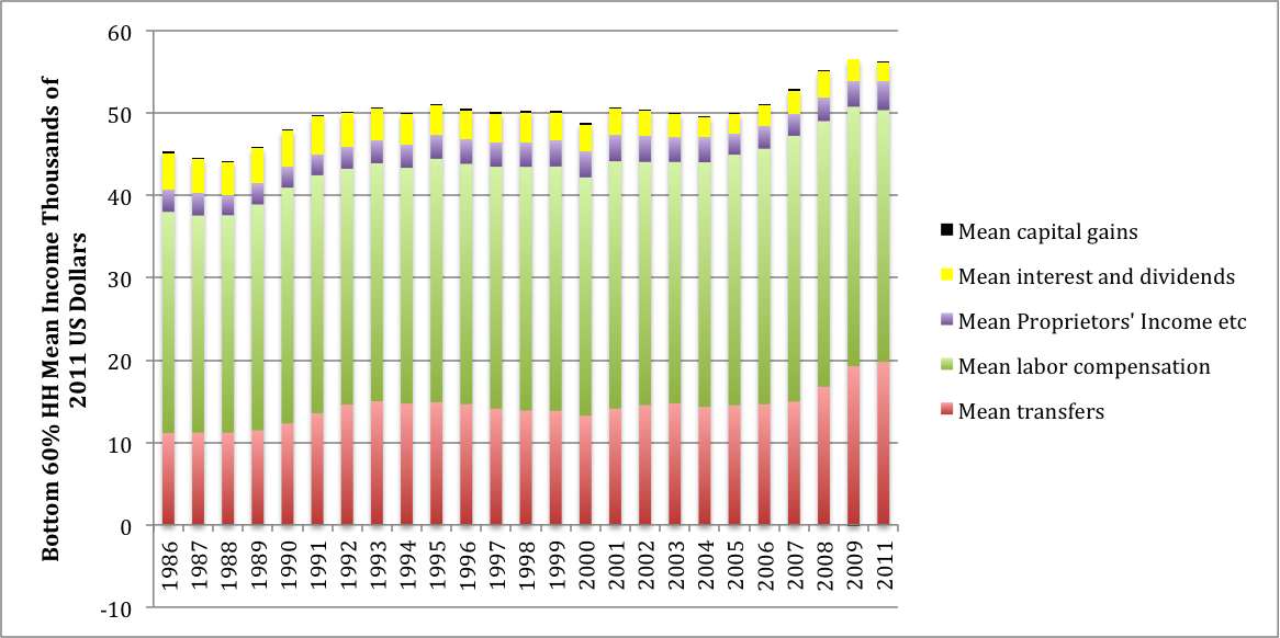
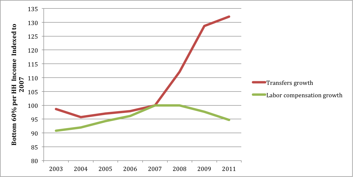
In Figure 6 one can see falling wages and rising transfers after the recession got underway. The latter will decline with recovery. Rising minimum wages in ranges currently being discussed could marginally benefit low income recipients but how widespread they will be remains to be seen.
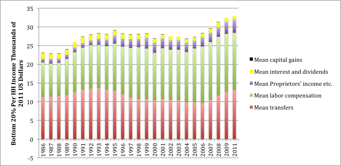
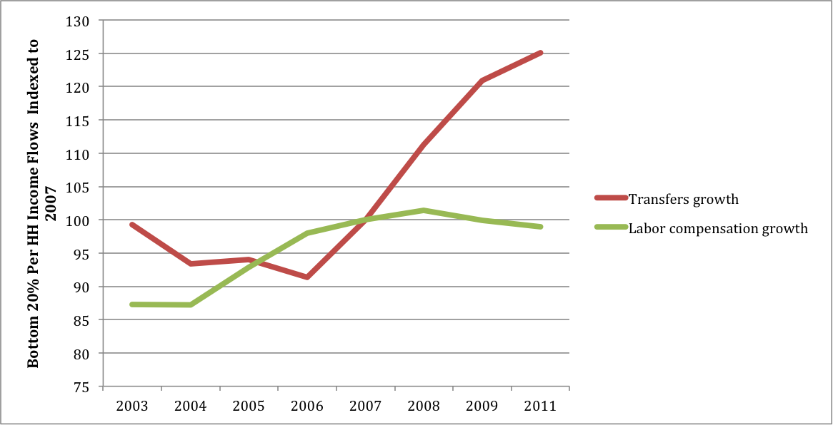
Figures 7 and 8 draw a similar picture for the bottom twenty percent. Their household income in the $30,000 range is dominated by labor compensation and transfers. With recession, wages dropped off but transfers rose sharply. Thanks to credits they have negative direct taxes but are still hammered by FICA.
These comparisons can be summarized in a ratio named for Gabriel Palma of the University of Cambridge, the “Palma ratio” which draws a contrast between the rich and poor. Figures 9 and 10 present ratios of per household income of the top one percent to the other groups, with and without capital gains respectively.
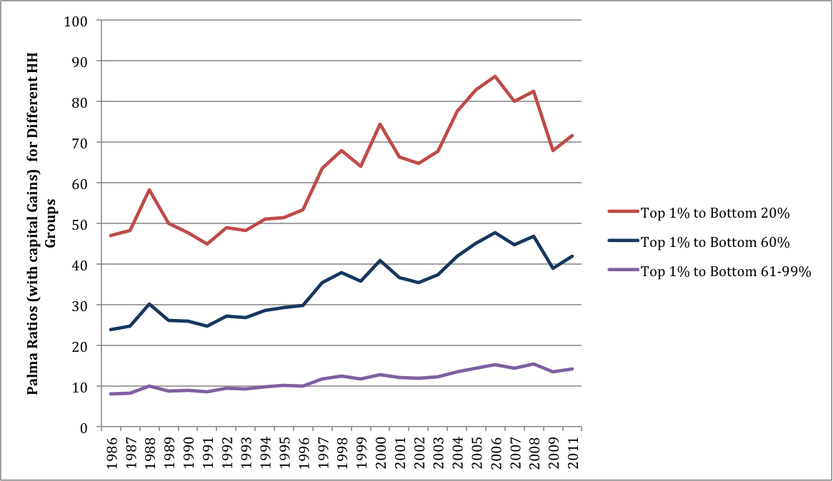
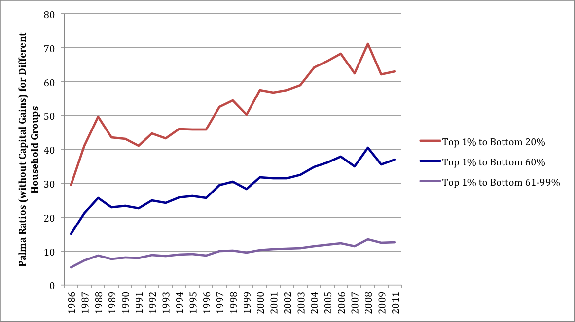
With capital gains included the ratios were strikingly high before 2007, but then dropped off rapidly. The decrease in Figure 10 is less sharp, reflecting the instability of asset prices. For the reasons discussed above, the Palma ratios almost certainly increased after 2011.
This latest green shoots theory of income redistribution looks rather doubtful.


I had thought this issue resolved in a Pew Institute piece: “A Rise in Wealth for the Wealthy; Declines for the Lower 93%.”
http://www.pewsocialtrends.org/2013/04/23/a-rise-in-wealth-for-the-wealthydeclines-for-the-lower-93/
All of Taylor’s graphs cut off just after 2011, which would tend to confirm my assumption.
This is a new controversy, based on an article well after the date of the Pew article, that looks at the same time frame that Taylor did and argues inequality did not increase when you included transfers.
Isn’t this akin to claiming Helios guides the sun across the sky in his chariot? Also, I apologize for the cheese but I could not resist, do people read his paper with Rose colored glasses?
This sounds like a great academic dispute, conveniently side stepping the bigger picture. I mean, Rose is directly supportive of government programs in that article. It’s all arbitrary start points, anyway. That’s the point of starting this discussion in 2007.
I think perhaps the tricky thing fundamentally for leftist thought is dealing with our present reality that in a world of corruption and looting, where so much government activity goes to support connected insiders rather than the broader public, deflation is actually a rather effective method of reducing inequality. And I think that’s the real tension – between perspectives that put the emphasis on increasing aggregate demand and perspectives that want to focus on decreasing the excessive concentration of wealth and power.
That could be a rather more useful avenue of exploration for academic economics than these kinds of inside baseball disputes.
I’ve always found it useful to follow the Gospel of St. Mark (Twain): Where do Rose and Leonhardt get their cornpone? That will tell you who gave them this putrid, little assignment.