The Milken Institute has released a new report on the housing/credit crisis, which is a preview of a book to be released this spring (hat tip reader Dwight). What I found particularly interesting, given the Institute’s conservative leanings, is that the policy recommendations were on the whole, middle of the road. They acknowledged the need for regulation (but urged that it focus on preventing future crises, with tougher restraints on liquidity, credit, and capital leverage, and monitoring of off balance sheet exposures (frankly, I’d be done with them). It also did not call for ending subsidies to homeowners (admittedly, it would take a very long time to wean Americans off that, even if there was the political will for it), but a change in practices. I don’t see this tone as representing a change in the Institute’s stance but a pragmatic recognition of what is feasible in the current environment.
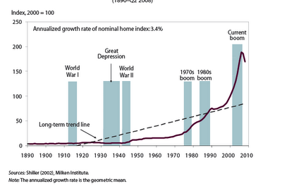
Some of the charts I found noteworthy. My favorite Robert Shiler factoid is that housing prices, from 1890 onward (no typo) have increased at a real rate of 0.4%. The first chart shows how stupendous the recent runup was:
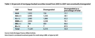
Even though many readers no doubt recall that downgrades were coming a mile a minute, I hadn’t seen a tally before:
More good stuff here.


Anyone care to guess what caused the inflection in credit expansion in the 70s? That’s right we snapped the back on the gold standard and went fully fiat.
Anyone care to guess what caused the second inflection in credit expansion in the 90s? That’s right, Greenspan went ballistic with his moral hazard bailouts and monetary easing.
Is it not amazing that there are still people around who argue against the austerity of a gold standard?
I’m reading a plan for the government to offer refinancing for home loans at 4% is gathering steam. 0% would be preferable but there is still no guarantees that monthly payments will be meant and housing values will stabilize considering were in or nearing a depression.
Guess they will try anything when disparate except a payroll tax holiday for six months or more.
Yves,
You have a typo in “typp” :)
Anon of 1:34 AM,
Thanks for the catch. Boy, am I hopeless on that front!
Anon, there isn’t enough gold in the world to use it as a trading currency, the real economy outgrew it.
To be reasonable, these graphs ought to be log plotted over that long a timeframe and that large a scale. It is fairly amazing that last quadrupling occured during a period when nominal stated inflation was fairly quiet. But we’re talking about a scale so compressed from 1890 to 1940 that you can’t even get a clue about that era’s price moves. And a long term “trend line” representing a , what is that, a 10 fold, or a 40 fold increase? Needs to be log plotted or it is vastly over-stating the current predicament. It still remains a predicament, mostly because of the leverage against the mounting losses and the globalization of what was previously a localized housing phenomenon, but it isn’t so far removed from the rest of measured time as this graph appears.
With apologies to Yves who probably won’t like it much (she’s nicer than I am) here’s my new song about H1B foreign workers, to the tune of “America the Beautiful”:
Here comes the world’s academic mob
and endless waves of pain
You see their face in every job
Your career goes down the drain!
America! America!
God shed the H1B’s
and let them land in their own land
from our sea to their sea!
Inspired, no? Well I like it, and it tells a true story about my life and diminished expectations.
Is the long term trend line calculated using 0.4% real growth or is it calculated using the recent thirty year bubble? It looks misleading to me.
Needs a log chart.
Hi Yves,
I am curious about your views on the Australian property market. Do you think authorities are likely to succeed in keeping the bubble inflated?
I have been amazed that the level of consumer debt has not somehow translated yet into greater external funding difficulties.
Thanks,
David
Cent21: that’s a ludicrous claim. There is no “right” amount of gold. The key to gold being a monetary commodity is that it is LIMITED in supply. It wouldn’t matter if there was only a 1000 tonnes, or even just 1 gram. It’s also fungible and divisible, so the problem of availability can be solved by further division.
I suggest you read the section on the Gold Invention in A Bubble that Broke the World because this “not enough gold” meme is getting out of control in anti-gold, pro-monopoly money circles
Not sure that showing a chart on nominal house prices means much. Even if house prices had been stable or even falling in real terms their nominal price could have trended up almost as sharply as the curve shown.
Actually, the Case-Schiller charts are inflation adjusted prices. It is actually better to see the a chart where the nominal prices, and the real prices are shown as it better explains how astounding the recent bubble was, how far we still have to fall (especially since it appears that a general debt-deflation is setting in and that because of over investment there is now an over supply of housing units), and it explains why the earlier small bubbles bursting in the early eighties and early nineties were not notice since those real price declines were masked by the higher general inflation of those years. http://mysite.verizon.net/vodkajim/housingbubble/
As for those who think Gold is the panacea for all our economic woes, all I can say is: Panic of 1837, Panic of 1857, Panic of 1873, Panic of 1893 (and the subsequent depression led to W.J. Bryan’s famous Cross of Gold speeech in 1896), and finally the Panic of 1907. Further, Gold did not stopp WWI from producing inflation which the Federal Reserve had to stop by raising interest rates sufficiently to cause the 1920-21 recession (now famous on right-wing blogs as the “Harding Depression”), with the economy reviving as interest rates fell, what was to become the classic post WWII business cycle until this most recent event. This event has more in common with 1929, 1893, and 1873 in that it arises from excessive financial speculation, an overinvestment spree (particularly in setting up factories for export in China), and huge asset bubbles (I am sure the guy making loan on a tulip bulb in 1635 Amsterdam thought it as a AAA safe investment as well).
The upper class and upper middle class (I am one) get a tremendous tax subsidy if we buy real estate. Because our asset prices are falling, we are going to use our political clout to try to keep back the tide. Which is why you hear both Democrats and Laissez-faire free market Republicas make proposals to “fix housing,” e.g. use tax dollars to support bubble prices. Its not pretty, its not right, and blame the politicians as we will, the fault is in ourselves.
The chart of house prices becomes parabolic upward after Vietnam/OPEC/recycling credit to LDC countries.
Thus there really is no valid straight-line trend-line.
Almost certainly, a standard stat program was used to create a best-fit trendline; an example of GIGO.
‘factoid’ is not equal to ‘fact’. In fact the two words are the inverse of one another.
The first thing I noticed in the Milken report is that there is no mention of Fannie/Freddie in the Key Findings section.
Colin is right, data series that grow at geometric rates are most easily viewed on a log axis. Also, the constant growth rate curve is cleary not right, since such a trend line would only display as a straight line when plotted on a log axis. It’s surprising that Shiller would make such a goof.
The biggest knock on gold currency: there is not enough future gold to cover population growth. In fact gold production continues to fall.
Fiat would survive much longer periods of time if interest wasn’t attached to the renting of money. Compounding interest demands inflation.
BTW, I don’t think there is a chart to show manipulation outright. Just the cyclical wave patterns with blow offs prone to manipulation ghosting in the background.
Precious metals currency would flatten or lower any waves.
I agree that it’s hard to get much out of a price chart going back 120 years if it’s not adjusted for inflation.
Here is the chart you’re looking for, Case-Shiller going all the way back to 1890, but this time adjusted for inflation. It’s the third chart in this article:
http://krugman.blogs.nytimes.com/2007/12/28/housing-how-far-is-down/
Yves,
Re: Typos
You’re not using Internet Explorer are you? Make the move to Firefox and it tells you when you misspelled something (with a little red squiggly line under the word).
Another problem with the housing chart is the fact that it deals in the unit “houses”. The houses being built in 1940 were far inferior by almost every measure to the houses being built today. Much smaller square footage, for one thing, along with a host of other improvements.
Graph needs to be semi-log scale. Any long-term graph charting steady annualized growth looks like a bubble on a linear scale.
I am trying to understand the 0.4 % value, is that per year ? If so, is the chart saying that a house that costed $1000 in real 1890 dollars is worth 1502.58 in real dollars at the end of 2002?
The formula is A= P(1.04)^n or in this case 1000=(1.004)^102
Thanks
I would try to graph it relative to the cost of building the house in each year.
I’m sure that after the current 20% correction it is in line with historical ratios.
I’m kind of tired of this economist blabla that considers houses as if it was some sort of standard commodity.
Quality of materials, insulation, environmental laws, better kitchens, better plumbing, etc, all have contributed to increase the cost.
You may say that maybe houses are too much for the average people, but please also regraph the chart using Income growth instead of inflation. You’ll see that prices were too low in the 90′ decade and were tooo high in 2007, current prices are more or less in line.
Prices will still go down because they always overshoot.