By rjs, a rural swamp denizen from Northeast Ohio, and a long-time commenter at Naked Capitalism. Originally published at MarketWatch 666.
This week saw the release of reports on June retail sales and industrial production, important as both are tracked by the NBER business cycle dating committee, who make the official calls on US recessions. Real retail sales, adjusted for inflation with the CPI, which was also released this week and covered below, appears to have turned negative in June, while manufacturing looks like it may show negative quarter over quarter comparisons. Add those to the surprising downturn in new home construction, declining inventories, and the larger trade deficits in April and May, which appears to have continued in June, and the second quarter GDP is looking pretty ugly.
June Reports on Retail Sales
 The Advance Retail and Food Services Sales Report for June (pdf) from the Census Bureau tells us that seasonally adjusted retail and food service sales were at $422.8 billion for the month, up 0.4 percent (±0.5%)* from the $421.2 billion in seasonally adjusted sales in May; and also up 5.7 percent (±0.7%) from the $399.9 billion of sales in June of last year, in figures that are not adjusted for inflation.. This widely followed report is an advance estimate of sales representing 1.8 million firms collected by phone, fax or mail from a sample of approximately 4,900 firms and will be revised when more complete data is available next month. Census tells us in a footnote that since that ±0.5% margin of error in June includes zero, they don’t have enough statistical evidence to determine if sales actually rose in June or not, so keep that in mind as we review the seemingly precise figures in this report. Unadjusted totals show estimated sales of $420,645 billion in June, up 3.7% from $405,484 billion a year ago but down 5.4% from the $444,572 billion of actual sales in May. May’s sales gain was reported as being revised down from 0.6% to 0.5% but the actual change was statistically insignificant, from a gain of .550% to a revised change of 537%.
The June retail sales story was all about automotive sales, wherein sales at vehicle & parts dealers rose from a seasonally adjusted $79,028 million in May to $80,461 million in June, a month over month increase of 1.8%. Most sales were apparently of new cars and trucks as well, as two weeks ago Wards Automotive estimated that light vehicle sales for June were at a seasonally adjusted annual rate of 15.89 million, 4% above the May sales rate, a 67 month high and the best June sales since 2006. Excluding cars & parts, the aggregate of all other June retail sales increased a statistically insignificant $139 million, or 0.0%, and that was more than covered by the seasonally adjusted increase in gasoline sales, which rose $316 million to $45,491 billion in June, meaning that without sales of cars, parts and fuel for them, retail sales at all other outlets actually fell $177 million for the month, amounting to a decrease in what some call "core retail sales" of less than 0.1%..
Other than automotive sales, other retail trade sectors showing better than average adjusted sales increases in June included furniture and home furnishing stores, which saw sales rise from $8,228 million in May to $8,426 million in June, a 2.4% increase, which was their best since May 2012, non-store retailers, which are catalog & online outlets, who saw sales rise 2.1% from $37,154 million in May to $37,936 million in June, clothing stores, where sales rose 0.7% from $20,914 in May to $21,061 in June, and the broad category of stores specializing in sporting goods, books or music, where sales also rose 0.7%, from $7,451 in May to $7,505 million in June. Our copy of a table segment from the report showing these seasonally adjusted monthly percentage changes is to the right above, which also shows the year over year change in sales for each of these retail classes…note the June jump in furniture sales more than doubled the year over year sales increase for those stores. Also note total "retail trade" listed thereon includes all retail sales except those at bars and restaurants, which was up 0.6% in June and 6.0% year over year.
Retailers who saw seasonally adjusted sales decrease in June included building and garden supply stores, where sales fell to $25,772 million from $26,346 million in May, bars and restaurants, where June’s sales of $45,251 million were 1.3% below May’s level of $45,821 million and their worst one month drop since February 2008, department stores, where June’s adjusted sales of $14,492 million were 1.0% less than May sales of $14,631 million, and a catch all category of miscellaneous store retailers, who saw seasonally adjusted sales fall from $10,668 million to $10,402 in June. Smaller sales declines of 0.1% were also recorded for food & beverage stores, where sales fell from $53,765 million in May to $53,706 in June, and electronic and appliance stores, where seasonally adjusted June sales of $8,311 million were slightly lower than May sales of $8,319 million..
It’s probably worth noting that all of those retail store types except for sporting goods, hobby, book and music stores actually saw unadjusted sales decline in June, as May is a higher than average sales month across a broad spectrum of retail categories, and sales always fall in June.. The largest unadjusted sales drop was recorded by building material and garden supply stores, where unadjusted sales fell 16.0%, from $34,108 million in May to $28,642 million in June. In a chart that received some distribution, zero hedge purportedly showed that the seasonal adjustment in this June report was an indication of data manipulation to make June sales appear better than the actual data implied; the error in their analysis, however, is that one cannot take the gross seasonal adjustment in any month and compare it to other years, as in arriving at the seasonal adjustment for retail sales, Census adjusts sales for each retail time series separately, and uses those to arrive at the aggregate change…for instance, furniture sales usually decrease in June, but this year they decreased less, boosting their seasonally adjusted sales…
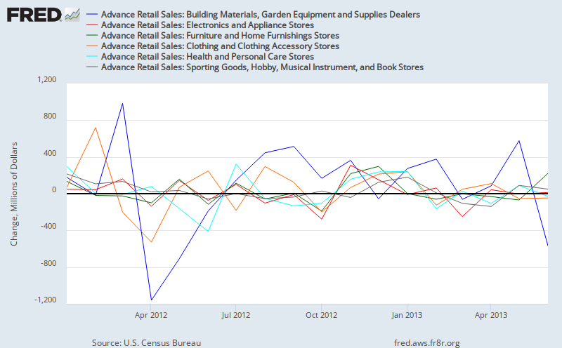
Below we’re including two FRED graphs which show the month over month change in millions of dollars in each of the major retail sales groupings since the beginning of 2012; you can click on either for a larger view. The first FRED graph shows the seasonally adjusted monthly change for motor vehicle & parts dealers in blue, the change in sales for food & beverage stores in red, the change in gasoline station sales in orange, the sales change at general merchandise stores in green, the non-store, or online sales change in teal blue and the change in monthly sales at bars and restaurants in grey, in that order for each month. It’s pretty obvious that gasoline sales, influenced by price swings, are the most volatile element here. In our second FRED graph below, which you’ll note on the left has a smaller scale than the first, has the seasonally adjusted monthly change in millions of dollars at building & garden supply retailers in blue, at electronics and appliance stores in red, the sales change at furniture stores in green, clothing stores sales change in orange, drug stores change in teal blue, and the change in sales at stores specializing in sporting goods, hobbies, books or music in grey, again in that order for each month. Note that none of these seasonally adjusted sales changes are adjusted for changes in prices…

Consumer Prices
The next report we’ll cover, the CPI, is one often used to adjust the retail sales report for inflation, although strictly speaking it should not be, because it includes prices not included in retail sales, such as the cost of housing and medical services. In GDP calculations, the broader component of "personal consumption expenditures", which accounts for 70% of GDP, is deflated using the PCE price index. Nonetheless, there is nothing encouraging in a greater increase in June consumer prices than the increase in aggregate retail sales, which aren’t adjusted for inflation whatsoever. The Bureau of Labor Statistics (BLS) reported that the seasonally adjusted Consumer Price Index for All Urban Consumers (CPI-U) increased 0.5% in June, and it also more than offset the 0.4% average hourly pay gain for June that BLS reported two weeks ago. Meanwhile, the unadjusted CPI-U based on prices from 1982 to 1984 = 100 rose 0.2% from 232.945 in May to 233.504 in June. Since seasonally adjusted prices increased 0.1% in May, but were down 0.4% in April and 0.2% in March, this increase brings the CPI back approximately to the level of February…
Slightly higher prices for gasoline drove the changes in June, accounting for approximately two-thirds of the entire CPI increase, while also accounting for most of the difference between the seasonally adjusted index and the unadjusted price change. The unadjusted gasoline price index rose 0.6% from 310.352 in May to 312.212 in June, but since Spring gasoline prices normally peak before Memorial Day and fall slightly in June, that small increase this June was projected into a 6.3% seasonally adjusted increase in the gasoline index in this report, driving the energy price index, which accounts for 10% of the CPI, to a 3.4% seasonally adjusted gain.. Seasonally adjusted price changes in other contributors to the energy index were more subdued; electricity rose 0.2%, while fuel oil fell 0.5% and natural gas fell 0.4% in price…year over year, energy prices are up 3.4%, led by an 11.7% jump in gas utility prices..
Food prices, which account for just over 14% of the CPI, increased at a seasonally adjusted 0.2% rate in June, although the unadjusted food index was barely changed, moving up from 236.526 in May to 236.792 in June. Prices for food away from home rose 0.2%, led by a 1.6% increase in prices for food at work and at schools, while prices for food at home also increased by 0.2%, with cereals and bakery goods and meat, poultry and fish both up 0.4%, while dairy products and fruits and vegetables just saw price increases of 0.1%. The food index saw a 1.4% increase over the year ending June, with prices for food at home up 0.9% and prices for food away from home up 2.2%, with prices for food at work and schools again showing the greatest annual increase at 5.3%, while full service meals were up 2.3% and fast food prices were only up 1.8%.. Major year over year changes in prices of food at home include an 8.4% increase in bacon prices, a 10.2% increase in fresh whole chicken, a 6.9% increase in egg prices, a 6.8% increase in prices for donuts and sweetrolls, and a 6.7% increase in apple prices, while prices for coffee fell 5.4%, prices for dried beans and peas fell 5.4%, prices for potatoes fell 3.7% and sugar prices fell 6.0%…
The price index for all items except food and energy, otherwise known as the Core CPI, increased 0.2% in June, the same as in May, and is now up 1.64% year over year, compared to last month’s 1.68%; shelter, the major component of the CPI at 31.6% of the total index, was up 0.2% in June as both rent and homeowner’s equivalent rent both rose by that same amount; year over year, the cost of shelter is up 2.3%, with rent up the same and owner’s equivalent rent up 2.2%. The price of new vehicles was up 0.3% in June and 1.2% for the year, while used cars and trucks saw prices decline 0.4% for the month and 2.3% since last June. Other factors contributing to the increase in the Core CPI include the cost of medical care, with medical commodities up 0.5% and medical services up 0.4%, apparel, which saw prices rise 0.9%, household services, which were up 0.5%, and furniture and appliances, which both saw price increases of 0.2%.. Meanwhile, the index for transportation services fell 0.1% as vehicle rentals fell 2.0% and airline fares fell 1.7%, the recreation index slipped 0.1% as prices for video and audio products were down 0.8%, and the price index for education and communication was up less than 0.1% as a 0.5% increase in tuition was partially offset by a 0.2% decline in prices for information technology commodities..
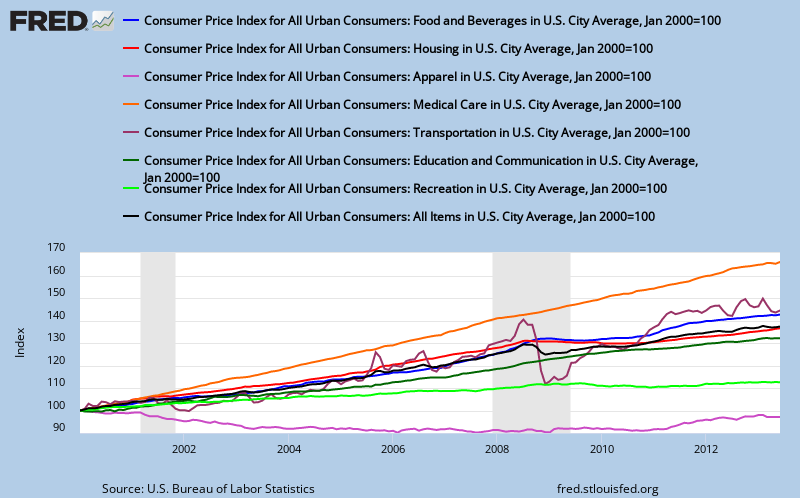
Our FRED graph above shows the change in the CPI-U since 2000 in black, and the track of the monthly changes in each of several major components of the CPI since January 2000, with each index reset to 2000 = 100 for an apples to apples comparison (some composite indexes are based on 1997, others on 1982). In blue, we have the track of the change in the price index for food and beverages, which doesn’t seem to be as volatile as alleged by those who’d remove it from core measures. In red, we have the change in the price index for housing, which at 41% of the CPI also doesn’t reflect the volatility we’ve seen home prices, but rather the more stable homeowners equivalent rent; note this index also includes housing related energy. In violet, we have the index for apparel, which has been the only index to show a net price decline over the decade. The transportation index, in brown, shows the impact of volatile gas prices on the cost of transportation, while the index for medical care in orange has obviously risen the most over the period. In addition, education and communication prices are tracked in dark green, and the track of the recreation index is shown in light green.
Industrial Production
The other key release this week was from the Fed on Industrial Production and Capacity Utilization for June, which showed that the seasonally adjusted industrial production index, which is benchmarked to 2007 = 100, rose from 98.7 in May to 99.1 in June, which is indicated to be a 0.3% increase. Of the component indexes, the index for manufacturing rose from 95.5 to 95.7, also indicated as a 0.3% increase, while the mining index rose 0.8% from 116.9 to 117.8 and the utility index slipped 0.1% from 99.3 to 99.2. Recall that mining in this context includes oil and gas production, and that the seasonally adjusted utility index is heavily influenced by unseasonable weather, which boosted the March reading to 103.8 and has resulted in negative comparisons since, such that the overall industrial production index just now regained the 99.1 reading first reached in March.. Nonetheless, the industrial production index is now 2.0% ahead of it’s year ago reading, as the manufacturing index increased 1.8% and the mining index increase 4.4% since last June…
However, for manufacturing, which is over 75% of industrial production, the quarter over quarter comparisons do not bode well for its contribution to 2nd quarter GDP; the manufacturing index slipped at an annual rate of 0.2% in the quarter just completed, after having increased at a 5.1% rate in the 1st quarter and 2.4% in the 4th quarter last year. Output of durable goods was up 1.5% in the 2nd quarter after being up 6.5% in the first, with a 9.7% annualized gain in the output of computer and electronic products and a 7.3% increase in motor vehicles and parts, offset by a 7.2% annualized decrease in output of primary metals and a 3.2% decrease in production of electrical machinery and appliances. Non-durable manufacturing, on the other hand, decreased at a 1.5% annual rate in the 2nd quarter, after showing a 4.5% annualized gain in the 1st, led by a decline of 8.4% in output of textile and product mills, a 7.1% decrease in output of apparel and leather, and a 7.8% decline in production of petroleum and coal products, offset only by a 4.7% increase in production of plastic and rubber products.. Meanwhile, mining, which accounts for over 14% of the industrial production index, was up at a 4.6% annual rate in the recent quarter, after being down 0.7% in the first quarter, while utilities, which are less than 10% of the index, saw no gain in the 2nd quarter after being up at a 5.2% annual rate in the first three months of the year…
In addition to the indexes for major industry groups, this report also indexes industrial production by market group. In June, the index for production of consumer goods, which accounts for 27.14% of the total industrial production index, increased 0.5% to 94.6 after falling 0.3% to 94.1 in May; output of consumer durable goods increased 1.1%, led by a 1.4% increase in automotive products production and and a 2.2% increase in output of home electronics, with no durable components showing decreases. Meanwhile, the output of nondurable consumer goods rose 0.3% in June, after being down 0.4% in both April and May; foods and tobacco output increased 0.8%, paper products production increased 0.4%, while output of energy decreased 0.3%…
The index for business equipment, which accounts for 9.61% of the industrial production index, advanced 0.5% to 102.6 after falling 0.1% in May and 0.2% in April; production of transit equipment was up 0.5%, while output of IT equipment fell 1.0% and other industrial equipment rose 1.1%. In addition, production of defense and space equipment was up 0.1% in June, its first monthly increase this year, while construction supplies and business supplies, two indexes with no subcomponents, also both showed nominal 0.1% month over month increases. Production of intermediate materials to be processed further, which accounts for 46.54% of industrial output, increased by 0.2% in June, after gaining 0.2% in May and retreating by the same amount in April. Output of durable materials increased by 0.4% as output of equipment parts led the increase with a gain of 0.8%. Output of nondurable materials, on the other hand, slipped 0.1%, with a 1.2% decrease in paper output and a 0.3% decrease in output of chemicals more than offsetting a 2.3% increase in production of textiles..And lastly, output of energy materials to be processed further saw a 0.4% increase in June…
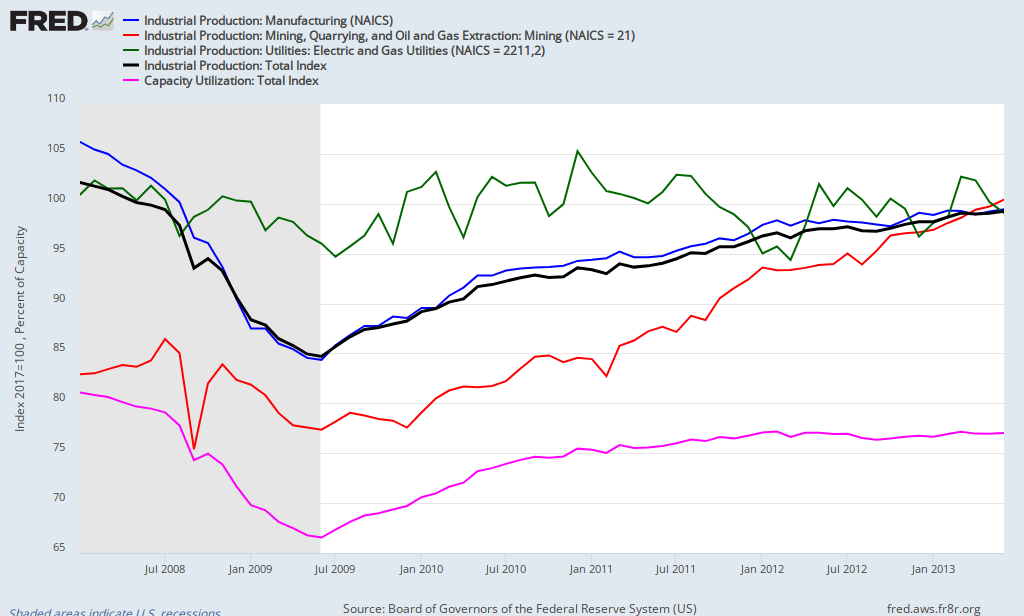
Capacity utilization for total industry, which is expressed as a percentage of plant and equipment in use during the month, was up 0.1% in June to 77.8% and that was also up just 0.1% from a year earlier. For manufacturing, the factory operating rate was at 76.1%, up 0.1% over May and 0.2% higher than a year earlier, while utilities were running at 77.6% of capacity, down 0.1% from May and at an operating rate 1.2% below a year ago; meanwhile, 87.9% of mining and drilling equipment available was in use, up 0.8% for the month but only 0.2% higher than a year ago. Capacity growth was revised with this release and now shows 1.8% greater capacity to produce than a year ago. Manufacturing capacity has increased 1.5%, utility capacity has increased 1.2%, and mining capacity is up 4.1%, likely reflecting an increase in gas & oil rigs. Our FRED graph for this release, to the right above, shows capacity utilization for total industry in pink since January 2008, with the scale indicating percentage of capacity in use; it also shows the industrial production indexes, with the same scale for them also on the left based on 2007=100. The production index for all industry is in black, the manufacturing production index is in blue, the utility production index is in green, and the mining production index is in red…
New Housing Starts
The surprising report of the week was the headline drop in new housing starts during June, from a seasonally adjusted annual rate of 928,000 units in May, to an estimated annual rate of 836,000 in June, a 9.9% decline and the lowest level in a year. But as we know, the census reports on new housing are derived from a small sampling of permits offices and road canvasses by census field reps and hence have the largest margin of error of any widely watched economic releases, so we’d better take a closer look at where the headlines are coming from…
The Census report on June New Residential Construction indicates that June housing starts were "9.9 percent (±11.4%)* below the revised May estimate of 928,000", and that asterisk points us to a footnote which says in part that if the range contains zero, which it does, it is uncertain whether there was an increase or decrease in new home starts. Reading a bit more we see that range is describing the 90% confidence interval; in other words, what that 9.9% ± 11.4% means is that based on their slim sampling, census is 90% confident that the number of new home starts in June, if seasonally adjusted and projected over an entire year, would result in something between 730,336 and 941,920 residential units being started over a year’s time. Their estimate on single family starts has an equally wide range of likely starts; single family home starts are reported down 0.8% (±11.0%)* from the revised May estimate of 596,000; which means there’s a one in ten chance that the annual rate of single family starts in June was greater than 656,792 or less than 525,672. Similarly, the year over year range of starts, 10.4 percent (±14.9%)* above last year’s rate of 757,000, includes zero and an asterisk, meaning that with the data at hand, Census cant even be 90% confident that new home starts actually rose from a year ago…
The actual monthly estimates of new home starts by census field reps from which these seasonal adjusted annual rates were contrived were 80,400 in June, and 88,100 in May, with single family starts accounting for 59,200 of June starts and 57,800 of units started in May. Most of the reported June decline in housing starts came from the a decline in the volatile starts in buildings with 5 or more units, in which fell from 29.400 units in May to just 20,400 units in June, so it’s a fair guess that a slowdown in starts of apartment building accounted for most of the apparent pullback reflected in the headline numbers. Reported June home completions, which are also estimated at an annualized rate with a wide range of uncertainty (6.3% ±14.1%* higher than May) totaled 65,800, leaving a seasonally adjusted 624,000 homes under construction at the end of June, up from 621,000 at the end of May, suggesting it’s doubtful construction employment will be affected by this one month contraction in housing starts.
This report also includes an estimate on new building permits issued during the month, and because they sample about half the permit issuing places in the US for this metric, the margin of error on new permits is small enough that we can get an real idea of the actual monthly activity. In June, new housing units authorized by permits were estimated to be at a seasonally adjusted annual rate of 911,000 (±1.0%), which was 7.5% below the May rate of 985,000 and 16.1% (±1.7%) above the estimate of 785,000 from last June. 624,000 (±1.2%) of those new permits were for single family units, statistically unchanged from May’s 620,000 single family permits, and 261,000 units were authorized in apartment buildings of 5 or more units…
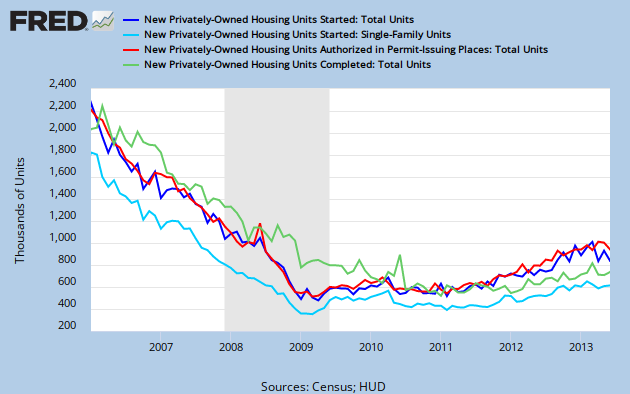
Above, our FRED graph for this report shows the census monthly estimate of total new home starts at an annual rate in dark blue going back to the beginning of 2006, while the portion of those that were estimated to be single family starts is shown in light blue. We can see that the seasonally adjusted starts are lower over the past three months than they were during the 1st quarter of the year, suggesting that unless starts pick up in coming months, new investment in residential structures may suffer in subsequent GDP comparisons, as it takes an average of 6 months for a single family home to be completed, and an average of 11 months from start to finish for all types of multi-unit building. Units of seasonally adjusted new housing construction authorized by permits is shown in red, and though they were at a post bubble high in April, we should have seen more of them turn into higher starts by now, as the average time from permit to start is less than a month for single family homes and less than two months for multi unit residential structures. This suggests that builders may be moving cautiously in the face of higher interest rates. Lastly, the green track on our FRED graph is total residential units completed per month, at an annualized rate. As long as the seasonally adjusted rate of starts remains above the rate of completions, construction employment should remain stable, if not increase, on a seasonally adjusted basis…


Congress Cuts Kill Recovery!
I quit reading after the author referenced zero hedge. The web site is an anti government perma-bear site with no reliable information and anyone who references it is not worth reading.
GLH, the reference to Zero Hedge that I saw criticized as inaccurate a widely distributed chart from that website. How could the author criticize ZH without mentioning their name?
wow your post reads just like the ‘Deliverance’ posters that took over ZH 3 years ago
https://www.youtube.com/watch?v=Uzae_SqbmDE
‘GLH was so narrow minded that if he fell on a pin it would blind him in both eyes’
One can’t even cite to debunk? If so, we’ll be leaving out an awful lot of links!
rj, that CPI chart sort of leaves me wishin you hadn’t learned the makings of those FRED charts!
Masterful Job RJ
Too bad the housing graph is from 2006, not 1986 — housing lasts much longer than any other consumer item, so the longer term trend is more relevant. Similarly, my own theory of the Fin Crisis is overbuilding from 2002/3 or so.
Overinvestment is too little studied, but usually results in a big local fall. If big and wide enough, a financial crisis due to overinvestment / mal-investment. I guess that only in the next few years will the US be building at a “long term” stable rate.
Tom, i used a short time frame on that chart so one could see the recent movements, but the chart is linked to the same chart at the St Louis Fed, where you can change the “Observation Date Range” to view the data over any span you want:
http://research.stlouisfed.org/fred2/graph/?graph_id=129554&category_id=0
there are 4 lines on that chart, but if you type in the date you want on one, then click “Copy to All Lines”, you’ll change the date range for all 4, and then clicking “Redraw Graph” will give you the picture…
I don’t know how they come up with those numbers, especially for supermarkt items. I hardly ever see any prices go down.
I am seeing more sales in an effort to get us to the stores. But I notice that there are fewer people in the stores. Even Dollar General, where the people who couldn’t afford Walmart went, is empty. And in Walmart, I find it difficult to locate workers for assistance. And when I go to check out, most of the registers are closed.
Meanwhile, the price of gas keeps shooting up, and that doesn’t help.
i gave a thought to describing the BLS methodology on those prices, but it slipped my mind…
here’s their answer to “How are CPI prices collected and reviewed?”
http://www.bls.gov/cpi/cpifaq.htm#Question_8
..from Sunday NY Times front page article, AND Gretchen Morgenson’s fine investigative journalism, business section; apprx. 30% of cost of barrel of oil is due to financial sector $peculation…
AND “financialization” of U.S. economics…which valued 19% of U.S. economics, 2001, but 41% by 2007…
follow the $$$$….
All these numbers are fabrications built on fantasy and massaged by statistical finagling. I track actual cash outlays day by day and have seen increases at 12-15% per year since 2010, despite the fact that my life hasn’t changed one bit.
Figures don’t lie; liars figure. Taking any of these numbers seriously simply gives added comfort to those selling the trickle down Growth Fairy Scenario. Its purpose is to keep the rats turning the treadmill to nowhere, while the looters and speculators continue to cash in.
jack, that’s what zero hedge always says…go argue with GLH, 2nd comment above…
Great time to get into deep debt bondage. Feed the machine, they are screaming for it, double down on the psychiatric medication, break the piggy bank, get relatives to chip in, follow the herd over the cliff.