By Lambert Strether of Corrente.
Naked Capitalism is supported by a mix of revenues: your (critical and greatly appreciated) contributions, and advertising. As we say in the site policies:
Yes, we have it. No ads, no site. We don’t like the visual clutter any more than you do but treating this website like an enterprise rather than a hobby requires funding.
“No ads, no site.” Another way of putting this is that the goals for this fundraiser assume an additional level of revenue from the ads. Now, we don’t maximize our advertising revenues; in fact, Naked Capitalism, by comparison to many other sites, is quite restrained. Another way of putting this is that your contributions enable us to avoid even considering adopting methods that some might call, well…. unsound. (And another way of putting that: We don’t intend to fail in our mission of getting the bad guys because of a revenue shortfall.) Here are eleven examples of advertising dollars we’re leaving on the table because taking those dollars would create a horrid user experience for you. And we can leave those dollars on the table because we can rely on your contributions, whether of $5, $50, $500, or $5000. Click here to contribute!
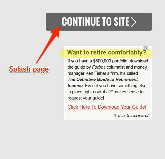
1. Naked Capitalism isn’t Forbes. We don’t have a splash page, with an ad, that forces you to click a “Continue to Site” button to read your favorite content. (The Tip Jar is to your right.)
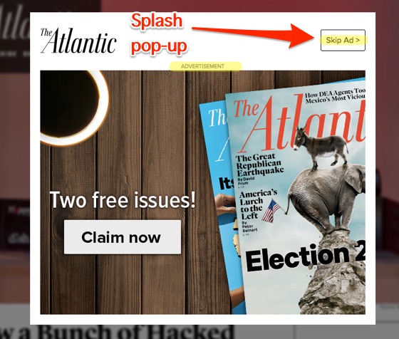
2. Naked Capitalism isn’t The Atlantic. We don’t have a splash pop-up, with an ad, that forces you to click a “Skip Ad” button to get to the site. (The Tip Jar is in the side bar, under the heading “Tip Jar.”)
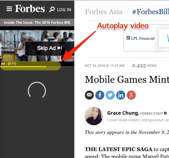
3. Naked Capitalism is not Forbes for a second reason: We don’t have autoplay videos that start with ads. (You may click the Tip Jar’s Donate or Subcribe links.)
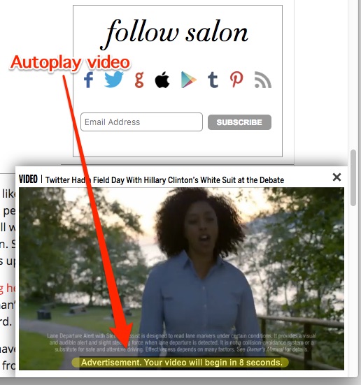
4. Naked Capitalism is not Salon. We don’t have autoplay videos that pop up when you scroll through the article, starting with ads. We are leaving all that money on the table. (You may click the Tip Jar’s image of snow leopards).
5. Naked Capitalism is not McClatchy. We don’t have pop-ups that clutter the headline area of posts. (The Tip Jar has not moved. It’s still to your right.)

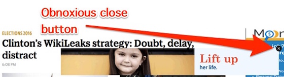
6. Naked Capitalism is not McClatchy for a second reason: We don’t have pop-ups at the bottom of posts that you can’t make go away except by clicking an obnoxious, non-standard close button that’s often not easy to find. (Perhaps we should make the Tip Jar into a pop-up and put advertising on it?)
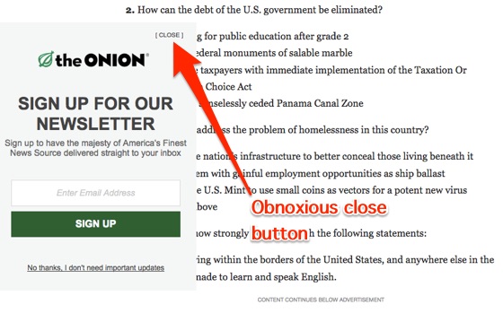
7. Naked Capitalism is not The Onion. We don’t have pop-ups on the left (that obscure the text (and that have obnoxious non-standard close buttons)). (Better idea: Make the Tip Jar an autoplay video! With advertising!)
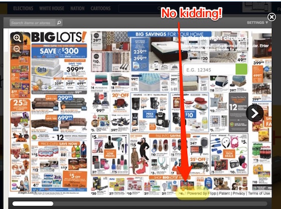
8. Naked Capitalism is not McClatchy for a third reason: We don’t have pop-ups that are, for pity’s sake, complete and cheesy advertising circulars! That cover the entire screen! (Unless you have a heart of stone, the Tip Jar is to your right.)
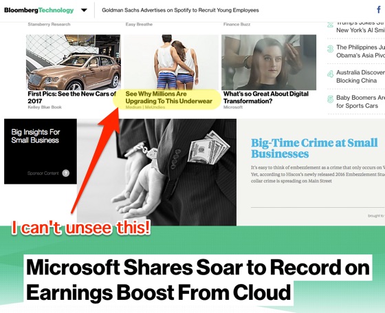
9. Naked Capitalism is not Bloomberg. Naked Capitalism uses proper pages, and not (swipe-friendly) “infinite scrolling,” where when you scroll to the end of a post, you’re suddenly in the next post, where you don’t want to be. Now, at Bloomberg, some demonic force induced them put advertising blades between the posts, where you’ll always see them when swiping, whether accidentally or on purpose. And not be able to unsee them. (Please help us avoid seeing what cannot be unseen with the Tip Jar.)
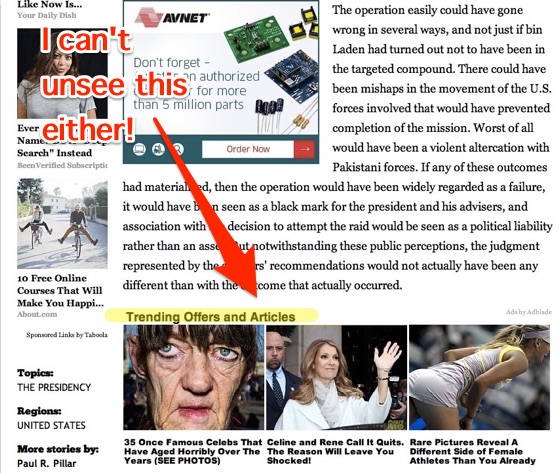
10. Naked Capitalism is not the National Journal, which managed to juxtapose this horrid ad blade with the story of how Obama (is said to have) whacked Bin Laden. (Please help us to avoid this horrid experience with the Tip Jar.)
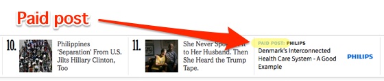
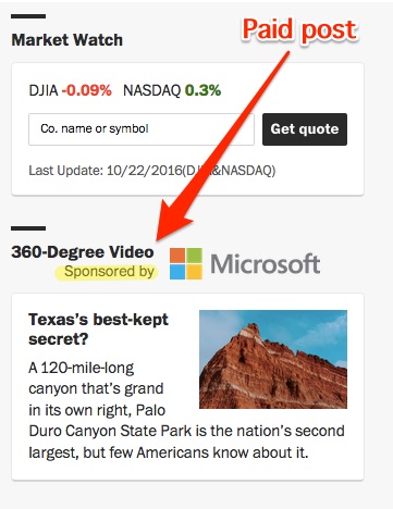
11. Finally, Naked Capitalism is not the New York Times or the Washington Post. We do not pollute our pages with “sponsored content.” (The Tip Jar, under the heading “Tip Jar,” is to your right, the “Donate” and “Subscribe” links are under the snow leopards (and you can also click the snow leopards).
Naked Capitalism can’t do without advertising. But we can — and have — avoided the worst of it. Thanks to your contributions! So please make one now if you haven’t!


Thank you for getting rid of CAPP ads.
A kindhearted woman gains honor, but ruthless men gain only wealth. Proverbs 11:16 NIV
Don’t mention User Experience when we can’t even find your search button on your site. This site has great content but much like zerohedge.com, it has the poorest ugliest most horrible user experience design.
You are the only person in the entire history of our site who says he can’t find the search field, which is in the right column.
You are also the only reader to complain about our design. Once in a while we have a reader say they have trouble with the sizing it on their phone, but the last case was a Safari issue, and not our issue. Those complaints are on the order of three a year versus 300,000 monthly unique viewers. And in fact, on most site, the way they’ve made their search fields virtually invisible by using a magnifying glass icon and not showing were to put your cursor is hardly user friendly. There are many MSM sites where I find the search field difficult to find and use, and I bet they have the sort of hip user experience you want.
In fact, when me mentioned our tech budget, multiple readers begged, “What ever you do, don’t change the design, we like your retro design.”
We are out to optimize the readability of the text, since we are long form and very few site are these days. The caliber of our comments section says readers are reading our pieces despite them being long by Web standards.
In addition, the overwhelming majority of sites have ruined themselves with misguided “improve the user experience” redesignsw which were apparently driven by designers and not readers. Bloomberg was at its best in its noir version. The current site is such a horrorshow I rarely visit it, when it used to be my first stop of the day. The Financial Times just did a redesign that makes it much less easy to scan. If that’s what you want, we don’t want that because it makes the site less usable.
The site is working fine on my Droid phone, desktop, and laptop.
You are right about iPhones. A few operating systems ago, Apple improved our experience by eliminating the feature for most sites of enlarging the font by turning the phone sideways. It’s not just an NC issue. Apple is always looking to make things kludgier, I mean better.
I believe there is a direct inverse relationship between how “high-tech” a site design is and how easy it is to acquire information from it. So here’s to plain text and no flashing arrows or ads that I have to use Ghostery has to squelch.
That principle carries through much of digital design. Take for example the act of typing text on a so-called smart phone using your thumbs vs using all your digits on a standard keyboard. Or tuning a device using buttons and flashing numbers vs. a round dial.
There is a technical reason why both Presidential candidates are terrible at communication. One can’t hold a thought longer than the Twitter maximum, and the other is so addicted to her Crackberry that she was willing to steal classified national security information in order to have it at her thumbs at all times.
I love the design of Naked Capitalism — simple, clean, easy to read — Thank you!
Steve C is right — Apple took away our ability to turn the I-phone sideways and magically enlarge the type. Damn it. Apple just seems to specialize in crapification (one of my favorite words that I have learned right here at NC!) So now most of the time I just wait til I get home and am able to read NC on my laptop. Sigh.
> “Don’t mention….”
That’s phrased in the imperative; we don’t take assignments, not even negative ones.
And do feel free to write us a large check for the site redesign; we did in fact do a redesign one or two years ago (time flies), based on reader feedback, and it was part of our fundraiser. If we had significant requests for another redesign, we would have incorporated that in this year’s fundraiser, too.
Oh, pu-uleeze (did I spell this right and more importantly is the spelling ugly?)
This site does not need mindless graphic embroidery and site gimmickry.
It’s beauty is of word, thought and argument.
–
(simples upon simples that create their own complex patterning, forever renewing and negating and anewing)
I disagree strongly.
Think about books. Standard chapter books have changed little in their design over the centuries for a reason. They are simple and comfortable to read. We choose not to make them massive technicolor pop-up books with folding pages because that is a terrible way to convey words and information rich content (not art).
Think about digital e-book readers. The best are the ones that look like real books (i.e. kindle).
NC is striving for something similar. Simple black and white design with very little visual distraction.
PLEASE DON’T CHANGE IT. Just my 2 cents.
I love love LOVE your design. So many sites have become unreadable. Yours is absolutely simple and beautiful. THANK YOU!
I was going to make a donation, but then I remembered it’s time for an underwear upgrade…priorities ;-D
Is that D a pun? :)
It’s a big grin.
Every time I go to one of the above-mentioned publications, I’m surprised that readers tolerate those intrusive ads. It reminds me about Adrian Chen’s article on Russian troll factories, whose real aims are to make the Internet in general a hostile, depressing place to be.
AKA: companies like Adblade and Flipp are achieving the same results as Putin’s troll army! Somebody’d better tell these publications!
Yes, yes! Tell us more about the underwear upgrades! Enquiring minds want to know!
Nope, I’m sorry. I cannot find the news on your site from the future. Thus I must conclude, you are using the Sears Chrystal Balls, and not the Tiffany Crystal Balls.
I have a subscription in the hope that at some point you can afford the Tiffany Crystal Balls, which tell the future the 1% want to $ee, without any di$tortion. (I have it on good authority that Hillary has a vice grip on a pair of Crystal Balls).
I believe Trump has recently mi$placed his Crystal Balls, either due to overuse, or new flaws which prevented his Crystal Balls from seeing anything that was not rightward in his gaze.
Until then please keep reporting on, and making pointed comments on, the near past in your indefatigable manner.
yep, I noticed this right away. so easy to navigate…and search.
Is it coincidence that your tip jar features snow leopards, also the name of the last version of MAC OSX before crapification set in?
I think not. One of the pleasures of the site is the elegant design, complementing the elegant writing and ideas.
The NoScript extension for Firefox seems to remove all the ads, but with that caveat, this is an elegant site.