By Wolf Richter, a San Francisco based executive, entrepreneur, start up specialist, and author, with extensive international work experience. Originally published at Wolf Street
Women weren’t so lucky either. But who got the spoils?
On the surface, the annual household income data released by the Census Bureautoday, looks mediocre. But beneath the surface, it looks grim – grim for whom? Ha, we’ll get to that.
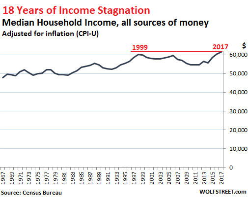
So the mediocre news right up front: < Median household income in 2017, adjusted for inflation (via CPI), inched up a measly 1.8% to $61,372. “Household income” is the entire pre-tax “money income” of a household, including wages, interest, dividends, Social Security, Workers Comp, child support, and the like, but excluding capital gains. The mediocre news is that median household income has finally inched above where it had been 18 years ago, in 1999:
Now the grim news: bitter reality for men.
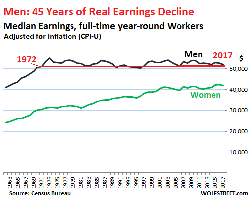
But it’s not great for women either: For women who were working full-time year-round in 2017, median wages (income obtained only from working) declined 1.1% on an inflation-adjusted basis to $41,977 – from a record in 2016 of $42,448.
So a hiccup perhaps in a well-deserved series of increases going back to 1960. The female-to-male earnings ratio remained at the record level of 80.5%, first achieved in 2016, up from the 60%-range before 1982.
But for men – oh dude! Median real earnings for men who worked full-time year-round fell a full 3.0% in 2017 to $52,146. On an inflation-adjusted basis, men had earned more than that in 1972 ($53,609). This translates into 45 years of real-earnings decline for men:
Men have suffered the brunt of the real-wage repression over the past four decades, obtained in part via inflation, an insidious process where wages inch up, but not quite enough to keep up with the Fed-engineered loss of purchasing power of the dollar – a process Wall Street economists praise with conviction.
In addition, even a slight but systematic and purposeful miscalculation of the Consumer Price Index (CPI), which is used to adjust this inflation-adjusted income data — for example a percentage point or less each year — is cumulative; and over the span of four decades, the real-real earnings decline is large. Wonder why many men are frustrated?
So who got the spoils?
“Earnings” in this data set are the fruits of labor – so wages, salaries, and the like. But “household income” includes “money income” from other sources:
- Earnings
- Unemployment compensation
- Workers’ compensation
- Social security
- Supplemental security income
- Public assistance
- Veterans’ payments
- Survivor benefits
- Disability benefits
- Pension or retirement income
- Interest
- Dividends
- Rents, royalties, and estates and trusts
- Educational assistance
- Alimony
- Child support
- Financial assistance from outside of the household
- Other income
“Household income” is measured on a pre-tax basis. But it does notinclude noncash benefits, such as food stamps, subsidized housing benefits, or healthcare benefits — a hefty amount for executives at big companies.
While household income includes income from investment (items 10, 11, 12, and 13 in the list above), it does notinclude capital gains and other forms of capital appreciation of any kind, from portfolio gains and home-price appreciation to stock options.
In terms of the income distribution, the proceeds from investment (items 10, 11, 12, and 13 in the list above) play a critical role at the upper end. Again, this income does not include capital gains! This is how the median household income, pre-tax and adjusted for inflation, has grown by income segment (quintiles) and for the top 5%:
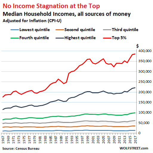
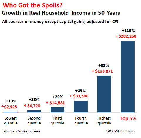
The inflation-adjusted household income of the top 5% (red line) has soared by $202,000 (119%) since 1967, to reach $385,289 in 2017 (not including capital gains). Compare this to the bottom 60% of households (three lines at the bottom), whose incomes have booked tiny gains. The bottom 20%, with a mean of $13,258 in 2017, gained just $2,925, or 19%, over the past 50 years:
This phenomenon of disproportionate income gains at the top doesn’t even include capital gains, which would skew the chart into the stratosphere, thanks in part to the Fed’s QE and zero-interest rate policy (now finally on the way out) to accomplish Ben Bernanke’s wealth effect. He explained it to Americans in an editorial in 2010 in the Washington Post. The explicit purpose was to make the wealthy – who already had the most assets – wealthier so that they’d feel more confident in their genius and more satisfied with their lives after the heavy losses they took during the Financial Crisis, in the hope that they’d spend a little more. The first part worked: The wealth effect created the Everything Bubble. But if these capital gains were included, the chart would look truly absurd.
However, for the bottom quintile on the income scale, their real household income has dropped 8.6% since 1999.
On second thought, Mr. Bernanke, strangling the real incomes of the 60% or 80% of households that spend nearly every dime they make and on whom the economy relies for growth, while enriching some households at the top that don’t even spend their gains — well, this may not have been the most effective economic model over the longer term, no?
But the Fed has now changed its tune. QE is getting unwound and interest rates are rising. Read… Markets Increasingly Sure: 4 Rate Hikes in 2018


This is all good stuff but what’s the use? Mr. Bernanke and his fellow adherents will find some brilliant excuses for why all this is not there fault or explain that cheaper electronics makes it all good; the Democratic Party’s leadership and core fanatics will just bleat more variations of Russia!, Deplorables, job training, while denying what’s in front of our eyes, so why reform?
Look over there! Squirrels!
While I applaud Wolf Richter for this interesting article, the devil is in the detail with this sort of analysis. For example (1) household income based upon one earner households then vs two earner households today, (2) a very youthful population then vs an aging population today (something like 13 wage earners for each retiree then, only 2 or 3 wage earners per retiree today), (3) what age group are we considering – does this data include fixed income retirees (4) then we have a vast expansion of the fixed income benefits system today compared to then, (5) does the Fed still measure income today by the same metric as then (thinking John Williams and Shadow Stats here) – and so on.
Also the data is a bit murky with respect to the ‘highest quintile’ and ‘top 5%’. I am assuming that if this specific data were examined carefully in isolation we would find it was highly skewed – meaning that the mean and median would be two distinct and different measures. For example, Wall Street bankers may be a small percentage of these groups, but their bonuses, salaries etc disproportionately distort the results – whereas the lower quintiles would likely not display such a pronounced distortion, I would expect, due to in part to the law of large numbers. It would be useful to look specifically at the distribution of these two groups.
Don’t know if Bernanke is solely to blame for this development – there are quite a few culprits stretching back a few decades – but he certainly was a part of it.
There is and always has been, 1 worker to 1 retiree in Social Security. That plus your “murky” comment of the top 5% puts me on alert that you have an agenda.
timbers – I don’t know where you get your numbers from, but if you get the data from ssa.gov (2012) you will see that the number of workers has dropped from 16.5 during the 1950s to 2.9 today.
And my agenda is this: to get to the facts. We need to understand exactly which part of the economy is at issue. This is obscured by the way the data is presented. My thinking is that the most important facts are still buried in the categories ‘highest quintile’ and ‘top 5%’. The data of those categories will probably be skewed or multi-modal.
What would happen is that we would filter out where the huge gains were made and identify exactly which industries/business sectors/roles were causing these distortions. My thinking is that it would be primarily related to the FIRE economy (excluding capital gains), but without accurate analysis one cannot be certain.
And Ben Bernanke is not solely to blame for this situation – the trend line of the top two groups has been consistent since 1967, long before BB ever came along, as Wolf’s data illustrates. Again, an analysis of the top two categories would reveal changes during this time – perhaps from a single mode then to multi-mode distribution today.
I agree that more particular data would be helpful. I suspect that the “FED-engineered inflation” is centered on constantly increasing real estate prices and is necessary for the banking cartel to be able to keep the RE loan portfolio in the performing category. In the FED money system, money is issued when loans are funded. The requirement that loans are repaid keeps everyone in the game, but the requirement is too strict when most people have no income gain to cover interest costs or consumption debts. Therefore, asset inflation is necessary so that loans are repaid when assets are sold to new borrowers. Having better and more detailed data would help to show how the system works in actual practice.
The number of workers to retirees, is and always has been, roughly 1 to 1. That is a fact, and a fact I choose to emphasize over your “facts.”
You need to explain yourself; your “fact” appears to be nonsense.
You may be referring to the insurance face of SS, in which my previous earnings now “fund” my SS check. (MMT aside.) But that is largely fictional; the “trust fund” is a recent addition. In reality, current payments fund those checks (or the Fed gov’s ability to print money); SS is a transfer system, young to old. Which is a big improvement over a more personal, and utterly unreliable, transfer system.
Furthermore, the ratio of workers to dependents is very important to the economy, indeed the society, as a whole, since it’s a real limiting factor. This is the price we pay for doing the right thing and limiting births: an aging population.
That social security worker ratio is garbage, it is just a result of people aging into the system. That is why the ratio was so high at the outset. See this chart: https://www.ssa.gov/history/ratios.html
In fact this has nothing to do with the workforce, it is only about the definition of a “beneficiary”. While the ratio has been declining in recent years, the ratio was stable at 3.3 for decades until baby boomers forced it down to 2.8 – hardly a tectonic shift.
Some individuals when a flashlight shines in their general direction attempt to adjust the narrative. Personally know an individual with ‘capital gain’ of $40k +/- 8k per yr. Low debt to income, yet will complain about increasing costs, taxes and other economic slackers. Like wow…. that capital of yours was inherited, not earned.
Epistophy is probably in the ‘Highest quintile’ of income before capital gains, etc. OR has been living under a rock, blind to the flat wages the middle and lower class scrape by with $0.30 /hr raise that are considered generous by management. Not that the managerial 2.5% /yr raise, not including bonus, are any less generous via corporate standards, right?
Trickle down, capital gain bubble-Nomics
Debt seems to be the tipping point for security.
How much is acceptable before it becomes insecure
Government(s) borrow to lend to companies:
If companies borrow to pay wages, awaiting:
– a merger
– B2b payments
– sales
– stock increase (buys/sales)
seemigly
just a big game of Hot Potato, last crisis 2008 produced QE digital Fiat
next crisis trimming bloated fiat… disregarding perhaps petro-fiat(s) & IMF float.
On a finite planet, increasing price of a resource while increasing fiat(s) to compensate debt payments for decreasingly available resource seems inflationary.
Consider: Suppose the top quitile today, on analysis, actually contains two distinct groupings – one of say 4 million persons centered around an average income of $110,000 and another of 250 thousand with an average income of $2,000,000. The first group would experience no increase of income over the period of interest. However, the second, high income mode experienced a gain of more than 1700%. We cannot know this type of information until we dig further.
You see, the highest quintile (and the top 5%) is the only one that does not have a bound, or upper limit, on income. That is one reason I say the data and the way it is presented, is murky.
You are asking for another percentile break, perhaps at 1% or 0.1%.
Guess what; the whole distribution is skewed. There’s no carving out of a “responsible” earnings mode: the distribution is skew. And it shows up in every article on inequality: income looks like capital gains looks like wealth: skewed AF. No magical masters-of-the-universe modes you can single out and execute; just the standard skewed distribution of a rich-get-richer system.
You said earlier that your agenda is to get to what part of the economy is issue. The answer is: return on (monetary) capital, and return on (social) capital.
I take no sides in this argument. But I want to throw something else into the mix–
https://www.census.gov/library/stories/2017/08/young-adults.html
Note the number of 18-34 year olds who now live with parents, 33% approximately, versus the number in 1967, thus saving money and not spending on starting an independent household. This stretches earnings substantially.
That assumes that they are working.
A great post, thanks Wolf! “Party like it’s 1999, household income level is up!” will be the headline most places, but that wage decline is definitely the story. I wonder what role #4, Social Security, plays in helping to drive the total household income level. The PDF from the census doesn’t breakdown what drives the total HHLD growth, but I suspect that social security also helps keep that headline story of household income a good (or at least okay) one, but it’ll also continue to mask the real insight of wages heading downward.
Again, thanks Wolf. There are so many commentators on the economy weighing in on a daily basis (thanks Water Cooler!), but so few care to peel back the onion even a layer or too. Thanks for doing just that with the income and poverty report.
It doesn’t include benefits. As a guess, on average in 1972 totaled 20%. Now they are about on average 32% of wages.
Of what benefits do you speak? Social Security? Medicare?
Or are you making the argument that worker benefits have been rising over the past 40 years while wages have stagnated?
Many jobs have no benefits whatsoever, and it seems pretty clear it’s getting worse not better, especially at the small-business level. What benefits do Uber drivers have?
He’s making the point that the upper income quintiles also have benefits, that the lower quintile commonly do not, and that the differential income growth curves would look even more skewed if benefits were estimated and included.
OK thanks
What benefits? Do the majority of Walmart, Amazon warehouse, Uber, McDonald’s (and all other fast food and restaurant servers) and farm workers receive ‘benefits?’ Other than, ‘You have a job, peon, be grateful for that benefit!’
I can give only one concrete example of benefits cost in the early to mid-70’s: the large eastern university where I worked used a benefits rate of 28% when calculating their payroll budgets.
No, they were 25% of wages in 1970, and half the increase is due to legally required payments, mainly higher payroll taxes, which the BLS counts as an employee benefit.
And I strongly suspect the retirement contribution then was too low, since plans in 1970 were entirely defined contribution. So you could add a percent to account for not having funded the liability properly.
I believe most retirement plans in 1970, and before, were defined benefit plans. Defined contribution plans became more attractive to employers after the “creation” of the 401k and ultimately supplanted defined benefit plans. At least in the private sector.
Young people looking at the societal carnage of recent years wrought by Washington, Wall Street and Silicon Valley have every reason to doubt that there is anyone concerned about them. Their attention, money and souls, sure, but as fellow humans, not so much. They may even channel their inner Herbert Stein: “If something can’t go on forever, it will stop.” Income growth, labor force participation or societal engagement, why not all three?
Boys get marginalized throughout their school years (You can’t sit still, then off to shunning, you bad person. Now tell me again why won’t you make an effort to study?).
Then they go to college to hear more of the same demonization. One hopeful sign is that the idiocies at bastions of higher learning like The Evergreen State College and U of Missouri have been exposed, their enrollments crash down as potential matriculants vote with their feet. Who wants to pay for such extra abuse when there is so much freely given?
The job market isn’t any picnic either, what with daily reminders of Kafka’s The Trial.
In sum, ignoring half of society, any more than the other half, or pick your subgroup, is inadvisable for the preservation of the species and domestic tranquility. Closing with another quote, from observer Lily Tomlin: “I try to be cynical, but I can’t keep up.”
Folks: An interesting problem here. It looks as though instead of raising women’s wages to men’s wages, what is happening is that men’s wages are being brought down to the level of women’s wages. See first and second graphs.
Hmmmmm. Maybe we have a culture problem that much of the discourse about “men” and “women” and their careers is just another divide-and-conquer tactic of class warfare. And maybe unionization of white-collar workers would be the answer (surely, I jest, because so many white-collar workers resent unions…)
Don’t tell this news to Gloria Steinem and her Twitter followers, though. They’re still trying to get Hillary through the so-called glass ceiling, even as these statistics indicate that for most women this is going to be a thickly plastered ceiling not easily cracked.
To me, the most important result of 40+ years of wage and salary stagnation/decline is that it is now patently obvious to millions that the system is indeed rigged, and the presidential candidate who most recently pointed this out will do nothing to make it right. In fact, with the recent tax cut bill, he will make it even worse. Makes you wonder what he meant by “rigged.”
If only the top 5 percent show any meaningful increase in prosperity, then it gives lie to the old adages that hard work and industry are surefire ways to get ahead. Instead, our economy resembles a lottery, with most of the winning tickets going to those who have the right kind of parents. When this kind of economy produces far more losers than winners, then we are setting up conditions for a revolt. No wonder socialism (Norwegian-style, not Cuban) is more popular than capitalism among the younger generations!
Another lesson I draw from the 40+ years of wage and salary stagnation is that the instabilities in our unstable social structures are increasing at a time when the number and strength of potential disruptions to those social structures are also increasing.
i’m confused. the census bureau’s report, table 1 shows twagehe same 1.1% decline for both men *and* women full-time, year-round “wage earners”. where did the 3%,”poor men”, come from?
why, it’s almost like the game is rigged in favor of those who are already winning
“it’s called the american dream because ya gotta be asleep to believe in it” – Carlin