By Lambert Strether of Corrente
I whinge about the day’s ghastly connectivity problems in Water Cooler; the upshot is that since I must press Submit in the window of opportunity when my hotel’s ping rate drops to triple digits, this post is going to be short and sweet, with even more handwaving and wild speculation than usual. Perhaps that’s a good thing!
This post is basically a cross between the Biobot biweekly chart that I publish in water cooler, which combines clinical case counts and wastewater data, and the helpful timeline (parts one, two, and three) put together by the Death Panel crew. (The whole series is worth a read, especially if you don’t put your fist through the screen, and the Death Panel podcast is great, and not really bleak at all.)
Here is the central question posted by the Biobot chart, which I don’t recall raised by anyone else:
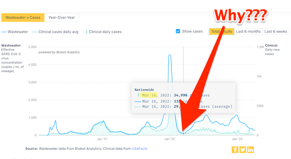
Before March 2022, clinical case counts (aggregated by USA data from CDC state- and local-level public health agencies) and virus concentration in wastewater track each other pretty closely, as one would expect[1]. On or about March 16, they diverge. Curious! This post is an attempt to give a plausible account of why they did. First, I will lay the Death Panel timeline against the Biobot chart for the critical period. After that, since I have the Biobot chart top of mind, I’ll do a crude visualization of “the area under the curve,” which will show that Biden’s current “high plateau” is just as deadly as Biden’s Omicron peak.
Figure 1: A Successful Propaganda Campaign
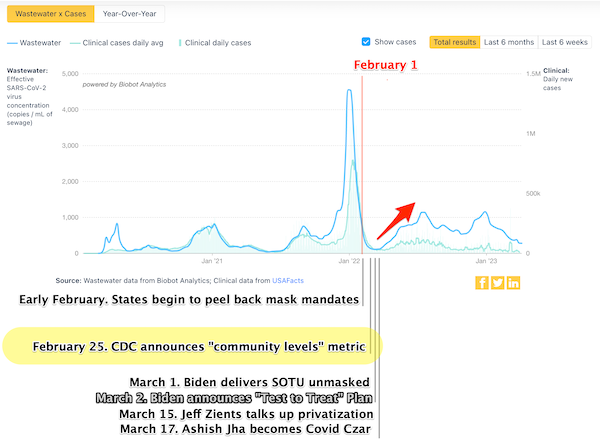
Legend: Black is dated Death Panel events; grey is from a useful DOD timeline.
If we ask ourselves “what changed” before March 16, CDC’s change from transmission (“Red Map”) to so-called “community levels” (“Green Map”) leaps to the eye:
Death Panel elaborates:
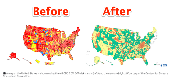
Until the CDC changed their masking guidance, their transmission map, which is the visualization of how prevalent covid spread is and where masks should be recommended, was bright red, with nearly every US county filled in at “High” transmission. This is still the case, in fact: you can still see the old map if you try—it’s just no longer used to set federal public health guidance.
Under the new guidelines, the map immediately turned a discomfiting [not at all] shade of pastel green. All of a sudden, masking wasn’t recommended by the CDC in 70% of the country.
Recall that almost no states even had a mask mandate by this point. Before the CDC made this change, those states had been universally going against CDC guidance. The CDC basically changed its guidelines to say, “Yeah, sure, ok.”
A more technical explanation of the Community Level system is this:
The CDC used to declare a county “High” covid risk—meaning masks should be worn there, appearing bright red on the map—if transmission was happening at a level of 100 cases per 100,000 people.
Under the new metric, covid cases themselves do not even count toward the guideline determination until there are twice that amount of cases—200 cases per 100,000 people.
In other words, under the new system you can have twice the rate of covid transmission that would previously have qualified as “High” risk level in the area where you live, and your area will still be counted as “Low.”….
One of our favorite analogies used to explain this system comes from our colleague Nate Holdren: if you replace “covid” with “drunk driving” in this system, then while the old system was like saying, “Hey friend, you’ve had a lot to drink. Let me call you a cab,” the new system is more akin to saying, “Hey friend, you’ve had a lot to drink. Let me Google how many open hospital beds there are in the area real quick before you go ahead and drive home.”
By this point, we know that [the Biden Administration was] looking for a way to communicate that people could relax on covid, while being eager to avoid a repeat of the previous year’s “declaration of independence from the virus.” So when they announced the change in metrics, it was described as a win.
We’ve all done a lot of whinging about CDC’s failures at scientific communication. But replacing the “Red Map” with the “Green Map” was a brilliant example of twisted genius.
Red = stop. Green = go. Everybody consults CDC’s Green Map. Reporters, school administrators, college Deans, public health officials, town councils, everyone. It’s ubiquitous, and comes from a trusted source. But not only does the soothing pastel of the Green Map communicate that masking is not necessary, it communicates that Covid is no longer serious. I believe that the Green Map is reponsible for a behavioral change after March 16, a change that drove the divergence. In order for clinical cases to be counted, a patient has to show up to be counted. But once the Green Map kicked in, people no longer showed up. They went to work, coughing. Or sent their kids to school, coughing. Or never tested after the superspreading wedding, or whatever. They powered through. They led their lives. So the clinical case count no longer reflected actual cases, at all. However, wastewater — for reasons I assume are obvious — did.
So Walensky, the CDC, the public health establishment, and every single shill or flack that bought into or propagated their bullshit has a lot to answer for.
Figure 2: Peals and Plateaus
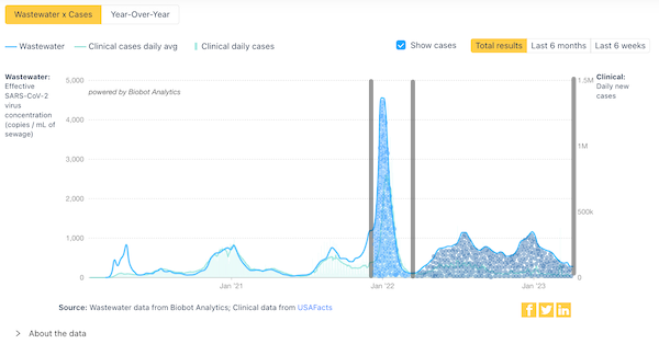
My crude method was to put dots under the peak and the plateau, and then count them (as if I filled up two oddly shaped containers with peanuts, and then weighed the peanuts). I begin the peak count near the “stair step” of December 8, after which Omicron went vertical; I remember tape-watching that transition quite vividly.
Peak: 180
Plateau: 237
QED. When we look at the counts “under the curve,” we see that indeed Biden slaughtered more people during the plateau than during the Omicron peak. Impressive, especially given that nobody noticed, at least that I’ve seen.
(Caveat: The shipping department would never let me pack anything, because I would start thinking of something else while I was counting and lose track. So 180 and 237 are spuriously accurate. However, I think the difference is large enough to allow me to draw the conclusion I have drawn.)
NOTES
[1] This is not true for the initial surge that peaked in April 2020, but I lay that to wastewater tracking not being up and running at that time.
Here are the pundits + the occasional goverment shill mentioned by name in the Death Panel series. (There are many links to publications where the author is not named, presumably becase they’re not sufficiently culpable).
JG Allen
Monica Gandhi
David Leonhardt
Rochelle Walensky
Dylan Scott
Ashish Jha
Ben Mazer
Anthony Fauci
Jen Psaki
Emily Oster
Bob Wachter
Jeff Zients
There are not very many of the Shing. No doubt the Hague Tribunal would find this list helpful as a starting point.


Thank you for your Herculean efforts keeping track of the ongoing Corona flu pandemic and the similarly Herculean efforts of the CDC and u.s. Elites to hide and lie about the situation. I am growing horrified contemplating what might happen were a truly dangerous virus, bacterium, or fungus to start another pandemic — not that I believe the Corona flu is that minor and with you I think the Corona flu leaves “Something Awful” for the future of many of those who were infected.
Excess mortality is another useful metric. So far, it doesn’t seem to have been compromised though no doubt the existing high level will be factored in at some point.
Here’s excess mortality and official covid counts for Oregon, binned by half year to even out the noisy data:
Oregon SARS-CoV-2 and excess mortality
Lambert, I applaud your resourceful low-tech method of estimating the areas under the curve. Another, even easier way to reach your conclusion is to turn the plateau segment on its side, vertically, and superimpose it on the peak segment. Or vice versa, rotate the peak segment a quarter-turn and place it along the bottom of the plateau. In either view it becomes visibly obvious that the plateau has larger area.
Yes, Lambert’s method is ingenious. Another way, if you have access to an accurate balance or kitchen/jeweller scales, is to print out the curve on paper, cut out the peaks with scissors, and weigh them.
That relies too much on dexterity and the quality of the scissors. Monte Carlo integration is similar to Lambert’s method and it is a decent approach.
One of my co-workers just got back from a vacation cruise.
“Sick as a dog and can’t talk now”. That was the first email today.
I said he was lucky that they let sick people off ships now. I’m sure he was the only one. (sarcasm off)
I didn’t say: Not so lucky for everybody he encountered on his journey home.
Looking at Fig. 2, it seems the divergence occurs in fall 2021, then the curves match again as the sharply falling wastewater numbers coincide with the lagging fall of the cases. I believe this coincides with the expiration of the federal funds for free testing.
I concur. The unavailability of free testing meant people who couldn’t afford $125 a pop tests disappeared from the data. This was the 1st act of govt malfeasance. I remember well the comparison – everybody lost their minds when Trump said,” … if we stop testing right now, we’d have very few cases … ” – but #Jo3yNordStre4m totally got a pass for executing exactly what Tump said. The worst was yet to come.
>>>(The whole series is worth a read, especially if you don’t put your fist through the screen, and the Death Panel podcast is great, and not really bleak at all.)
I already have borderline high blood pressure and there is that family history of aneurisms. Are you trying to get some more of us to that Great Vacation Spot in the sky?
;-)
Somedays, I feel like I have checked into the Hotel California without knowing so.
Well, when one metric is gutted, the public who wants to know moves on to other deemed to still be reliable. Thus, no metric must remain uncorrected, especially not those that are featured in popular widely-read blogs. Those whose job it is to correct “the Geiger counters” read the blogs too and then ensure that the metrics that are considered valid are valid in the right way. Right now in my view, there is not a single metric (including waste water) that still reflects the raw case counts. This is because a) the ‘proper’ authorities fixed them and b) evolution of the virus rendered the existing metrics unreliable (e.g., PCR tests are exquisitely sensitive to mutations and will be made obsolete by the viral RNA mutations, if not continuously updated). The best measure of disease spread right now is probably the amount of coughing in public and work setting and the level of labor absenteeism.
The reference to Geiger counters stems from the japan tsunami 2011 nuclear disaster and its aftermath, where a ban on Geiger counters in the general population seems to had been considered. It did not take place but claims have come about that the government Geiger counters and data on the radiation levels were not trustworthy. This led to production of alternative ‘grassroots’ Geiger counters, which supposedly showed true reading (e.g., Safecast Geiger counter), although as you know ‘revolutions are not televised’ and to what extent a grassroots Geiger counter advertised in general press is truly grassroot is open to debate…
Clearly not enough Americans are dying or becoming permanently disabled every day for the populace to either notice or care.
It’s a sick society.
Have to disagree with your first sentence. I don’t think that kind of “lesson” will ever take here and now. I do agree with your second sentence.
Sars Cov 2 appears to be a bacteriophage that can at least in theory replicate in fecal bacteria in sewers. https://pubmed.ncbi.nlm.nih.gov/34336189/ This would easily explain the decoupling of sewage and case numbers.
Apparent replication on media in vitro is a long, long way from most of the biomass being bacteriophages.