Yves here. This article, which demolishes the widely used economic models that did such a poor job of forecasting our current inflation, also describes how economists have tried fiddling with these models rather than make a major overhaul. Author Servass Storm also sets forth how ineffective Fed action has been so far. The money quote:
The steady rise in the policy interest rate—from 0.1% in 2022Q1 to 5% in 2023Q2—has cumulatively lowered the core PCE inflation rate by 0.68 percentage points in the second quarter of 2023. The drastic monetary tightening by the Fed has thus lowered U.S. inflation by only circa one -sixth.
Storm does point out that the impact of interest rate increases is lagged, so there will be additional slowing next year.
The discussion is somewhat technical but readable for those interested.
By Servaas Storm, Senior Lecturer of Economics, Delft University of Technology. Originally published at the Institute for New Economic Thinking website

Introduction
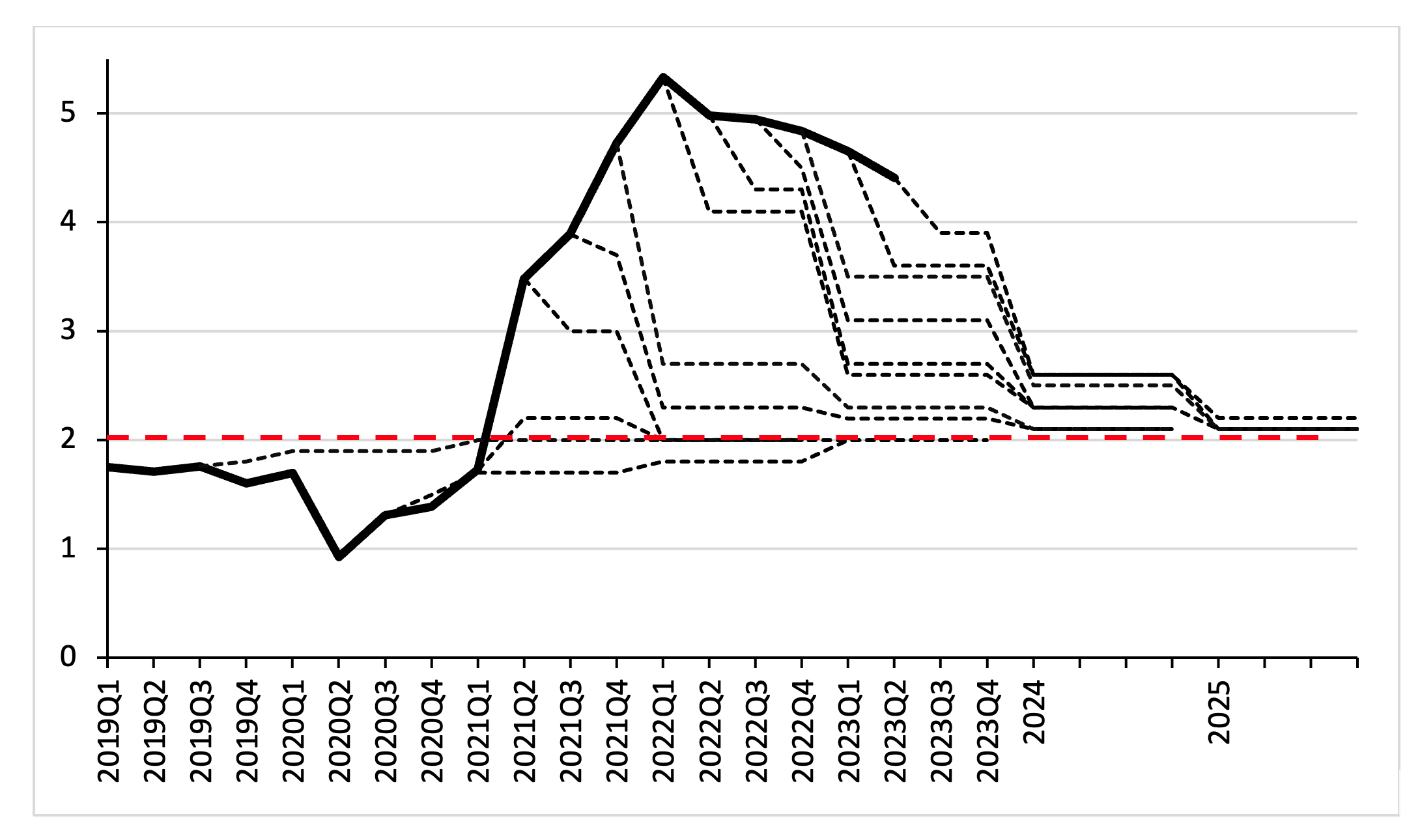
The recent increase in inflation took monetary policy makers by surprise, at least if we credit the Summary of Economic Projections (SEP) of the Federal Open Market Committee (FOMC) of the Federal Reserve (Figure 1). The FOMC did not anticipate the surge in the core PCE inflation that started in 2021 and it consistently projected the inflation rate to rapidly decline rapidly to its 2 percent target rate.
Instead, inflation continued to increase in the following quarters. The Federal Reserve, other central banks and most observers were wrong in believing that the inflation would be transitory in nature. Why were the members of the FOMC caught flat-footed and why did most professional forecasters have it wrong as well?
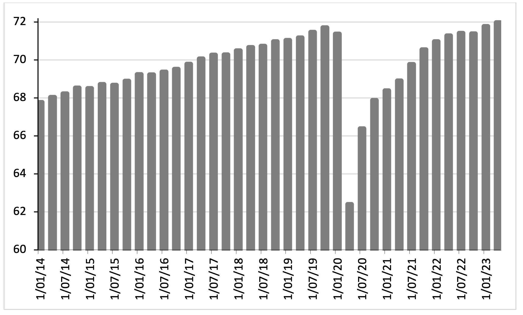
Figure 1: The U.S. core PCE inflation rate and the inflation forecast of the Summary of Economic Projections (SEP) (dashed lines) of the Federal Reserve up to and during the inflation surge (2019Q1-2023Q2; percentages)
The macroeconomic models currently used by major institutions including the Federal Reserve and the International Monetary Fund (IMF) failed to predict the inflation surge during 2021-2023 (Gopinath 2023). The failure to forecast the reemergence of high inflation rates is widely attributed to the empirical inadequacy of the Phillips curve—the much-debated relationship between inflation and some measure of economic activity—which is a relationship at the core of these macro models. A key criticism holds that the conventional measures of economic activity (such as the output gap or the unemployment gap) failed to signal that the economy was overheating and labor markets were becoming extremely tight. As a result, central bankers underestimated the inflationary pressure in the economy.
Another criticism holds that most estimates of the slopes of the Phillips curve are too low, which led establishment macroeconomic models to predict only a modest inflationary impact of a declining unemployment gap. Finally, conventional macroeconomic wisdom holds that a persistent increase in inflation can only occur when inflation expectations become unanchored. However, standard indicators of long-run inflation expectations did not rise in 2021-2022 and, therefore, the Federal Reserve and other central banks decided to go slow, as it could reasonably be argued that the surge in inflation would be only transitory. This proved to be incorrect as well.
The re-emergence of inflation thus threw the ‘science of monetary policy’ off the rails. Paraphrasing John Kenneth Galbraith, it is clear that faced with the choice between changing their paradigm and proving that there is no need to do so, the ‘scientists of monetary policy’ got busy on the proof. As a result, a number of ad-hoc epicycles have been added to the New Keynesian analytical core—in order to explain the sudden acceleration of inflation post-factum. In a new INET Working Paper, I look at how New Keynesian practitioners of the self-proclaimed ‘science of monetary policy’ (Clarida, Jordi, and Gertler 1999) have struggled to maintain their paradigm following the failure to foresee the surge in U.S. (consumer price) inflation during 2021-2023. The struggle to maintain a (failing) paradigm mostly consists of tweaking and twisting concepts, measurements, and analysis—adding epicycles to epicycles to (already fundamentally flawed) macro models. The Working Paper critically reviews the theoretical and empirical merits of three recent tweaks to the New Keynesian core: using the vacancy ratio as the appropriate measure of real economic activity; hammering on the considerable risk of an imminent wage-price spiral; and the resurrection of the non-linear Phillips curve.[1]
The Output Gap and the Unemployment Gap Failed to Signal the Surge in Inflation
New Keynesian macroeconomists propose a core set of ‘scientific’ principles that are needed to design and implement good, even ‘optimal’, monetary policy (Woodford 2010). These principles, intended to help central bankers determine whether the economy is overheating or underperforming, are held to be “reasonably general in applicability” (Clarida, Jordi, and Gertler 1999) and strong enough to guide the real-world decision-making by central bankers (Mishkin 2007; Walsh 2001; Wieland 2010; Woodford 2001). In this sense, there is a ‘science of monetary policy’, as Clarida, Jordi and Gertler (1999) write. But how useful is ‘this science of the economist’? The recent surge in inflation in the U.S. economy (2021-2023) provides a relevant testing ground to answer this particular question.
Let us consider the first principle of the self-proclaimed ‘science of monetary policy’ which holds that monetary policymakers should focus on the output gap, or alternatively, on the unemployment gap. Unfortunately for the ‘scientists of monetary policy’, their indicators of real economic activity failed to signal the sudden re-emergence of U.S. inflation. The output gap in the U.S. was negative throughout the period 2021Q1-2023Q2 according to official C.B.O. estimates (except briefly during the fourth quarter of 2021), even if the core inflation rate was sharply rising. This particular alarm bell did not go off and did not indicate an excess of aggregate demand.[2] Similarly, positive and moderately negative unemployment gaps failed to signal the sharp increases in core inflation. Estimates by Federal Reserve economists Jordà, Liu, Nechio, and Rivera-Reyes (2022) show that the contribution of the unemployment gap to U.S. inflation during 2020-2022 was statistically negligible.
According to the second principle of the ‘science of monetary policy’, the Federal Reserve should follow a non-discretionary monetary policy rule, based on either the output gap or the unemployment gap (Woodford 2010). However, the estimated policy interest rates based on the Taylor rule during 2021Q1-2023Q2 turn out to be much higher than the actual interest rate set by the Federal Reserve. According to the ‘science of monetary policy’, monetary tightening should have proceeded earlier and much more aggressively than it actually did. Frequent calls for far more aggressive monetary tightening by economic experts, all standing on the sidelines, echoed the stiff monetary tightening implied by the Taylor rule.
The recommended monetary tightening constituted an overkill. The U.S. inflation rate has peaked and is declining. The term structure of U.S. interest rates became inverted around December 2022 and has remained inverted ever since. The inverted yield curve signals that bond investors expect inflation (and interest rates) to go down, in response to the actualmonetary tightening by the Fed that has been implemented. We must count ourselves lucky that the Federal Reserve (wisely) decided to take a more gradualist approach than the aggressive monetary tightening recommended based on the monetary policy rule.
Inflation Expectations Were Not Accurate as Well
The third principle of the ‘science of monetary policy’ holds that central bankers must be forward-looking. This is key, not just because monetary policy affects the economy with a considerable time-lag of several quarters, but also because current inflation is argued to be significantly influenced by expected inflation. An increase in expected inflation is, in this view, a serious warning that current inflation is going to increase. However, inflation expectations did not significantly increase during 2021-2023, and hence, both central bankers and market participants accordingly thought that the 2021-2022 surge was just a temporary blip. Inflation expectations turned out to be inaccurate and provided no timely signal for monetary tightening.
The failure of inflation expectations to provide an early warning of the re-emergence of inflation is not that surprising, however. Available econometric evidence shows that future inflation expectations depend in large part simply on current and lagged inflation (Fair 2021, 2022; Rudd 2022). This macro-statistical evidence of backward-looking expectations is consistent with (micro-level) survey evidence showing that the strongest predictor of households’ and firms’ inflation forecasts are what they believe inflation has been in the recent past—which are not always accurate beliefs (Weber et al. 2022; Candia, Coibion and Gorodnichenko 2022). Survey evidence further shows that households, firms, economic experts and professional forecasters disagree considerably in their views on expected inflation (Weber et al. 2022; Ahn and Fulton 2020). “It seems clear that firms’ inflation expectations are not rational, nor even very sophisticated,” writes Fair (2021, p. 119). Federal Reserve economist Jeremy Rudd (2021) concludes that the direct evidence for an ‘expected-inflation channel’ is not just weak, but very weak.
The claim that an increase in expected inflation raises current inflation is also wrong. Higher expected inflation can only raise current inflation if firms and workers have the means to raise prices and nominal wages in anticipation of higher prices in the future. While businesses may have the market power to elevate prices (and profit margins), it is unrealistic to assume that American workers possess the bargaining power to bring about an increase in their nominal wages in anticipation of higher prices in future (Stansbury and Summers 2020; Storm 2021; Ferguson and Storm 2023).
How Effective Has the Monetary Tightening Been in Reducing U.S. inflation?
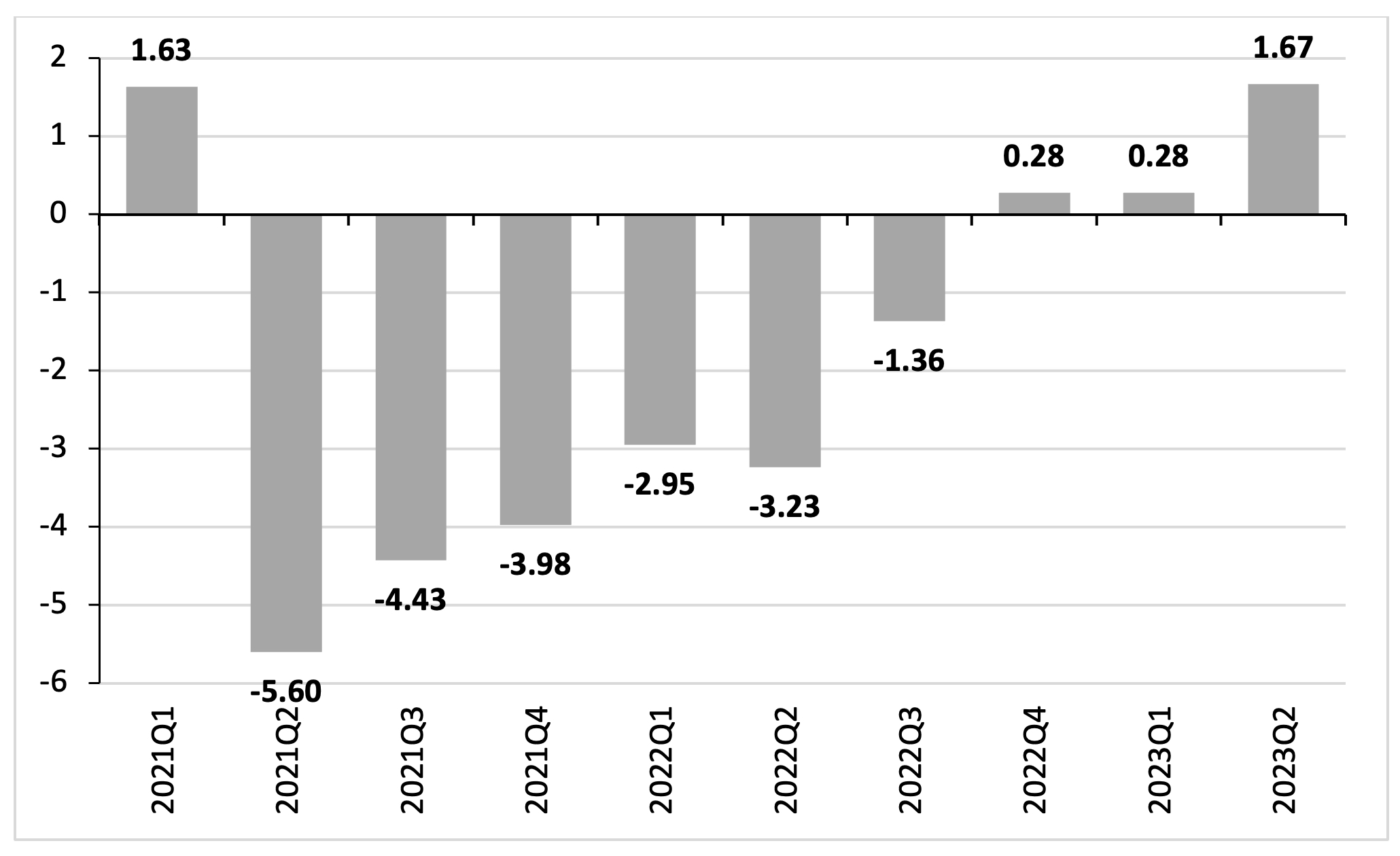
Before we proceed, it is important to get a sense of how effective the monetary tightening by the Federal Reserve has been in lowering U.S. inflation. To get a sense, I calculated the predicted decrease in the core PCE inflation rate, using Fair’s (2022) quarterly forecasts of an increase in the policy interest rate by 1 percentage point for the period 2022Q1-2023Q4. The cumulative impact of monetary tightening on the U.S. inflation rate appears in Figure 2. The steady rise in the policy interest rate—from 0.1% in 2022Q1 to 5% in 2023Q2—has cumulatively lowered the core PCE inflation rate by 0.68 percentage points in the second quarter of 2023. The drastic monetary tightening by the Fed has thus lowered U.S. inflation by only circa one -sixth.
Figure 2: Estimated impact of monetary tightening on the PCE inflation rate: the U.S. economy (2021Q4-2023Q2; percentages)
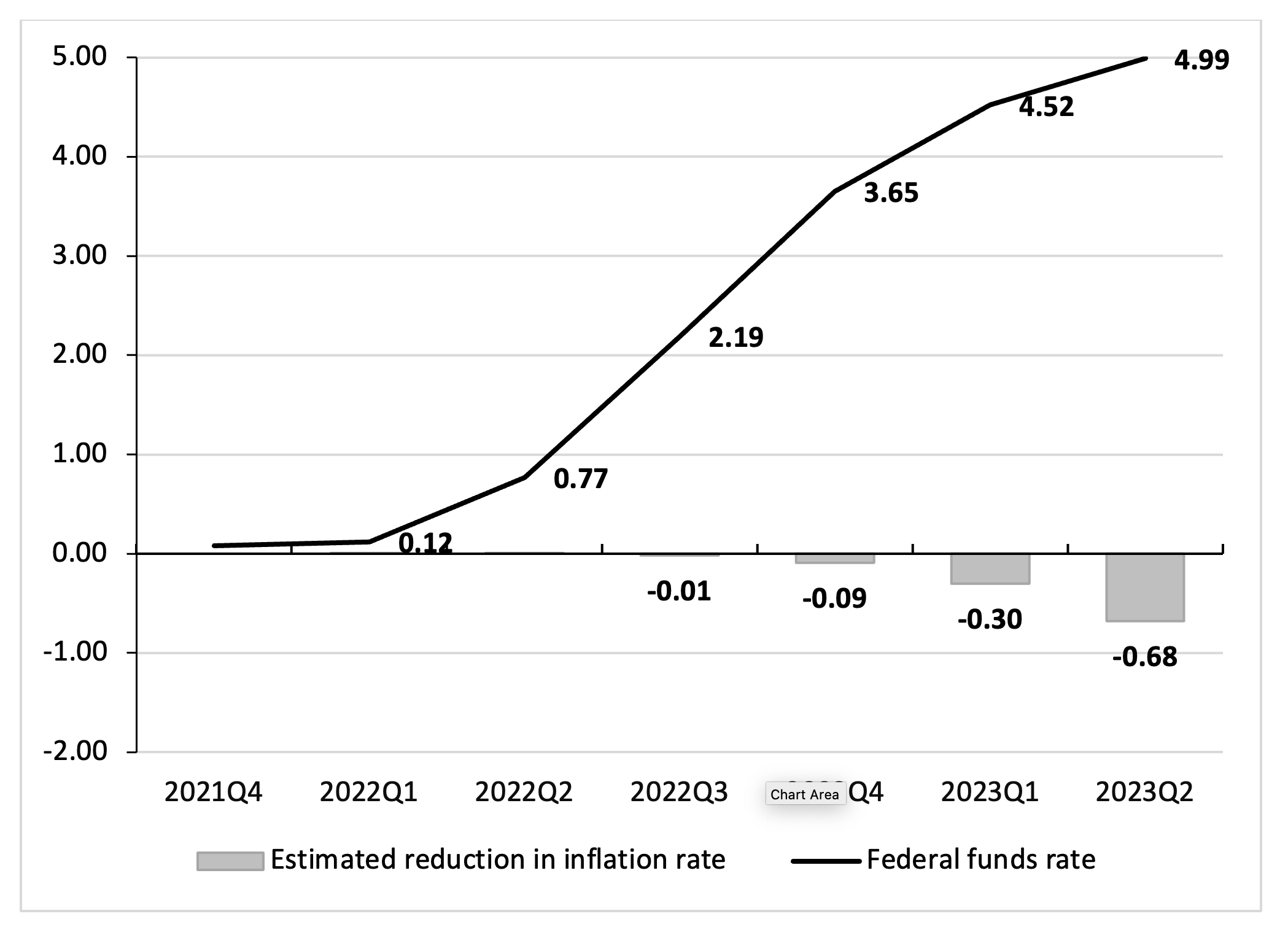
Going by Fair’s (2021) estimates, the biggest impacts on inflation of the monetary tightened that has already happened, will occur during 2024, assuming no further rate hikes after 2023Q2, because of the lags involved. The U.S. inflation rate will then be lowered by around two percentage points by the monetary tightening during 2022Q2-2023Q2. This suggests that, by mid-2023, the Federal Reserve has already raised interest rates by enough. This conclusion is confirmed by the inverted term structure of interest rates: since December 2022, the interest rates on longer-term Treasury securities (with maturities of more than 2 years) have been lower than the yields on short-term T-Bills (with maturities of 1 year or less). If correct, the far more hawkish Taylor-rule based interest rate paths, consistent with the ‘science of monetary policy’, represent clear cases of a monetary-policy ‘overshoot’.
Adding Epicycles—or Ways to Blame Workers for the Inflation They Did Not Cause …
The output gap, the unemployment gap, the New Keynesian Phillips curve, and inflation expectations did not give timely and relevant signals. The re-emergence of inflation thus threw the ‘science of monetary policy’ off the rails. In response, the ‘scientists of monetary policy’ got busy on constructing evidence, and novel ‘stories’, confirming their prior belief, namely that the surge in inflation must have been due to a sudden tightening of U.S. labor markets, leading to higher wages and threatening a reemergence of a wage-price spiral, reminiscent of the wage-price spiral of the 1970s. With remarkable ease and speed, core analytical concepts (including the NAIRU and the unemployment gap) that were earlier argued to be central to their approach, were thrown overboard—in favor of alternative measures and arguments.
The vacancy ratio is the first rabbit that was pulled out of the New Keynesian hat. The vacancy ratio for the U.S. is historically very high (as is shown in Figure 3)—and on the face of it, this does seem to suggest a very tight labor market. The vacancy ratio began to rise in the first quarter of 2021 and peaked at a value of 1.9 vacancies per unemployed person in the second quarter of 2022. The exceptionally high vacancy ratio thus constituted a much better match with the prior beliefs of the New Keynesian Thought-Collective than the unemployment gap, which (as we saw) did not change so strongly. Appealing to the vacancy ratio as a measure of labor market tightness also has some intellectual pedigree—after all, the Diamond-Mortenson-Pissarides model of job search in labor markets with frictions was awarded the Nobel Prize in economics in 2010. Thus, Barnichon and Shapiro (2022), Domash and Summers (2022a, 2022b), Benigno and Eggertsson (2023) and many others argue that the vacancy ratio is the best measure of economic slack with a strong track record on correctly forecasting wage and price inflation.
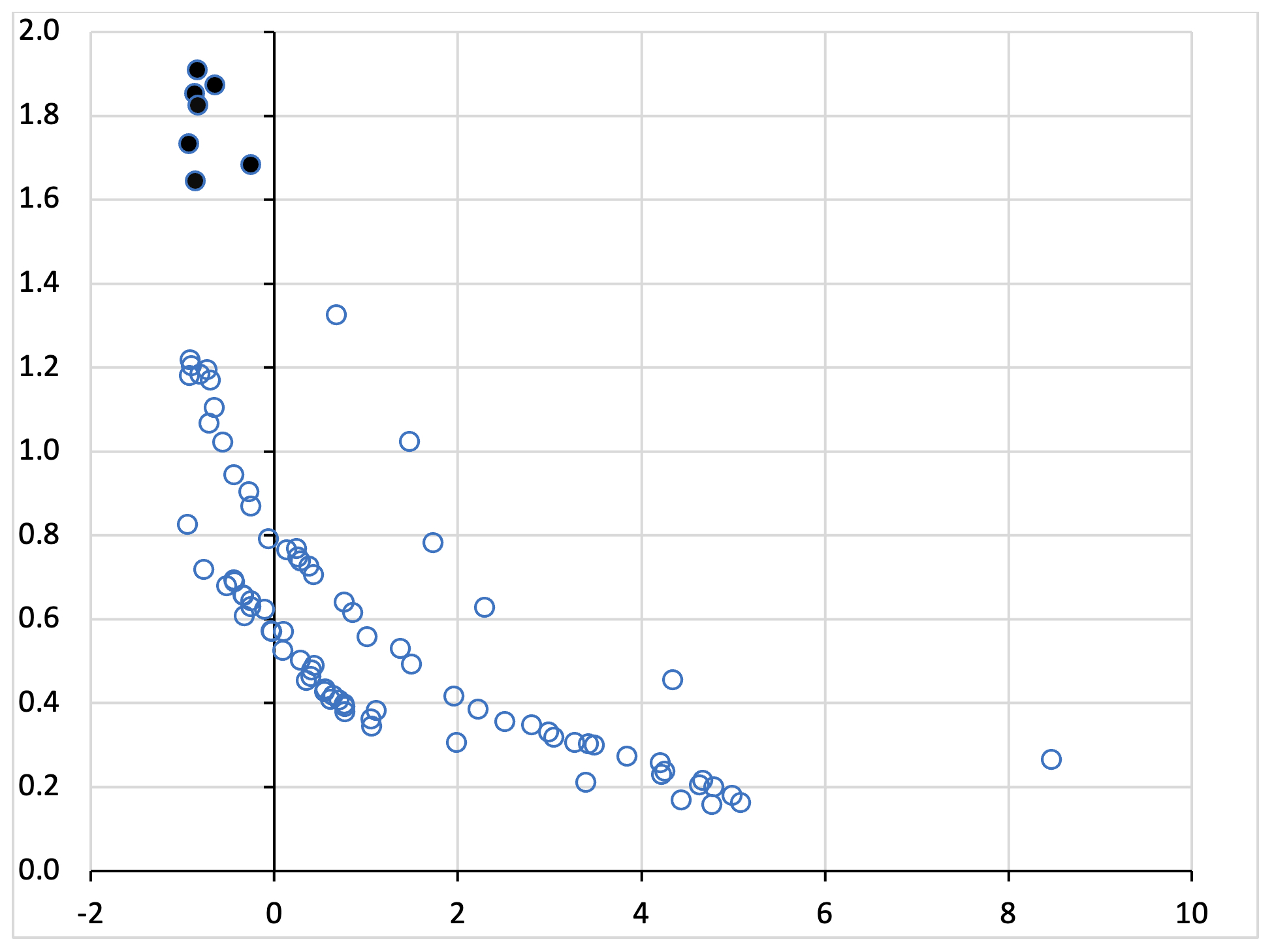
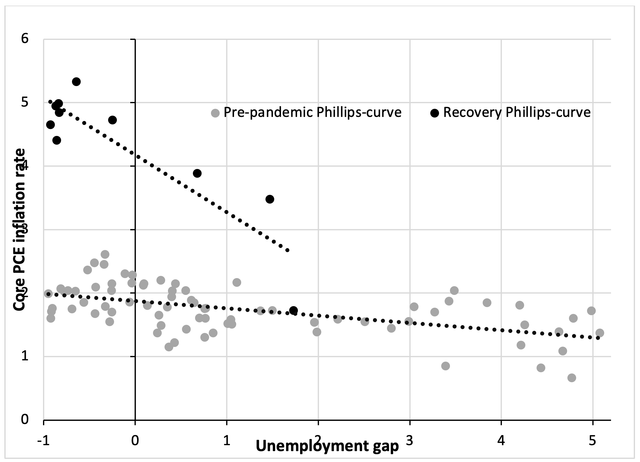
At first sight, using the vacancy ratio in place of the unemployment gap does appear to make sense. To illustrate, Figure 4 presents a scatterplot of the vacancy ratio (on the vertical axis) against the unemployment gap (on the horizontal axis), using data for the years 2001Q1-2023Q2. It is clear that there exists a strong negative (statistically significant) correlation between the unemployment gap and the vacancy ratio. Both indicators are giving similar signals on the labor market: a negative unemployment gap goes together with a higher vacancy ratio (and vice versa).
Figure 3: The vacancy ratio: the U.S. economy (2001Q1-2023Q2)
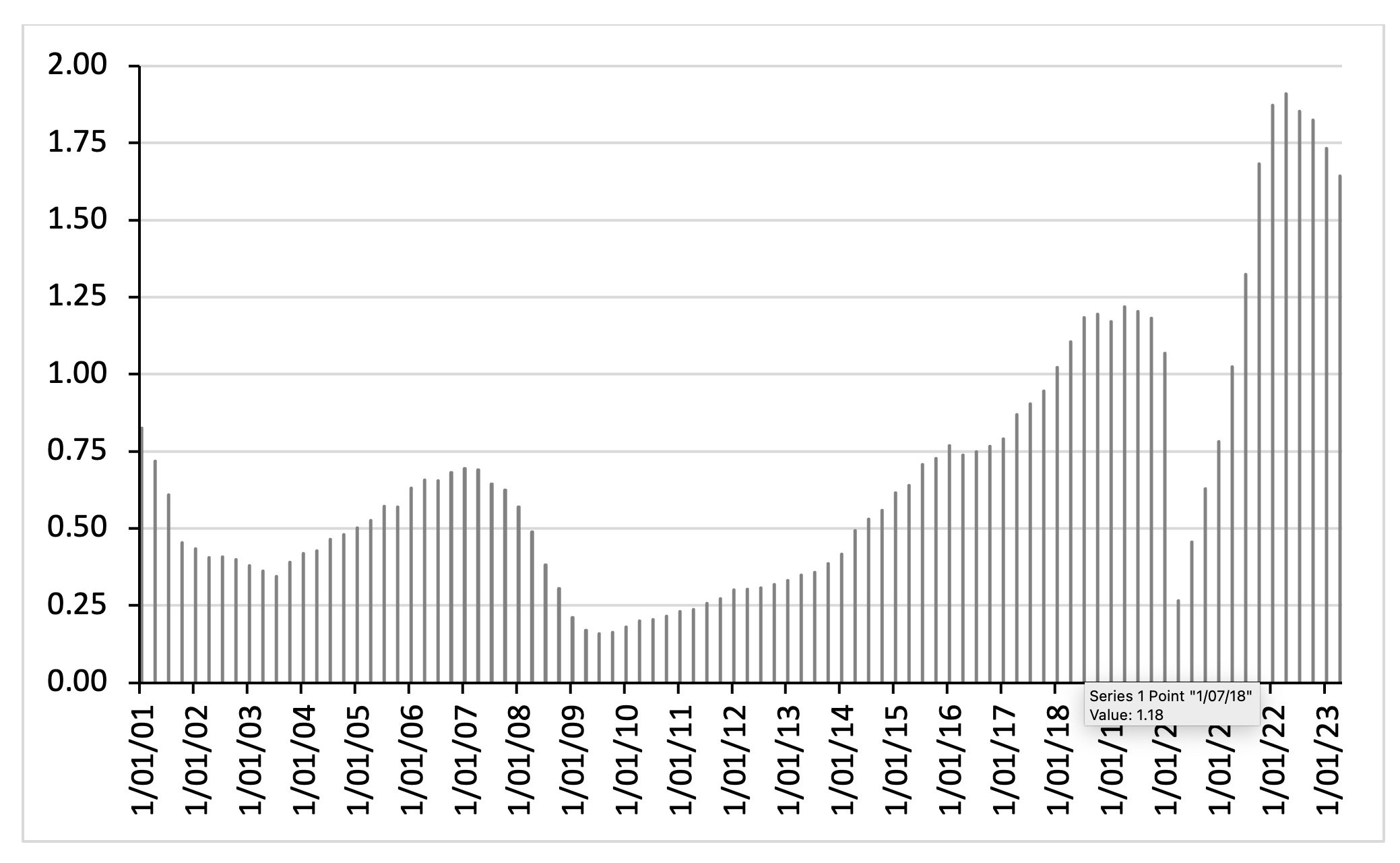
But it is also clear that the vacancy ratio began to rise rather sharply after 2021Q1, while the unemployment gap remained positive, turning negative only in the fourth quarter of 2021. Note that the long-run mean value of the vacancy ratio during 2001Q1-2021Q2 is 0.57 with a standard deviation of 0.29. If we assume a normal distribution, then the 95% confidence interval for the mean vacancy ratio is equal to < 0; 1.14 > and the 99.7% confidence interval would be < 0; 1.43 >. The very high values of the vacancy ratio recorded during 2021Q4-2023Q2 lie outside the 99.7% confidence interval and must be considered outliers. This is illustrated in Figure 4, where the seven outlier observations are indicated by black dots. The fact that the vacancy ratio ‘behaves’ out of sync with the unemployment gap during 2021Q4-2023Q2 and is also far outside its historical boundaries, should have set off alarm bells: why is the vacancy ratio changing in this way?
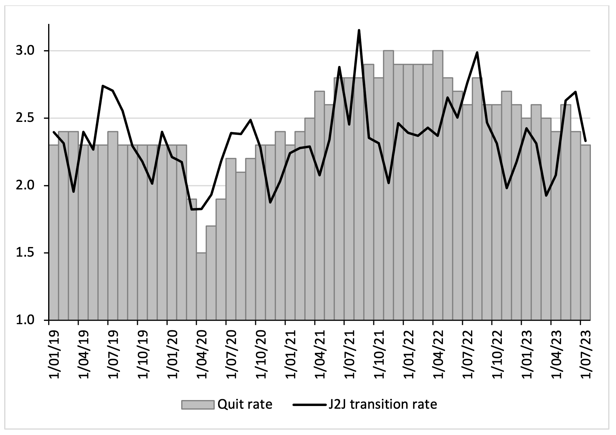
The point is that the U.S. vacancy ratio rose (so strongly), not because the economy was overheating (after all, the unemployment gap remains negative) or because the labor market was extremely tight. The vacancy ratio rose (so strongly) because of the massive occupational restructuring that resulted from the COVID-19 crisis, the lockdowns, the shutdown of the leisure and hospitality industry, the drastic changes in health risks associated with particular (in-person, close-contact) occupations, and the growth of the tech industries, warehousing, and online services and delivery (Ferguson and Storm 2023). In other words, the U.S. economy went through a post-pandemic surge in quits and job transitions (Birinci and Amburgey 2022) that is visible in the rise in the total non-farm quit rate, appearing in Figure 5.
Figure 4: The unemployment gap versus the vacancy ratio: the U.S. economy (2001Q1-2023Q2)
The aggregate quit rate rose from circa 2.3% of employed workers before 2020 to around 3% during 2021Q4-2022Q2 and the quit rate remained elevated until June 2023. The number of American workers quitting their job rose from around 3.1 million per quarter during 2014Q1-2020Q1 to 4.1 million per quarter during 2021Q1-2023Q2. Many explanations have been offered for this ‘Great Resignation’, such as workers reevaluating their jobs in the face of new (hitherto non-explicit) health risks, a wave of early retirements (also triggered because of COVID-19), a lack of (affordable) child care and workers changing jobs in a rapidly restructuring economy, i.e., the rise of online work and the expansion of delivery jobs (Ferguson and Storm 2023). The ‘Great Resignation’ is in actual fact better called a ‘Great Occupational Restructuring’ (see Birinci and Amburgey 2022).
Importantly, most workers were quitting their jobs to move to new—better and less hazardous—jobs. This is illustrated by the increase in the job-to-job (J2J) transition rate in Figure 5. For most of the period 2021-2023, the quit rate was close to the J2J transition rate, which indicates that most employees quitting their jobs were switching to other jobs. The elevated quit rate and the higher J2J transition rates did, of course, raise the vacancy ratio—which therefore does not signal a tight labor market, but rather a dynamic restructuring of the economy’s occupational structure, triggered by the shake-up of the U.S. economy following the COVID-19 public health crisis.
Figure 5: Total non-farm quit rate and job-to-job (J2J) transition rate: the U.S. economy (2019Q1-2023Q3)
Crucially, to the extent that employed workers are competing for the available set of job vacancies, the labor market may be considerably less tight than what is implied by the V/U ratio. Following the example of Fed economists Andolfatto and Birinci (2022), I therefore plot an adjusted measure of labor market tightness, V/(U3 + E*J2J) in Figure 6. This adjusted measure includes a different calculation for the number of ‘available workers’, U3 + E*J2J, in which E measures the number of employed workers and J2J measures the job-to-job transition rate in a given month.
The adjusted vacancy ratio is considerably lower than the conventional vacancy ratio, although it is still elevated compared with its historical average. However, what is remarkable about this adjustment is the fact that the gap between the conventional vacancy ratio and the adjusted one noticeably increases during 2020Q3 and 2022Q3. This shows that J2J movements became more frequent following the recovery of the labor market from the COVID recession—and by counting these movements in the numerator, but not the denominator, of the U/V ratio, the conventional vacancy ratio is found to exaggerate the degree of tightness of the U.S. labor market.
Figure 6: Measuring labor market tightness in the U.S. economy (2017Q1-2023Q3)
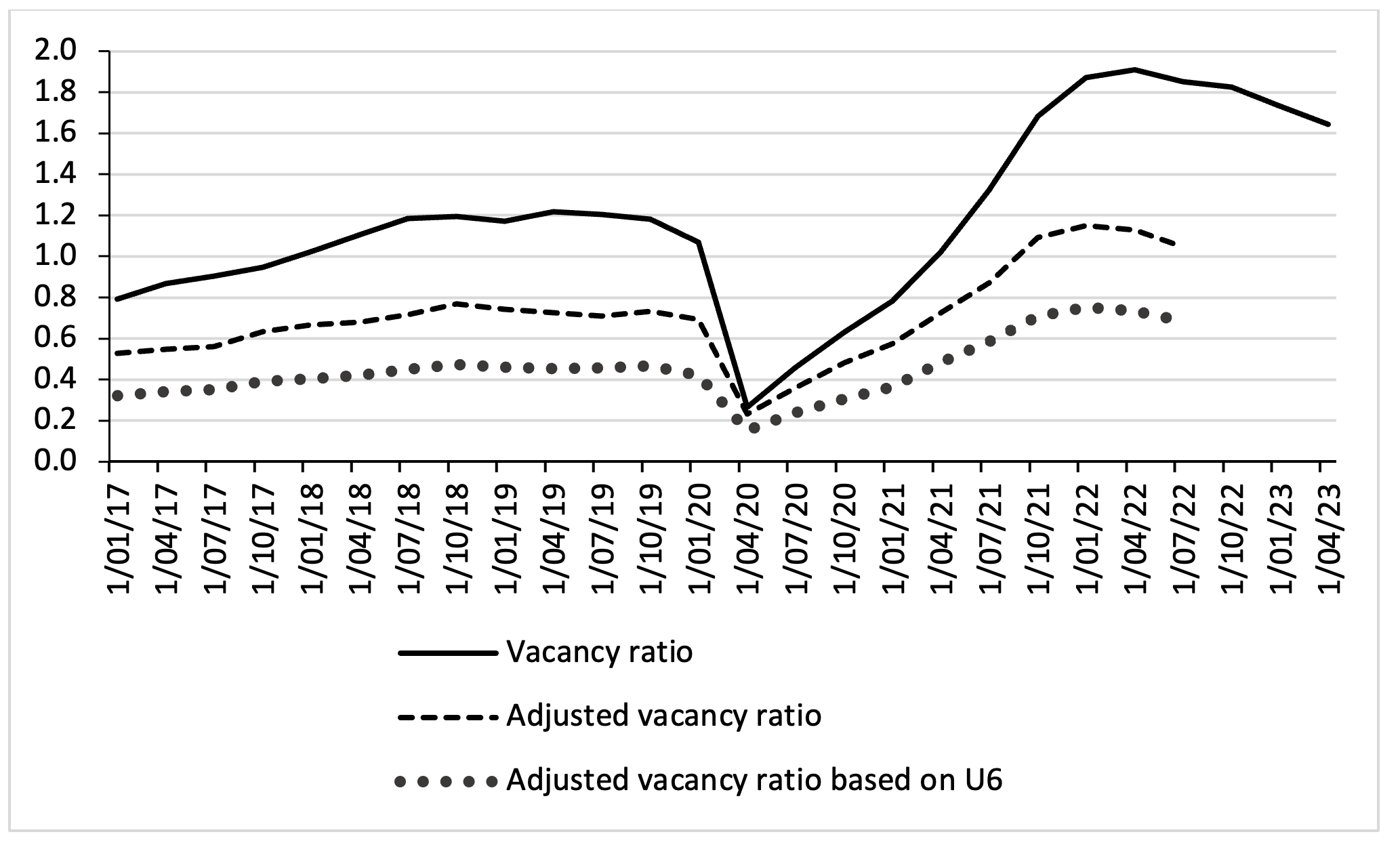
However, even this adjusted vacancy ratio still exaggerates the ‘tightness’ of the U.S. labor market, because it counts, in its denominator, only those unemployed workers who have been actively looking for work and excludes all discouraged workers and workers who are marginally attached to the labor force. However, as usual, as the economy recovers, large numbers of discouraged workers have re-entered the labor force—in fact, the number of discouraged workers declined from 17.6 million in the first quarter of 2021 to 10.5 million in the fourth quarter of 2022, which means that more than 7 million people re-entered the labor force. Therefore, I next plot a second alternative vacancy ratio calculated using the broad definition of unemployment (U6, which includes discouraged workers) as well as the J2J transitions in each month. As Figure 6 shows, the “adjusted vacancy ratio based on U6” is considerably lower than the conventional vacancy ratio and diverges from this conventional measure during 2021-2023. Both adjusted measures suggest that the U.S. labor market is not as tight as the conventional measure indicates.
Both adjusted measures of the vacancy ratio do show some tightening and, hence, could still be associated with higher nominal wage growth. This is especially likely because many job switchers were moving to better-paying jobs. The job-switcher “wage growth premium”—the difference in median nominal wage growth between job switchers and job stayers—did increase in 2021-2022, but in recent months, the premium has declined again, which indicates a gradual post-pandemic normalization of the U.S. labor market (during 2023). However, even if job switchers managed to move from jobs with lower nominal wage growth to jobs with (somewhat) higher nominal wage growth, America’s workers were—on average—unable to protect their real wages as the inflation rate began to increase. Nominal wages have not kept up with the increase in the (CPI) inflation rate, as is shown in Figure 7. Right when the U.S. inflation rate begins to increase, i.e., in the second quarter of 2021, real wage growth turns negative—and real wage growth remains negative for the next five quarters. Nominal wage growth only catches up with the inflation rate in the fourth quarter of 2022, but—as can be seen—real wage growth remained very low during 2022Q4-2023Q1.
Figure 7: Growth rate of median usual weekly real earnings of (fully-employed) wage and salary workers in the U.S. (2021Q1-2023Q2; percentages)
In addition, the labor income share of all workers in U.S. GDP has steadily declined during the 30-months period of 2020Q1 and 2023Q2. Recent household data published by the U.S. Census Bureau (2023) show that real median household income was 2.3% lower in 2022 than in 2021. The real median earnings of all workers (including part-time and full-time workers) decreased by 2.2% between 2021 and 2022, while median earnings of those who worked full-time, year-round decreased 1.3%. Declining real wages and a falling labor income share are not exactly signals of an “extremely tight” labor market—and appear to be inconsistent with the very high conventional vacancy ratio.
Other indicators of labor market strength also show that the American labor market is not tight. Consider Figure 8, which presents data on the stagnating average number of hours worked per week by American employees. In fact, the average number of hours worked fell during 2022 and 2023, compared to 2021—which is strange when there is supposed to be an excess demand for labor. As Martin Sandbu (2023) writes in The Financial Times:
“why, at a time of supposedly excessive demand for labor, are people working fewer hours than they used to? Or from the point of view of companies, why are they not “sweating the intensive margin” — jargon for making existing employees work longer hours? And why have average hours been falling just when employers are being forced to raise wages — so we are told as an explanation of inflation — to get enough workers to meet the demand they face?”
A final obvious measure of labor market strength is the employment rate (of all persons aged 15-64 years). In the U.S., the employment rate has languished below or at pre-pandemic levels (Figure 9), which—again—suggests that the labor market is not ‘tight’.
Figure 8: Average Weekly Hours of All Employees, Total Private (January 2021 – August 2023; monthly index January 2020 = 100; seasonally adjusted)
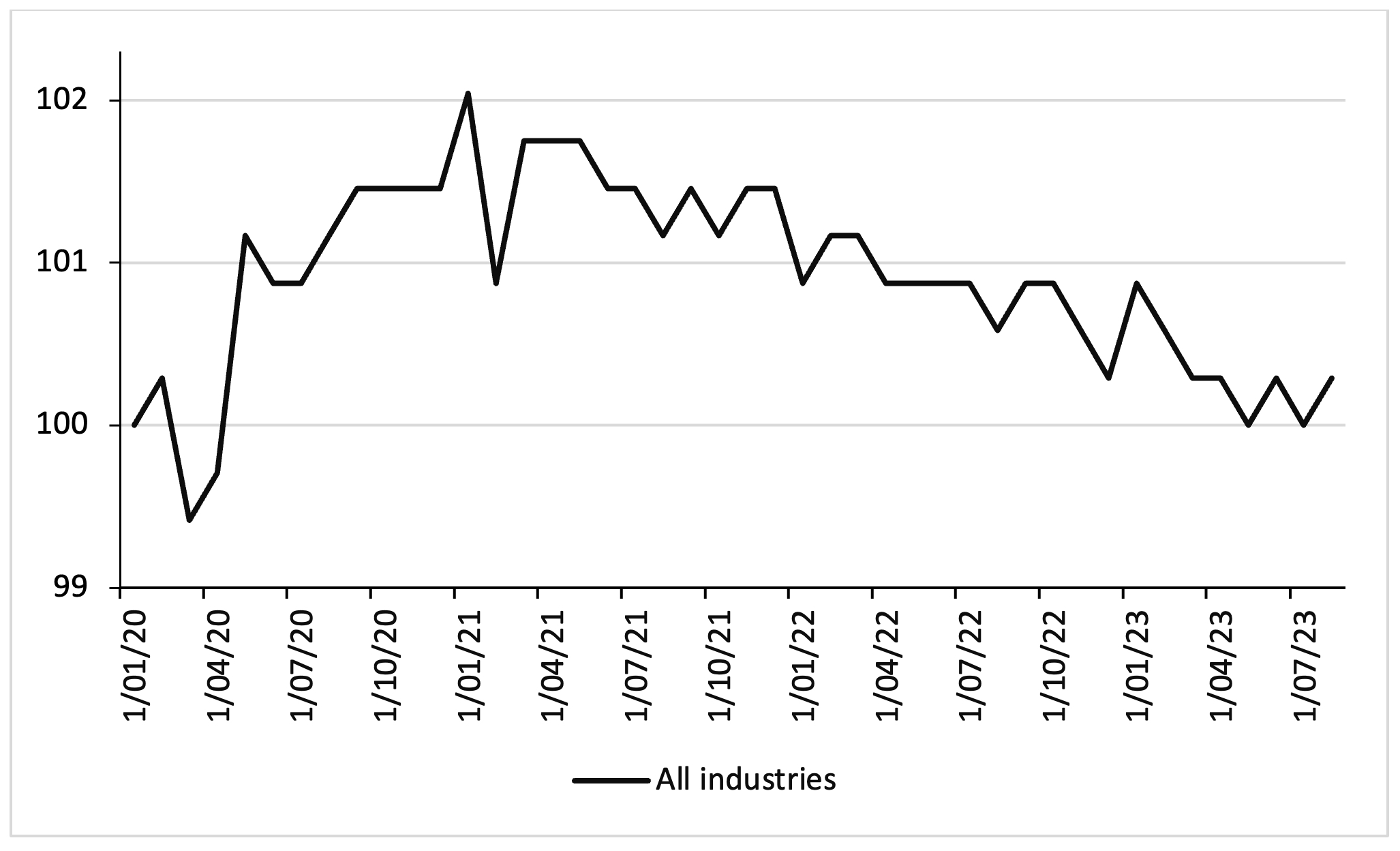
Figure 9: U.S. Employment Rate: Aged 15-64: All Persons (2020Q1 – 2023Q2; percent; seasonally adjusted)
It is reasonable to conclude that the signal given by the sharp rise in the conventional vacancy ratio (V/U) in Figure 3, which was found to be out of sync with the unemployment gap, is caused by the drastic occupational and sectoral restructuring that occurred during the COVID-19 crisis, and does not reflect a general tightness of the U.S. labor market. Uncritical use of the vacancy ratio as an indicator of the tightness of the labor market is bad scientific practice. It amounts to cherry-picking an indicator that is ‘biased’ to showing an exaggerated tightness of the labor market, setting monetary policymakers up to deliver significantly more monetary tightening than can be justified on the basis of alternative and arguably more reliable indicators (Mui 2022).
Professor Phillips to the Rescue: Invoking a non-linear Phillips curve
Another epicycle that has been added to give the ‘science of monetary policy’ a semblance of real-world relevance, is the argument that the good-old Phillips curve, which had ‘flattened’ in previous decades and was already proclaimed ‘dead’ by some, has suddenly and vigorously returned to life, becoming much steeper than before during 2021Q1-2023Q2.
This is illustrated in Figure 10: the slope of the pre-pandemic Phillips curve for the U.S. is much smaller (in absolute terms) than the slope of the Phillips curve during the recovery period. Based on simple linear OLS regressions, the pre-pandemic Phillips curve has a slope coefficient of -0.11 compared to a slope coefficient of -0.87 for the recovery-period Phillips curve. The pre-pandemic slope coefficient implies that the unemployment rate must be raised by 9 percentage points in order to lower the core inflation rate by 1 percentage point. Such a high sacrifice ratio means that to “try effectively to wipe out hard-core inflation by squeezing the economy is possible, but disproportionately costly. It is burning down the house to roast the pig” (Robert M. Solow quoted in Rudd 2022b).
The recovery-period slope coefficient suggests a much lower sacrifice ratio: to bring the inflation rate down by 1 percentage point, the unemployment rate must be increased by only 1.14 percentage points. Hobijn, Miles, Royal and Zhang (2023), Crust, Lansing and Petrosky-Nadeau (2023) and Benigno and Eggertsson (2023) present more sophisticated econometric evidence of the steepening Phillips curve and the lowering of the sacrifice ratio for the recovery period (2021Q1-2022Q2). Their estimates are important, because they provide a new lease of life to the New Keynesian approach and also constitute good news for central bankers, who no longer have to burn down the house to roast the pig.
Figure 10: Phillips curves for the United States: pre-pandemic and recovery periods (2001Q1-2019Q4 versus 2021Q1-2023Q2)
Based on these empirical results, the Phillips curve has been argued to have become non-linear which becomes very steep at more negative magnitudes of the unemployment gap (Crust et al. 2023). This can be seen in Figure 10 when one visually combines the two linear curves into one downward-sloping curve (which would run convex to the origin). Figure 11 presents an even more powerful illustration of the non-linear Phillips curve—one in which the unemployment gap (or output gap) is replaced by the (conventional) vacancy ratio. According to Benigno and Eggertsson (2023), this figure is worth more than a thousand words, because it so strongly suggests that the relationship between inflation and labour market strength is more or less flat up to the point where V/U ≤ 1, after which it becomes steeply upward-sloping when V/U > 1, i.e., when there is a labour shortage.
Figure 11: Sometimes a Figure is Worth More Than a Thousand Words—Also When It’s Wrong: Core PCE inflation versus the vacancy ratio (2001Q1-2023Q2; percentages)
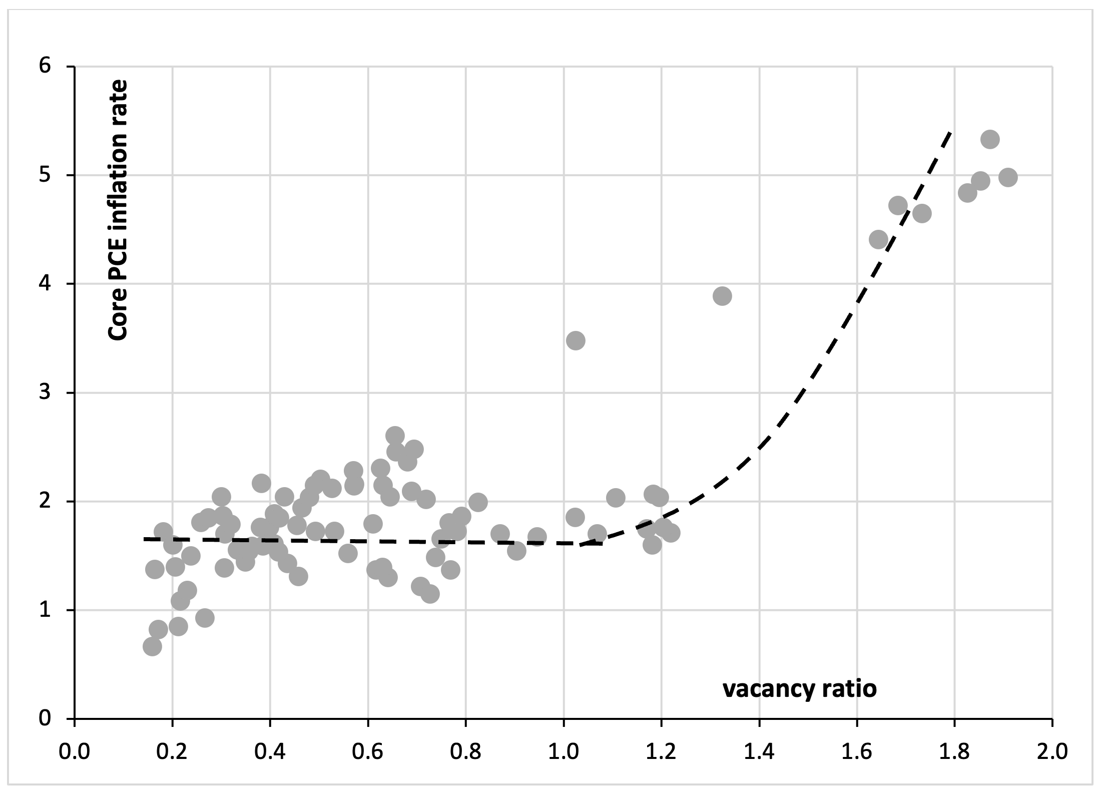
Benigno and Eggertsson (2023) build a New Keynesian DSGE model in which the labor market is modelled via search and matching. The key mechanism of the model is that nominal wages are “downwardly rigid” as long as V/U ≤ 1, but will rise rapidly when the labor market is tight (i.e., V/U > 1) and firms will outbid one another other for new hires. The simple (but incorrect) argument of Benigno and Eggertson (2023) then is that the Biden demand stimulus of 2021 was excessive[3] and pushed the vacancy ratio above the threshold value of 1. Central bankers and private forecasters were caught by surprise, because the vacancy ratio had remained below 1 for most of the time during 2001-2020, assuming that the Phillips curve would remain flat and thinking the impact on inflation would remain limited. Arguably only Lawrence Summers (2021) had it right, predicting that the economy would end up on the steeply upward-sloping segment of the Phillips curve of Figure 11.
How persuasive is the claim that the Phillips curve suddenly became non-linear? A first obvious problem is that the hypothesis of a non-linear Phillips curve is based on just 10 (quarterly) data points. Hence, Hobijn et al. (2023) are careful, writing that “it is still too early to determine whether this steepening of the Phillips curve is temporary or persistent.” A second problem is that the conventional vacancy ratio is a biased and unreliable indicator of labor market strength—and is grossly overstating the post-pandemic tightness of the labor market (as argued above). As we saw above, the sharp rise in the conventional vacancy ratio is largely due to the drastic occupational and sectoral restructuring that occurred during the COVID-19 crisis, and does not reflect a general tightness of the U.S. labor market. For this reason, Figure 11 is misleading: it is suggesting a causal relationship where there is none.
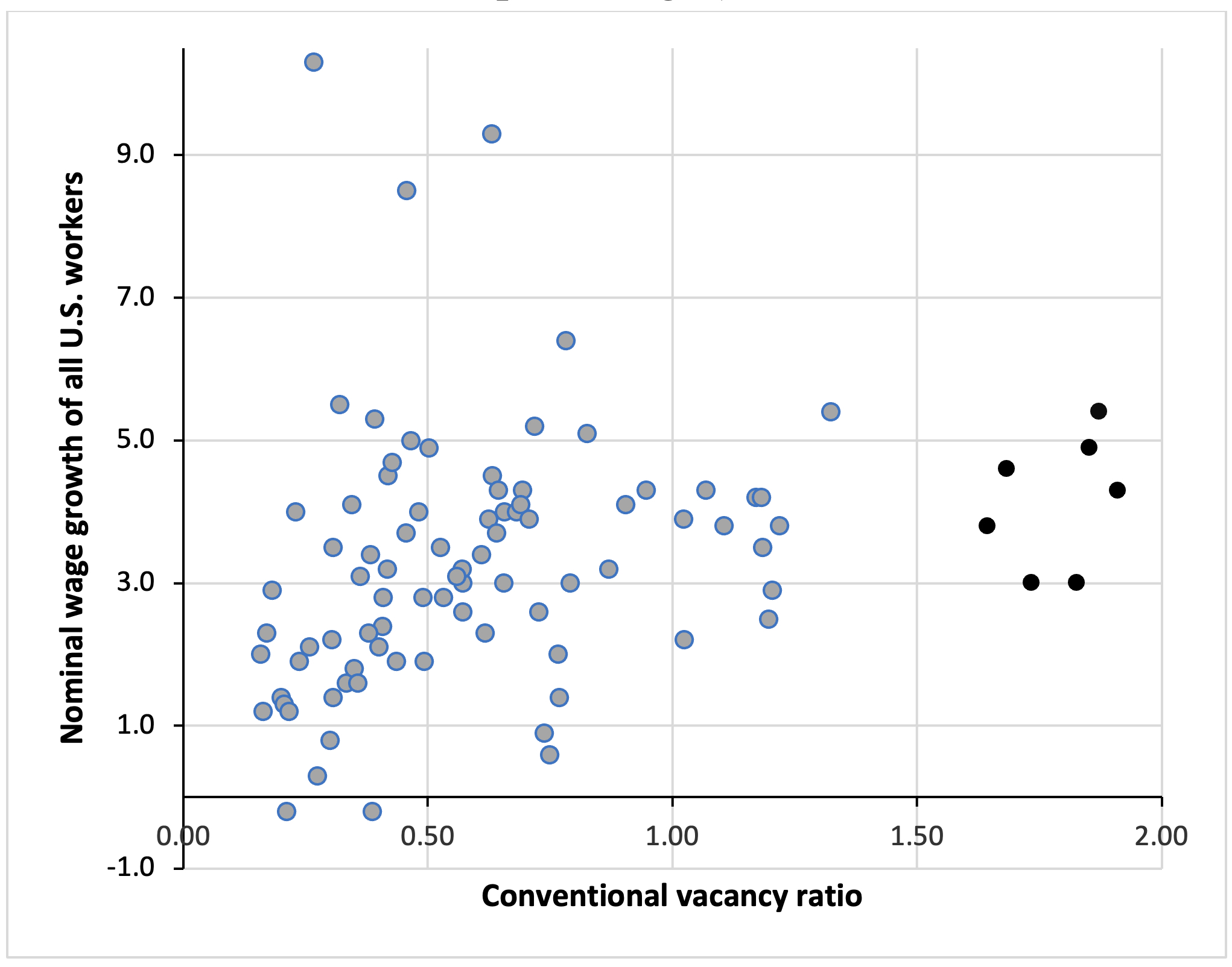
The empirical evidence is also not in favor of the explanation by Benigno and Eggertson (2023). True, Figure 11 is very suggestive of a Phillips curve that is non-linear in the conventional vacancy ratio, as high values for the vacancy ratio during 2021-2023 coincide with high rates of core PCE inflation during the same period. However, Figure 12shows that the coincidence is spurious: the high values for the vacancy ratio do not coincide with significantly higher growth rates for nominal wages. In other words, the ‘extremely’ tight American labor market is not generating extremely high rates of nominal wage growth and does not, therefore, ‘explain’ the recent acceleration in inflation. The reason is that the conventional vacancy ratio is significantly overstating the strength of the U.S. labor market, unlike alternative indicators discussed above.
There is a very good reason why the Phillips curve has become flat: decades of labor market deregulation have created what Alan Greenspan called workers ‘traumatized’ by job insecurity and afraid or simply unable to press for wage increases (Storm and Naastepad 2012; Weil 2014; Storm 2017). Drastic labor market deregulation in favor of corporations was one of the key drivers of de-unionization, as the political support for and enforcement of labor laws weakened, pattern bargaining broke down and the number of right-to-work states in the U.S. increased. Workers’ ability to organize was reduced by a direct weakening of labor law, employment protection, and labor law enforcement, and by an increased corporate use of union avoidance tactics (Stansbury and Summers 2020).
Figure 12: Here is a Figure that is Worth More Than a Thousand Words: The Vacancy Ratio versus Nominal Wage Growth (2001Q1-2023Q2; percentages)
All the forces that traditionally counterbalanced firms’ monopsony power and boosted workers’ bargaining power have been weakened in recent decades. Employment protection laws have become looser, the minimum wage has decreased in real terms, (private-sector) trade union density and collective bargaining coverage have fallen, as the number of workers in the gig economy rose, shareholders have become more demanding and powerful, and globalization has made workers more vulnerable to threats of job loss due to delocalization (Stansbury and Summers 2020).
Three conclusions follow from the above. First, the flattening of the Phillips curve is the outcome of the policy choices of successive U.S. administrations—starting with the Reagan administration in the 1980s—which structurally weakened the bargaining position of American workers. The Federal Reserve actively supported these policies by tightening interest rates every time the labor market became too tight. Second, there is no convincing reason to think that the Phillips curve has become steeper during 2021-2023, because there is not the slightest indication that the bargaining power of (organized) labor has become stronger. The conventional vacancy ratio may well be ‘extremely high’, but it is a poor indicator of labor market strength and the U.S. labor market is not ‘hot’—in fact, U.S. workers are not driving inflation, but instead are coping the best as they can with the soaring cost of living. The zeal with which the ‘scientists of monetary policy’ are trying to protect the analytical core of their model (i.e., the wage-price spiral) puts Ptolemy in the shade.
Conclusion
Zooming in on the U.S. economy, I have tried to document how the practitioners of the self-proclaimed ‘science of monetary policy’ have gone out of their way to salvage their paradigm—after the inflationary surge of 2021-2023 made it clear that the New Keynesian emperor was not wearing any clothes. All their elaborate tools and instruments, including the output gap, the unemployment gap, the New Keynesian Phillips curve and forward-looking inflation expectations, were found lacking, incapable of giving timely signals of the re-emergence of high inflation. To be fair, most economists, not just the New Keynesian ones, were caught unprepared—but for Keynesian economists, for instance, it was relatively straightforward to empirically account for the (unexpected) surge in inflation within their existing paradigm, which allows for cost-push inflation, working through backward input-output linkages in global supply chains, and for constant—and rising—profit mark-ups as well as for wealth effects (on consumption) and oil and commodity price speculation (Ferguson and Storm 2023; Breman and Storm 2023; Storm 2023).
New Keynesian economists do not have this luxury of a macro model that is relevant to the real world. And that is why they have to put in so much effort to steadfastly align their paradigm to real-world events. A paradox remains unresolved, however. The New Keynesians routinely accuse economists working on alternative paradigms of being incoherent dilettantes whose arguments rely on ad-hoc assumptions and policy-variant model parameters. But if the present paper has one takeaway lesson, it is this: the New Keynesians manage to maintain their paradigm only by adding further epicycles to its analytical core that are justified by ‘Just So’ stories.
The pot is thus calling the kettle black. But so far, they are still getting away with it. However, it is safe to predict that the New Keynesian core will break down under the ever-expanding weight of the added epicycles. The sooner this happens, the better. After all, the impenetrability of this continuously expanding New Keynesian paradigm is maddening—one must feel great sympathy for King Alfonso X of Castille (1221-1284), who, when shown the minutiae of the Ptolemaic system, is said to have remarked that “if the Almighty had consulted him on the matter, he would have recommended something a little simpler… “
__________
[1] This blog post will not discuss the second tweak reviewed in the Working Paper, for reasons of space.
[2] The negative output gap also means that it is wrong to claim that the increase in U.S. inflation was caused by rising personal consumption expenditure, funded by the various rounds of federal (and state-level) pandemic relief spending by the Biden administration. Evidence provided by Ferguson and Storm (2023), Asdourian, Salwati, & Sheiner (2022) and Parker, Schild, Erhard, & Johnson (2022) puts to bed claims that the surge in inflation has been caused by Biden’s pandemic relief spending.
[3] Repeating the same story again and again does not render it true. Evidence provided by Ferguson and Storm (2023), Asdourian, Salwati, & Sheiner (2022) and Parker, Schild, Erhard, & Johnson (2022) shows that the surge in U.S. inflation was not caused by Biden’s pandemic relief spending. The DSGE model of Benigno and Eggertson (2023) has been calibrated to generate the “stimulus causes inflation” story—and as with any algorithm, the GIGO principle applies here as well.
See original post for references


The surge in inflation is only unpredictable if your models don’t include actual human motivations, such as “What if we all just start price gouging, blame it on supply chain disruptions, and buy a new yacht?”. I highly approve of putting ‘the science of monetary policy’ in scare quotes. Economists still like to think economics is a natural science, but money doesn’t grow on trees.
Great read. I do wonder if Storm is making the same mistake as the Fed’s dot plotters though. Economics isn’t casual in a classic physics sense. It’s quantum physics – that is, probabilistic.
There might be many scenarios where transitory was true without changing inputs. And many scenarios where some of the classic flashed red and caught inflation earlier (again, without changing inputs).
This sticky inflation persisting into rate hikes (for now) could be an unlikely scenario even if it’s the only one we see. New model or old – we’ll still be working with something closer to a fortune cookie than many would like to believe.
I enjoyed this very much, though I still think that monetary policy is a noisy sideshow compared to where the main action is — fiscal policy and real resources.
The word ‘epicycle’ reminds me of the contortions put forward as fact before ‘discovering’ our solar system has the sun at it’s center. The well fed clowns masquerading as economists are doubling down.
>The zeal with which the ‘scientists of monetary policy’ are trying to protect the analytical core of their model (i.e., the wage-price spiral) puts Ptolemy in the shade.
Eclownomists lie to our faces. It is always and everywhere a price-wage spiral. Pustules of greed raise prices, peasants always lose trying to keep up.
This reminds me of historical efforts to reconcile the observed motion of planets to the earth centric model. When the rotation of celestial spheres couldn’t explain things like the retrograde motion of mars, additional spheres within spheres were added, and added each time another counterexample was observed.
I see cnchal had the same thought.
A.W. Phillips paper is titled “The Relation between Unemployment and the Rate of Change of Money Wage Rates in the United Kingdom, 1861-1957”. Please note that the paper was about wages– not prices. Subsequent talk of the “Phillips Curve” affecting prices is invention. Higher unemployment tends to put downward pressure on wages (duh!)– not prices. There was no discussion by Phillips of how higher unemployment might reduce price inflation. However, raising interest rates enough to trigger a recession would reduce demand for goods and services, which should reduce price inflation. https://www.jstor.org/stable/2550759
For reference: The unemployment-vs-inflation version of the Phillips curve was introduced by M.I.T. economists Paul Samuelson and Robert Solow in the American Economic Review in 1960: https://www.jstor.org/stable/1815021.
I skiped most of the bull shit. The inflation was due to the increase of the price of energy, war and disruption in the supply system.
Looked up a number of phrases but still scanned like mad until I got to Covid. There was the explanation for tight labor market and vacancy ratio numbers. It figures. MSM would rather invoke geocentric type explanations than get the reality of Covid in focus. The narratives pinned on that thing end up subjective every time (except around here).
Real wages? But yes wages.