We are getting closer!
See the latest version of the redesign here.
username: preview
password: nakedcap
[When suggesting a change and/or making a criticism, please give your OS and browser (e.g. “Windows 7, FF 24.0”). We really cannot see what you see, and the pages render differently in different browsers, so without the OS and browser information, your comment is in no way actionable. Also, for those of you visited the redesign page before, please clear your browser’s cache so we can be 100% sure that you’re loading the fresh copy. –lambert]
We’ve made a number of changes. What you’ll probably notice is the return of the NC orange. We’ve also had the logo turned into an image so you all get it in American Typewriter font as you are supposed to (basically, now only Mac users see it the way it is supposed to look).
The site has more grey and less blue than before because we’ve limited the blue even further in favor of grey (our designer said the blue that went with the NC orange is a color combo in advertising used for cheap products). Before, when you clicked on a link (say in Links), the site remembers and shows the link as blue. We’ve eliminated that. Now the only blue links are ad links (and you’ll see there aren’t many). If you miss that feature, please let us know, we might try restoring it in a different color.
We thought about making the site Optima for everyone (right now only some users see it even though that is the preferred font) but to do that and have an Optima look decent for everyone (the free Optima does not render well on PCs in IE) would have required us to license Optima at a cost of at least $40 a month. $500+ over the course of a year is what a day trip to DC costs, and also buys a ton of intern time, and those seemed to be better uses of funds. But we did change the default sequence (as in “If you don’t have Optima, then X font, if you don’t have X, then Y”) in light of the new design. That means some of you who used to get Arial will get a different sans serif font, probably Calibri (we moved Arial down and some fonts we liked better up in the stack).
The Tip Jar is not on the landing page but on the article pages. Not sure that’s a good call but my instinct was people clicked on the jar from individual article pages, not from the landing page. If that’s wrong and you think it goes on the landing page too, tell me pronto!
I did that in response to a very few but very vocal readers not liking the use of animal images for the Tip Jar. I was going to have a lot of rotating photos (we were looking to get hundreds to keep it interesting) but now I’m not sure given how vociferous two people were in their response. I do adore the snow leopard picture (it now alternates with the squirrel), so if there is to be only one Tip Jar photo, that’s it.
Also not sure the Tip Jar labeling is obvious enough. The old “Donate” and “Subscribe” buttons are really ugly but communicate VERY clearly. Do you have a suggestion as to how to make the label under the image more obvious (as in literal) without being too long?
In addition, in the last go-round, one reader suggested we run the page through an HTML editor. Our designer said that was a waste of time, in that she checks her HTML, but the HTML glitches come from WordPress plugins. She say no WP site will get a clean score in an HTML editor. She’s even tried scrubbing the code on some plug-ins, only only to have her edits overwritten by the next WP upgrade (and she does research plug-ins before installing them, since in some cases it is better to buy them than go with the free versions).
We still have a lot of detailed cleanup to do (thanks Lambert’s sharp eye for finding and documenting inconsistencies in use of blank lines, other demarcation stuff). But any and all changes, comments, and reactions appreciated!
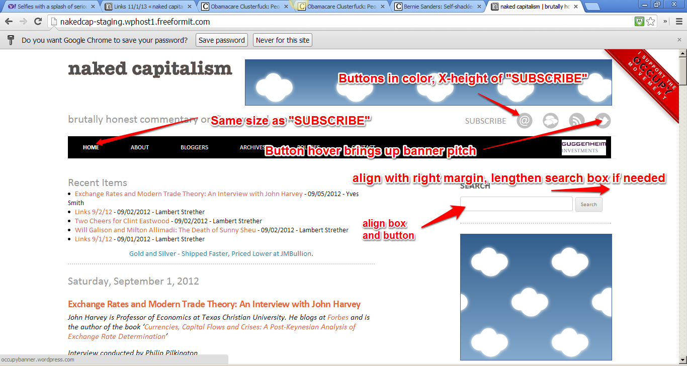
Header Area
1. Change sharing button colors (just above header bar) to brand colors, as in RSS orange and Twitter blue. Designer will decide colors for rest. Those colors are so strong that probably means the icons need to shrink (notice they have cute descriptions when you roll over them). Size as X-height of “SUBSCRIBE
2. Make the tagline smaller to conform with smaller sharing buttons
3. Search field and button should be same height and same top
4. Search box + button combo should be sidebar width.
5. Hover on twitter button should not being up text for Occupy banner (z axis)
Landing Page
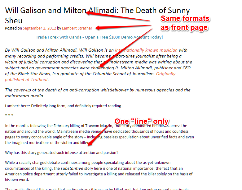
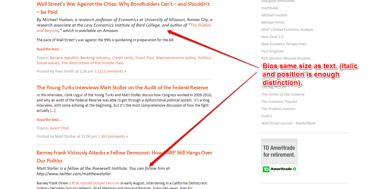
6. Bio author area text should be same size as body text of article
Article
7. Include Recent Items field as on landing page
8. Headline and author formatting should be same as front page e.g. orange headline
9. No more than one “line” between paragraphs (same leading as in paragraph, no extra space)
10. Copyright line should be same size as text
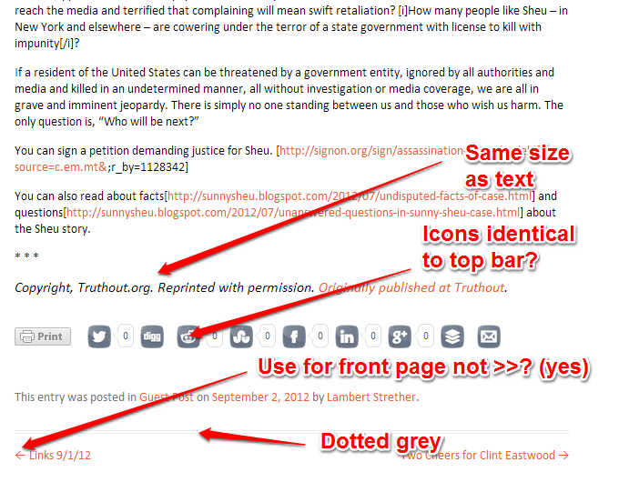
11. Rule at article bottom should be grey dot, identical to front page and sidebar separator
12. Can the icons for sharing be in the same format as in the header? Small, round, color?
13. This page uses -> for arrow, front page uses >>, I like ->, but should be consistent.
Comments
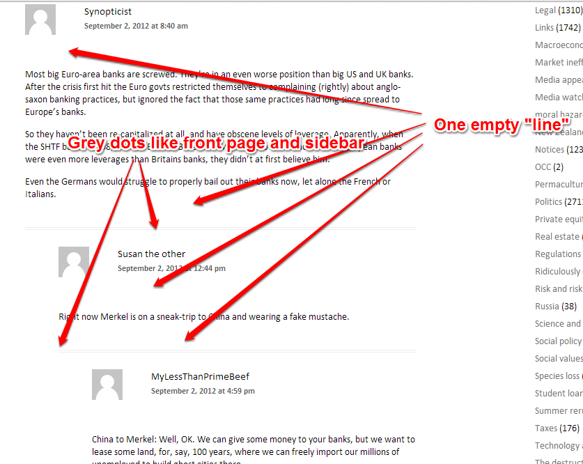
14. No more than one “line” between comment author block and comment body (same leading as in paragraph, no extra space)
15. Rule between should be grey dot, identical to front page and sidebar separator
And as before, please give us any comments, suggestions, and reactions! Thanks!


Thanks for asking!
Sorry but i really hate the way the huge black header bar dominates the landing page. The main thing I always check that page for is the recent list, so it’s pretty terrible to me for visability-wise that to be made so tiny and overwhelm it with that huge black bar of links I almost never use.
Even if you leave the bar as it is, it would be a lot less imposing if the recent list were not made so tiny.
Agree about the black bar. Also, on Opera it blocks out the Subscribe button. Home, About, etc, are the least important elements a reader looks for in coming to the home page. Also, maybe it’s my eyes, but the new font looks slightly smaller. Not as friendly for those of us who are older readers.
The partially (mostly) hidden subscribe text label was the first thing I noticed as well, using Firefox. The buttons above (a tad larger than I would’ve gone with) show up fine.
Does the nav bar really need to stretch all the way across the page?
The black bar feels very wrong. Too dominant
The gray type on opening page does not work. Why, I don’t know. I am not a big fan of gray type anywhere, but here moreso. It seems to detract from the message of the site somehow.
I like the tip jar on first page. It makes me re-think “can i afford this, this month?” every time I open the page. No reason not to have it on all pages.
The “Brutally honest” phrase does not work for me, for some reason. It feels ‘over the top’. I like the ‘naked capitalism’ phrase because it conveys a sense of whimsy and self awareness. ‘brutally honest’ seems too… self-serious?
All else looks about right.
Keep up the good work. NC is the first thing I read in the morning.
No problems here. I’m a little sad to see the end of the experiment with blue, and that we couldn’t find one subtly-toned enough not to look cheap. I’m surprised at the insistence on a blue that “goes with” the naked cap orange, in the sense of being the RGB complement of the orange. There’s nothing set in stone about complementary colors that you couldn’t have chosen a different hue; there’s no such thing as “the” color circle in physics or physiology that requires two colors to be perfect mathematical opposites in order to be complementary. Other blue hues might have worked, and I think my blue tones might have been worth a try as an alternative to the loud hues originally chosen.
But this is all overthinking and not worth the stress; the present state looks fine to me. I’m particularly looking forward to the “Recent Comments” bar starting to name which article they are comments in.
There are color wheels that designers use. I have no idea how these are developed, but the blue we have now goes with NC orange. You apparently can’t just put any old blue with any old orange and have it look coherent visually. Using a different blue means having to use a different orange, and readers really did not like a different orange. The orange is what felt strongly about.
I know about this subject and you don’t and I’m in a position to tell you that color was not chosen using a “color wheel that designers use”, it was just chosen by flipping the bits in HTML. It’s also not true at all that you can’t change the blue without changing the orange. I don’t want to have an argument about this, because it’s your site and I don’t think the design you’ve gone for is even a bad one, but please don’t say things like that. It’s like somebody telling you what’s what about McKinsey.
The black bar across the top (Home, About, etc.) sucks your eyes right in, it is very high contrast. Maybe lighten up a little–dark grey, dark orange or some complementary color.
I think having links previously visited show in a different color is a very nice feature. I think this is a major feature.
naked capitalism comes out a little out of focus (current Firefox, Windows 7). I don’t care, but is this what you wanted?
I don’t see anything wrong with animals by the tip jar. Variety is important–it keeps people from mentally editing that area out.
I agree that the tip jar is stealth subtle. It needs better labeling. What was wrong with Subscribe Donate? Two words don’t take much room.
One issue I’ve had with comments that I reply to is getting my reply in the right thread, it is easy to pick the comment above (or is it below) where you intend. This might be fixed.
Thanks, great progress on the redesign.
A couple of clarifications on re-reading.
The black bar could also be thinner (but still would be better not black).
My comment starting “naked capitalism” refers to the page title.
Strongly agree about the desirability of displaying visited links in a different color. It lets readers know where they’ve been and what they’ve read. It’s also subtly satisfying, and not just visually: a graphic indication of what you’ve visited lets you know how much of, say, the daily links you’ve clicked your way through, which rewards you with a faint sense of accomplishment. (Unless you’re procrastinating, in which case it punishes you with a faint sense of guilt. But none of us here is like that.) Pick another color, but please don’t trash the visited links feature.
Agreed. That’s the one thing about the new site that I change, t’were it up to me. It’s especially nice to be able to see which links you’ve already read when they are cited in an article.
And the sense of accomplishment thing is sooo true (embarrassing though it is to admit).
Might be worth adding a bit of coding to dynamically check for screen resolutions and reposition the “Occupy” banner. On certain screen sizes, it end up migrating off the main area into the right-most corner.
http://bayimg.com/OaBfhaaFo
The ad box under the first article is also wonky (the Addchoices link doesn’t work and there’s some links which are definitely not set up correctly associated with the ad) — sorry, dodgy ads are a real bugbear of mine ! Shows as a “buy gold” ad in my screen shot — I do love that some of the agencies who pay to keep NC going end up, erm, barking up the wrong tree. Although I do keep looking for that great product which will give me a 6-pack using one weird old tip — I missed out on that and it doesn’t seem to crop up on NC anymore so I can’t take it up (<- joke!)
Apart from that, I think you're hit the nail on the head with this current version. Modern, clean, intuitive, good balance between content and revenue space, the tip jar move to the in-depth article text is an inspired design decision. And the tag-line "help keep NC strong" is excellent. Much better than "give us some money cos we want it" type of call to action.
Am tempted to suggest "don't fiddle with it any more because you end up faffing about and taking away from a good thing by over-tweaking."
But please get the all ads to work properly :-)
While I didn’t like “onSwipe” for the iPad and would love to see it go your worrying to much about presentation. the information you provide and your comments are what’s important . On the other hand. your explanation for so e of he changes makes David Sirota’s article come alive.
http://www.salon.com/2013/11/01/how_the_1_percent_always_wins_liberal_washing_is_the_rights_new_favorite_tactic/
For Onswipe, there is a “Go to Desktop” icon in the upper left. Because it’s an icon you might have missed it.
If you select that, you go to the desktop version. And that choice will persist for a month, you don’t have to keep asking every time you visit.
I hate to spit on the flag, but does anyone else find your signature orange hard to read?
i will miss the blue links…i used it for a marker
if your going with black & grey, why not bring back the animal pic tip jar…page is a bit dreary.
Orange, italics, gray dotted and light blue are difficult to read for those with dimming vision. Colors should be darker to provided contrast on a computer display.
“Before, when you clicked on a link (say in Links), the site remembers and shows the link as blue. We’ve eliminated that.”
So far this morning, it HASN’T been eliminated. I hope you won’t do that. I find it such a useful feature. Coming back to the Links after a time away, it provides a marker for the last place you’ve been if you’re scrolling top down. BTW, when I had already read an article elsewhere, it would also show up blue but that didn’t happen this morning.
My minor nitpicks: There seems to be a big chunk of whitespace 1/3 from the right side, across every browser I tested. Maybe that is just temporary, and you’re already working on it, in which case I apologize for bringing it up.
Since I am on Japan time, it is useful to see dates and times for articles, that way I can catch up quickly rather than hunt through and find where I left off the day before. I imagine your Euro readers would find this useful as well.
http://bayimg.com/JABhgaAFO
Yeah George, really agree about the timestamp ! Never been able to figure out that one (is it Eastern time ? or local time equivalent e.g. GMT ? or something else entirely ? !)
On the whitespace between sidebar and text:
I read the straight NC site on a tablet, because I loathe the tablet-optimized versions of most sites, including NC’s.
So I find that whitespace very useful to swipe the page up and down, without accidentally hitting any of the ads, as I do on the current site.
Yves,
Please don’t change a thing! Seriously, It is one of the last nice and simple blog sites. I understand taht you need to monetize by putting advertisements, but that doesn’t mean you need to change the layout, fonts, or color schemes. On Firefox and Chrome it looks really good.
I also don’t like the black menu bar. Keep it orange!
I like the new site, just enough in common with the old design for continuity and psychological comfort.
One thing I don’t like is the header. It’s too tall and has too much empty space. It’s marked with clouds on prototype picture, is there going to be any content there?
Also, I would appreciate if read links were still highlighted.
Hi there!
First I would like to state that I visit NC daily because of the articles/contents/linklist and that I could not care less if the website was presented in any different fashion/style. If you were to convert the appearence to the old DOS prompt c:> style of the 80/90ies, I would still read NC regularly.
As for the proposed changes, they appear not to distance the website from its present appearance too much.That is ok with me, because I think the present design/style is fine on PC the way it is, as it does not clutter the view with megaicons a-la Windows Metro user interface style (windows 8).
I like essentialism, function and usabilty over form. The website that best represents, imho, the essential interfaces I seek is http://www.metafilter.com, an open community whose webinterface has changed little in the last 10+ year and that has timeless look that could have worked well in the 90ies. Metafilter is geared on making community discussion easy and expedite and it performs that task admirably.
Maybe design investements would be better spent on implementing/making sure that mobile user (especially people using tablets)can read NC without any inconvenience. Not that I have experienced any so far, but I guess tablet user are an important part of the userbase and also because, incidentally, I read NC in bed at night and there’s no way I am brining a laptop to bed, now that tablets exist.
With regard to the comment systems, the one presently used is fine with me, but I miss the thread collapsability feature that one can find on reddit.com. It’s quite convenient for tracking who is answering/replying to the main article and to declutter the page.
What’s the significance of the clouds?
Jest askin’…
The clouds are a placeholder for an ad.
The smaller font sizes will make it difficult for older people. While the type can be resized in the browser (assuming this ability is transferred to the final product), visitors to the site with sight issues will have to flip the font size both coming in and going out, and will have to do this with every visit. Obviously it’s not difficult, but it is annoying, and some readers may not be aware that font can be resized.
I heartily agree about font sizes. Expending processing cycles in my brain just trying to read (and reread to ensure I got it right the first time) overshadows the content, which is what I’m here for. The conscience mind does not, cannot, multitask.
We have the same font info as in the current site (save for changing the font order) so it should be the same as for the current site (we were having huge problems with rendering in Safari, which is what I use, so we had the designer copy what is in the site NOW exactly).
So the font size should be identical to what you get now.
What OS and browser are you using?
And did you know you can adjust viewing size in your browser?
I use Mozilla from a PC and for me the font also changes and gets much smaller in the preview. I hate to be a detractor as I know you’ve worked so hard on these improvements but I was wondering if it would be possible to have a way to just opt out of the changed format and continue to view it in the simpler old format we currently enjoy. YahooMail switched format a few years ago and you could stick with the classic view up until a few weeks ago. (now everyone’s been forced to change and is moaning about it). I had no idea I was seeing and incorrect title font. I actually am quite fond of the incorrect font I see currently because of it’s sharp edges. You are a sharp cookie Yves/Susan, and when I looked at the preview and saw the Mac-ish true font that is preferred I was chuckling because its softer rounded form seems to reflect less on the sharp side and more on the cookie side. Time for a bake sale. Arial is apparantly how I see the text and it is an unfashionable dinosaur but so am I. It’s a very readable size and it’s condensed so my screen is stuffed with information, whereas the preview seemed airy, less condensed, more time scrolling to read and when more space is taken up like that it will be harder for me to search back through lengthy articles or comment sections to locate information if I want to refer back to something. Change is hard, but I do have to say that the clean and simple graphic presentation of this site was a strong draw for me initially as a reader and kept me coming back. (and I’ll keep coming back but will be sad to see it go)
Agree with your comments about the bake sale header font. Surprised this is how the logo is intended to look. When I think of “naked capitalism” I think sharp, brutal, unflinching honesty. The typewriter font looks kind of friendly and kids’ room. Like a Sunday coupon circular. But then the squirrels sort of have that vibe too.
I think the squirrels are intended to be “helping each other”? It’s hard to tell what the squirrels are supposed to represent. Ian Welsh’s blog has rotating pictures but I like his more, they’re more neutral.
That is what you have been supposed to be seeing all these years and all Mac people see.
The font is American Typewriter. Every time you see an older spy movie, you’ll see a typewriter clacking out some really big deal secret communique on the screen….in American Typewriter!
That is what this is mean to evoke.
I agree. I like a stuffed page (and hate scrolling). Nothing like having half the paragraph clean out of sight.
It’s like trying to read things in this little comment box.
Thanks for your work.
Seems to me it would always be more beneficial to have a tip jar on every page, including the landing page.
I’m sure there are some folks, maybe a few but some, who come to the landing page just to donate.
No point in making it more difficult to give money, imho.
“Before, when you clicked on a link (say in Links), the site remembers and shows the link as blue. We’ve eliminated that. Now the only blue links are ad links (and you’ll see there aren’t many). If you miss that feature, please let us know, we might try restoring it in a different color.”
I would definitely miss that feature.
I appreciate that a great deal of work goes into the redesign of a site like this. That said, I must ask, is the pt. size smaller because we are all getting younger? If that is the case, maybe it’s worth the trade-off ;-)
As indicated above, we didn’t change the font size, everything is identical to the current site except moving Calibri higher in the font stack (as in you might be getting a different font but the size should be the same).
Please tell me what browser and OS you are using. Thanks.
I have Windows 7. Sometimes I read NC in Internet Explorer, and sometimes in AOL. Type is larger in IE than in AOL in both your current version and the new one. However, in both IE AND AOL, type appears significantly smaller in the new design.
Thanks, Yves and Lambert, for all of your attention to detail, and for continuing to make NC my go-to place each morning.
The only problem I’ve had with the current sit is the not so great position of the reply button and the inability to edit posts after discovering my bad english composition.
Fix that and we are golden.
I can’t tell if it’s different on the new site because all the comments are closed.
I like the new layout though being a no-frills/no-clutter kind of guy.
Yes indio007
I agree that the current version’s confusing positioning of the reply button is the only major issue with the current site. (The reply button is closer to the following post than to the previous post; making it difficult to know which post a person is replying to)
Viewing with Firefox, the unmodified text size is too small for comfortable reading. and the menu bar is too large.
If I increase the font size four increments, the menu bar is definitely too prominent.
Please tell me what OS you are using. As indicated, we copied the font stuff faithfully from the current site save the preference order (as in which one it looks for if you don’t have Optima), so I’m at a loss to understand how it can look smaller with the same coding.
1. The black bar has to change. It it has to stay, the size should only be twice the font size. A color other that black should be used because is pulls your focal point like looking into black hole.
2. Calibri font works fine on web and text pages, so don’t spend extra for some cutesy font.
3. As someone else mentioned, the logo has major problems. It looks like a poor scan of some image and is fuzzy. The color is way too washed out for a logo.
4. When a recent item (eg Links) is clicked on the title font is way to skinny relative to the text for the articles.
5. The font for all article lines is waaay too small. After a number of cntrl+’s to make the lines readable, all the text disappears and all that can be seen is the area where the tip jar resides. When the whole page is viewed the lines for the articles are so small that there is a third of the page that has a white space.
6. When an article is read, the color needs to change to show that the article has been read. Many of us will go through the Links articles to read what we are most interested in and then go through the list again later to see if we missed anything.
7. If you have a contact at a school that does graphic design, you might get a class or a professor to review the graphic layout and colors. Your designer may be excellent with WordPress and html but my suspicion is he/she is color blind and doesn’t have a good graphic design vision.
All comments are offered by a Firefox user on Windows 7.
The naked capitalism logo (which by the way, could use a redesign or a refreshing along with the site redesign) should be moved lower, and placed just a little bit above the “brutally honest” byline. Right now it looks like it’s lost in space. I was honestly hoping the NC orange would be changed or made darker, because for some reason, I find that it hurts my eyes on the links page.
The text on the test website has good vertical spacing but it could be a bit larger if you ask me for easier viewing.
I would the main content up towards the black menu bar to close the gaping empty space you have there. Also, consider locking that menu and header section in place, so that you don’t have to scroll up to navigate.
This may sound nuts, but what about a forum instead of a comments section?
NC logo is not changing but it does need to render properly so we’ll get on that.
Please let me know what OS and browser you are using. The font info is supposedly exactly the same as in the current site, so it should render the same as now (and it looks the same to all of us who are on the review team, and we use different browsers and OS among us).
In addition, my eyes are old enough to require tri-focals, and the text size is fine. So I wonder if there is a cache-clearing problem here.
A functional request for the comments section: along with the nested arrangement, add an option for a flat sort by time. That way a reader can not only follow threads by conversation but also see a glance what’s been written since a previous visit. The more comments a post inspires, the more helpful that sorting style becomes.
I am pretty sure we can’t do that, but I’ll ask.
WP is extremely feature heavy but I’ve NEVER heard of that feature (as in allowing a reader to flip from a nested display to a different format).
But the dialog system used here really is patched together and inferior, reminding more of those comment sections we see at the end of news paper articles. It assumes random comments made by random people. Here, we are having actual dialogs and debates. But the system we have here truly limits the possibilities of long term dialogs.
OldElmTree.com the blog of which I am a part of has perhaps one of the best dialog architectures out there. You don’t have to log in each time you want to make a comment. It lists both the resent articles as well as recent posts made to those articles. You can send privet messages. There is a window which gives you a list of all the replies made to your replies, very useful in keeping track of conversations. It allows you to quite the previous reply. There are tools where you can flag spammers or abusive language. Personal profiles are more user friendly, especially the use of avatars.
Just my two cents worth.
I would suggest using an RSS reader to follow comments chronologically. I like Digg Reader well enough, though others may have found something superior.
Home Page: The post demarcation is better, somehow (was the post title font enlarged slightly?), but the grey dotted line still falls short of being an intuitively effective separator and I’m still feeling it’s as if one post runs into another.
I’m seeing improvement there though. Nicely done, design-team. You’re almost there.
Using Windows XP. Prior browser was Firefox, this one’s Opera.
The nav-bar/subscribe issue still exists only now there’s a Guggenheim Investments button there, right in the nav-bar now. Confusing!
Home Page: I can also confirm that the post separation is apprehended thru the title. The dotted separator is almost invisible. Once ads start showing up at the end of the first few posts, it’s work to decode where one post ends and another begins. Posts further down the page (without ads or images) are easily distinguished, one from the next.
Looks fine to me!
Whoops, wrong link on my previous long comment. Comparison of Recent Items styling:
Original: https://dl.dropboxusercontent.com/u/4414866/Screenshots/shby.png
Tweaked:
https://dl.dropboxusercontent.com/u/4414866/Screenshots/siq5.png
Where’s the *LIKE* button??
Now viewing with Safari on Windows XP. Post delineation issue remains the same (ads and images confuse the process of scanning downward to get a general take of content). Expectedly so, that’s an eye/monitor age & settings issue – though neither my monitor age nor settings shouldn’t be way to far from what most people have to deal with.
Just for the hell of it, I tried viewing it in Lynx, and because the post text is indented, it’s fairly easy to delineate between posts.
Comments, though, render in purple and are almost impossible to read.
Meh. Only someone like me would even think of using Lynx. :)
i’m hesitant to say anything. because what seems to happen is we all make our comments and then the thing drastically changes, and really quite a bit of it at this point is nitpicking.
it looks fine. it is readable, the font types and sizes and spacing are good. the right side looks good. the fact that you can see which article comments belong to is good. the page width is a bit larger than the current one, which is strange to me (scrolling over to get it) but not anything that can’t be lived with.
black bar at top is a bit heavy, but so what?. I noticed that you put another smaller one above comments. having comments differentiated on the page visually is good.
the social media buttons only being on the article page (and not on the front) is very good. the old buttons were colorful and added some punch, and the new ones although sedately colored seem a bit whimsical, but who really cares? I don’t even use those, so perhaps someone who does should comment.
i’m honored that you even ask your readers what they think, much less take that into consideration. all I care about really is readability and ease of finding things. the rest is for ‘image’, which is understandably important but as long as it doesn’t look like the homepage of a 4th grade classroom….
+1000 “At some point you just have to shoot the engineers and ship the product.”
Font is too small!
Using Google Chrome, with Windows 7 Home Premium
Because I’ve seen only complaints about the nav-bar, let’s just state the obvious: It’s a HUGE improvement over the old, text-only version.
On the whole, the site is just similar enough to make me feel I’m still visiting Naked Capitalism I like that.
One thing you might want to look to – don’t have a comments section in your ‘About’ page. I can imagine the Zero Hedge-like storm from the right wing howling stooges if even the hint of the ad hominem is allowed.
Thanks for making the header title bigger and darker than it was. It could go to 100% black and it wouldn’t be bad. As my old typography professor used to say, written words are spoken aloud inside people’s heads, and typography tells them the tone of voice. Go ahead and make ringing announcement of your arrival.
But yeah, the header bar could be narrower and still work.
“[…] HTML glitches come from WordPress plugins. She say[s] no WP site will get a clean score in an HTML editor.”
She’s right. I hadn’t noticed the generator meta-tag declaring this to be a WordPress site — and it’s true that virtually no WP site is HTML compliant.
WP plugins (and lots of other HTML code) fail validation simply because authors don’t bother to check their own work and others don’t complain by filing bug reports.
Worse yet, design errors may be so fundamental that only a complete rewrite (with frequent validation) can fix them.
Looks good. The black menu bar seems non-mellow, but not a big deal.
You need to do what will generate the most income for the blog, but i prefer the tip jar in the landing page. I come to the site for news, info and excellent analyis on various topics, many of which i often have not heard about before nor knew i would become so interested in, so i look at supporting the blog in recognition and gratitude for it’s diversity of coverage. Maybe a “tip jar” works for being placed on each article’s individual page; but i like a “donation” or subscription option for the landing page as well so people will look at supporting the site as a whole and not just for the specific types of coverage each reader might be personally interested in.
[ I posted this a few hours ago, and then tried to post a reply to it before it was moderated — posting again in case it got lost. ]
A few quick thoughts… I’m a web dev / former UI designer.
Agreed on the black header bar being too dark — most web designers never use 100% black (http://ianstormtaylor.com/design-tip-never-use-black/). Also the font size / padding ratio seems off.
Ditto for the body text black too, actually — common practice is to use a not-quite black, primarily for readability. http://ux.stackexchange.com/questions/23965/is-there-a-problem-with-using-black-text-on-white-backgrounds
A technical point: it’s been standard practice for the past four years or so to use a technique called CSS sprites to reduce the number of HTTP requests. Instead of every image being an individual file and HTTP request (eg “naked-capitalism.png” and “naked-capitalism-on.png” for the logo), the images are combined into a single file or files for quicker downloading. I was surprised your new design did not use them. With the dozens of extra requests coming from the ad networks, CSS sprites would help offset that slowness. See, http://coding.smashingmagazine.com/2009/04/27/the-mystery-of-css-sprites-techniques-tools-and-tutorials/
=== TOPICS list
With the new grey links, TOPICS does not follow standard design practice of emphasizing less-important text; now the topic counts are darker than the topic names. (I’d also argue that lots of those numbers are so big as to be not useful, and maybe just remove them entirely.)
Also, the line-spacing for TOPICS is too tall; that’s good paragraph line spacing, but in a list like this, the use case is either scanning (just reading down the list) or looking for one topic in particular. The current line spacing is too tall for scanning, and then the whole list spreads out so far that it’s some work to scroll to a portion of the alphabet to find a particular topic. So it breaks in both use cases.
The TOPICS list with updating line spacing and topics count color: http://dl.dropbox.com/u/4414866/Screenshots/zuef.png
=== Post index layout
When posts are listed (eg on the home page), there are so many different lines of data and metadata, it’s difficult to scan the list. Part of it is the footer metadata (links). I spent about 5 minutes tweaking layout; I condensed the P spacing in the footer, and changed the post-footer link color. I think the links in the footer can be a different link color (with underlining on hover) and they still read as clickable. See how in the new version the content comes to the fore?
original: https://dl.dropboxusercontent.com/u/4414866/Screenshots/r0a%7E.png
updated: https://dl.dropboxusercontent.com/u/4414866/Screenshots/pw_p.png
=== Recent Items
The UL style for Recent Items is off; bullets should be indented relative to the content. See how “Yves Smith” falls down into the bullets in the original? Also, it seems like “Recent Items” header is crowding the list.
Original: https://www.dropbox.com/s/aotdwas6n9p2aar/shby.png
Updated: https://dl.dropboxusercontent.com/u/4414866/Screenshots/siq5.png
=== HEADER
As someone mentioned, the American Typewriter header is indeed fuzzy; I’m not sure why the image export appears to have orange/brown anti-aliasing. Here’s a magnified view, with a new version of the text: https://dl.dropboxusercontent.com/u/4414866/Screenshots/9u_8.png
Unmagnified: https://dl.dropboxusercontent.com/u/4414866/Screenshots/naked-capitalism-header-export.png
One more thing about the header: the placement of “Naked Capitalism” versus the tagline (brutally honest…) feels really awkward. I’m not sure what to do here; my instinct is to move the tagline up. …and then maybe move the line above the nav (the Subscribe links) below the nav?. I could spend more time tweaking but you can see how awkard the title/tagline separation is when you compare it to the tweaked version:
Original: https://dl.dropboxusercontent.com/u/4414866/Screenshots/tmt2.png
Tweaked: https://dl.dropboxusercontent.com/u/4414866/Screenshots/4wkf.png
Looks OK here. (Mozilla/5.0 (X11; Linux x86_64; rv:22.0) Gecko/20100101 Firefox/22.0) Slightly more readable than the current version.
The current site works fine with lynx (text-only browser). I can’t get to the test site with lynx.
What do you mean, “can’t get to” the test site?
I got to the test site with Lynx without any problem, and I’m tickled to find someone who thought to try it out (or even remembers it) besides myself.
So, I loaded this page to read the comments and complain about the speed.
According to Safari, viewing this page makes me download an obscene 285 resources (includes html document, images, css files, scripts, etc.) totaling a whopping 3MB.
This makes the page render in a pathetic 18 **seconds** from the moment I open it to the moment when it’s done running scripts and manipulating the layout.
During that excruciating course, my laptop’s fan kicked in and went so fast I wondered if the thing was going to take off. Your site generated no less than 16 javascript errors and 14 warnings before the fan stopped.
Anyway, I understand your desire to monetize this site, but this site is becoming almost as unresponsive as businessinsider.com. My only advise would be to slash the biggest offenders and keep your site from sending more than 200k or so when it loads (not including images.)
All that stuff you hate is from our ad service. I don’t control that. Get rid of that and the site goes dark. I’m sorry it’s so kludgey but I can’t do anything about that.
Quite frankly, I’d challenge that assumption. Users don’t go ahead downloading ad blockers, flash blockers and javascript blockers because they’re allergic to ads. They do so because the ads are an annoyance.
Look, take a brief moment and compare your site with e.g. daringfireball.net or loopinsight.com, both of which are rather good quality tech news blogs. Notice something? Only one, discreet, high value ad on each. And a weekly sponsor. Both provide their full feed and a bonus in exchange for a subscription. I’m unaware of how much they make, but a little birdie tells me that Gruber is making well over $10k/month blogging as a full-time job.
Surely you can match that kind of revenue or more using a similar model in the financial world, so please, don’t give me the dubious “the site will go dark without more ads” argument that newspapers have been killing themselves to death with.
Sorry, the only sites that have tried that model in this space died a LONG time ago.
Finance blogs compete with econoblogs. The writers are academics who don’t need to monetize. And I’m not a product-friendly site. I do not give investment advice nor do I candy up to the orthodoxy. I can’t even get paid speaking gigs. So who pray tell would give me high value ads?
Hi. I find it difficult to find post titles. Always have to search.
Chrome 30.0.1599.101 on Windows 7:
I like this version a lot, probably the best of the ones we’ve seen so far. It’s quite spare and minimalist, but functional and polished. The new orange/black/gray palette works well and contributes to the overall feel. It feels less cramped than the old one and makes better use of my screen space. The layout is sufficiently old school to evoke a newspaper or business magazine, with interactive elements there if you need them (but unobtrusive). The colors and layout are also similar enough to the old site to provide continuity.
The mobile version obviously needs some work still (is this on the to do list?) I can see it’s an adaptive page as the menu ‘snaps’ to a different version as I narrow the browser window, so you definitely have the capability to provide a mobile optimized UI, but it doesn’t look like any work has gone into the layout yet – even the menu is just a placeholder button. If you find time for this it would be great as more and more users come from mobile devices these days.
I also think it looks good, as a longtime reader I appreciate the priorities in place for the redesign. There are several sites I stopped visiting because they redesigned for complexity – or so it seemed to my eyes anyway. I need to be able to focus on the content and not the whirligigs. Thanks for asking :)
No, Please, No.
The font is horribly difficult to read on my PC using Windows 7.
The main font is smaller, oddly blurry (maybe because italics?), greyed out (why even the main font seems grey; may be due to the main font now being so small), and why italics? This is a serious problem for me and this font issue will reduce my ability to read your page. I will be less motivated to read NC. Please return the old font. Please.
re: donation option. My donation decisions come spontaneously. I think many people like me decide over time to donate. I will then click on the main NC page to seek the donation thing. Possibly put a donation button on the main screen more discretely (bottom?) or include with all those other buttons that you mention like twitter (but which I do not see in the example) but have the donation button as a different color.
Please do not use this font.
I’m using Firefox 24.0
why a tagline at all? I like including the word “honest” but “finance and economics” limits the content and “finance and economics” probably sounds boring to most humans — just being brutally honest.
I think Yves mentioned in the past that they needed a tag line to help bring the blog up to the top of the page when people search for it.I’d prefer to see “brutally” removed from the tag line, though, because what is brutal to me is constantly being lied to and misled by the mass media. That the blogs coverage and anylsis is “honest” is what sells it for me, and i find it refreshing and inspiring.
Thanks savedbyirony for reminding me about the search engine ranking prompting a prominent tagline. Could SEO consulting obviate the need for a tagline? Maybe post (another?) job search ad at CUNY Graduate Center’s online job board; this time for a very brief consulting engagement (or semi-pro bono advice?) from someone with SEO skills. Was an SEO a step in the fundraiser?
Can the tagline be invisible and still be integrated into search engines’ sniffers and algorithms? By “invisible” I mean making the tagline’s font match the color of the background.
1. I hate having a tagline but Google has been punishing us for not having one. And they do need to be somewhat descriptive.
2. The one I’d like to use, “Money laid bare” is unacceptable to them. Has to be 6-9 words.
how about, “naked capitalism: all the financial, economic and political commentary not fit for the WSJ to print”
Glad you kept the orange color – that’s so distinctive of your page and no other.
Well done and thanks and more thanks for what you do. You lifted the lid on fetid economics before the others and I will always be in your debt for that.
Sorry. I should have said I use Ubuntu One and FF 25.0
1.) The “dotted grey” line, which acts as a separator between stories hould be “heavied-up.” Graphically, there’s a sense of somewhat of a run-on, from story-to-story, in the preview content, IMHO.
2.) Perhaps more use of graphic elements with knockout type, as opposed to shifting colors (black to grey to orange) in the text, which comes across as difficult on the eye (especially as it’s implemented at the bottom of each post, where the color shifts are mosts prevalent). This could also serve, at the bottom of the posts where the tags are placed, as part of the story separation function, as well.
3.) And, while I’m hesitant to say this, frankly, there’s nothing special about “naked capitalism” in the American Typewriter font, in the masthead. At the very least, some customization of the font, making it “your own” logotype, is more in line with traditional graphic process, as well.
The fact that the blog’s title is, “naked capitalism,” doesn’t mean “barebones capitalism.” (The logotype is very barebones.) Bolder! More emphatic usage of the typography, IMHO. It’s more in-your-face content, and the logotype–at least some customization of the font, IMHO–should match that sentiment.
Just sayin’…(from someone who’s won a few awards from the ad community for typography, etc.; that and $4 bucks will buy me a cup of coffee at Starbucks).
On the tagline:
First, I think it’s just plain inaccurate to say the site’s main content, or perhaps most decisive contribution, is finance and economics. If that had remained so, I don’t think I’d have read you everyday for x years. Face it, you leverage your strengths in financial and economic analysis to wage an ideological and political fight. There’s a contradiction inherent in trying to do finance/economics without gravitating towards a political standpoint. Your relationship to that contradiction is what separates you from the pack and has lent the element of drama to the unfolding of NC. Even a self-described Reagan conservative with a weakness for the truth can be the wrench in the works of the ideological steamroller. We’re all anxious to see how far that allegiance will take you.
Second, brutally honest is ambiguous in the bad sort of way. Your analysis may appear brutal to someone in denial, when you hit the right notes and shake their world. It may appear weak and vacillating to someone ahead of your curve at that moment. Everyday I keep score of how brutally honest I think today’s posts are. It seems strange for you to tell me up front. Your “brutal honesty” may become an annoyance to powers that be, who may content themselves with the knowledge that the self-limiting and self-censoring tendencies of a project such as NK will usually win the day. The real drama revolves around the extent you are willing to be brutally honest with yourselves, with the political conflicts you experience every time you write, give an interview, choose a venue and confront a new event. That will decide whether you can continue to contribute as the political and ideological crises mature.
the links still don’t change to a different color after you click on them, then browse back to your original page
Late to the game, here, I know, and if it’s been said already, my apologies.
Please change the orange on white color theme. Way too much eye-stress. Personally, I loved the old Bloomberg site, white lettering on black background.