By Moritz Kuhn, Professor at the Department of Economics, University of Bonn, Moritz Schularick, Professor of Economics, University of Bonn and Ulrike Steins, PhD candidate in Economics, Bonn Graduate School of Economics. Originally published at VoxEU
Recent work examining the evolution of the wealth distribution has tended to not paid much attention to the role of asset prices. This column uses a new US dataset to explore the role that asset price movements have in the US wealth distribution. Asset prices matter because portfolio composition differs systematically along the wealth distribution. The data further show that no progress has been made in reducing wealth inequalities between white and black households over the past 70 years.
We live in unequal times. The causes and consequences of widening disparities in income and wealth have become a defining debate of our age. Recent studies have made major inroads into documenting trends in either income or wealth inequality in the US (Piketty and Saez 2003, Kopczuk et al. 2010, Saez and Zucman 2016), but we still know little about how the joint distribution of income and wealth evolved over the long run.
In a new paper, we exploit a unique new dataset that allows us to track the joint distributions of income and wealth in the US since 1949 (Kuhn et al. 2018). The dataset builds on household-level information that spans the entire US population over seven decades of post-war American history.
We unearthed historical waves of the Survey of Consumer Finances (SCF) that were conducted by the Economic Behavior Program of the Survey Research Center at the University of Michigan from 1948 to 1977. We then linked the historical survey data to the modern Surveys of Consumer Finances that the Federal Reserve redesigned in 1983. We call this new resource for inequality research the Historical Survey of Consumer Finances (HSCF).
The survey complements existing datasets for long-run inequality research that are based on income tax and social security records, but also goes beyond them in important ways. Importantly, it contains the same comprehensive balance sheet information as the modern Surveys of Consumer Finances, as well as granular demographic information that can be used to study dimensions of inequality – such as long-run trends in racial inequality – that so far have been out of reach for research.
Differential Trends in Income and Wealth
A central finding of this new research is that portfolios differ systematically along the wealth distribution. While the portfolios of rich households are dominated by corporate and non-corporate equity, the portfolio of a typical middle-class household is highly concentrated in residential real estate and, at the same time, highly leveraged. These portfolio differences are highly persistent over time.
An important upshot of this pattern is that relative asset price movements induce major changes in the wealth distribution and can decouple trends in income and wealth inequality for extended time periods. For instance, rising asset prices can mitigate the effects that low income growth and declining savings rates have on wealth accumulation.
This was prominently the case in the four decades before the financial crisis when the middle class rapidly lost ground to the top 10% with respect to income but, by and large, maintained its wealth share thanks to substantial gains in housing wealth. This is shown in Figure 1, which compares income and wealth growth for different groups of the wealth distribution since the 1970s.
Figure 1 Income (top) and wealth (bottom) growth across the wealth distribution
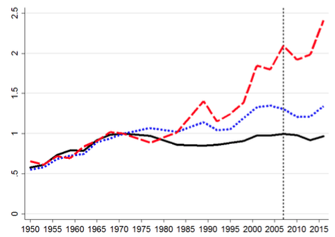
Notes: Growth of income (top) and wealth (bottom) for different wealth groups. All time series are indexed to 1 in 1971. The solid lines show growth rates for the bottom 50%, the short dashed lines for the middle class (50%-90%), and the long dashed lines for the top 10%.
Figure 1 shows that incomes of the top 10% more than doubled since 1971, while the incomes of middle-class households (50th to 90th percentile) increased by less than 40%, and those of households in the bottom 50% stagnated in real terms. In line with previous research, the Historical Survey of Consumer Finances data thus confirm a strong trend toward growing income concentration at the top (Piketty and Saez 2003, Kopczuk et al. 2010).
However, when it comes to wealth, the picture is different. For the bottom 50%, wealth doubled between 1971 and 2007 despite zero income growth. For the middle class (50%–90%) and for the top 10%, wealth grew at approximately the same rate, rising by a factor of 2.5. As a result, wealth-to-income ratios increased most strongly for the bottom 90% of the wealth distribution.
House Prices, Middle Class Wealth, and Discontent
Price effects accounted for the dominant part of the wealth gains of the middle class and the lower middle class before the Global Crisis. We estimate that between 1971 and 2007, the bottom 50% had wealth growth of 97% only because of asset price changes — essentially a doubling of wealth without any saving.
Put differently, for the bottom 50% virtually all wealth growth over the 1971–2007 period came from higher asset prices. Also, the upper half of the distribution registered wealth gains on an order of magnitude of 60% because of rising asset prices. From a political economy perspective, it is conceivable that these large wealth gains for the middle and lower middle class helped to dispel discontent about stagnant incomes for some time.
When house prices collapsed in the 2008 crisis, the same leveraged portfolio position of the middle class brought about substantial wealth losses, while the quick rebound in stock markets boosted wealth at the top. House prices plummeted after 2007 and recovered only slowly in recent years. By 2016, they were still 10% below their 2007 peak level. The bottom 50% lost 15% of wealth relative to 2007 levels, mainly because of lower house prices.
By contrast, the top 10% were the main beneficiary from the stock market boom and were relatively less affected by the drop in residential real estate prices. The consequence of substantial wealth losses at the bottom and in the middle of the distribution, coupled with wealth gains at the top, produced the largest spike in wealth inequality in postwar American history. Surging post-crisis wealth inequality might in turn have contributed to the perception of sharply rising inequality in recent years.
Racial Wealth Inequality
Race is an important stratifying dimension in the US with respect to the financial situation of households. For instance, Bayer and Charles (2017) document persistent earnings differences between black and white working-age men. The Historical Survey of Consumer Finances data provide a new perspective on the long-run evolution of racial wealth inequality, which had been uncharted territory until now, as long-run data were simply not available.
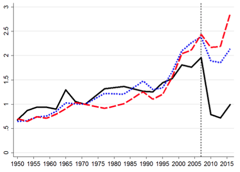
Figure 2 demonstrates the key trends in income and wealth growth of black and white households. In the figure, a reduction in the racial divide will show up as a stronger increase in black households’ income or wealth over time. A lockstep evolution of the series for black and white households signals persistence of racial disparities. The figure shows persistent and, in some respects, growing inequalities between black and white Americans.
Income disparities today are as big as they were in the pre-civil rights era. In 1950, the income of the median white household was about twice as high as the income of the median black household. In 2016, black household income is still only half of the income of white households. The racial wealth gap is even wider and is still as large as it was in the 1950s and 1960s. The median black household persistently has less than 15% of the wealth of the median white household. The overall summary is bleak. We document that over seven decades, next to no progress has been made in closing the black–white income gap. The racial wealth gap is equally persistent and a stark fact of postwar America. The typical black household remains poorer than 80% of white households.
Figure 2 Income (top) and wealth (bottom) growth of black and white households
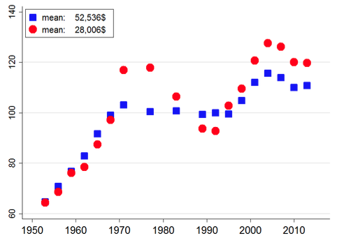
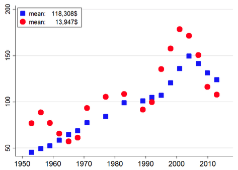
Notes: Panels show median income and wealth of black and white households over time. We show moving averages over three neighbouring observations. Red squares refer to white household heads and blue dots to black household heads. Average income and wealth levels for 1983-1989 (in 2016 dollars) are shown in the legend.
Conclusion
A key finding of our research is that asset price dynamics have been a key driver of the evolution of wealth inequality in postwar America, though they have attracted little attention to date. Asset price changes induce shifts in the wealth distribution because the composition and leverage of household portfolios differ systematically along the wealth distribution.
An important consequence is that the top and middle of the distribution are affected differentially by changes in equity and house prices. Housing booms lead to substantial wealth gains for leveraged middle-class households and tend to decrease wealth inequality, all else being equal. Stock market booms primarily boost the wealth of households at the top of the wealth distribution as their portfolios are dominated by listed and unlisted business equity.
Portfolio heterogeneity thus gives rise to a race between the housing market and the stock market in shaping the wealth distribution. Over extended periods in postwar American history, such portfolio valuation effects have been predominant drivers of shifts in the distribution of wealth.


This reminded my an older post
Guest Post: Leverage, Inequality, and Crises
The author has substantiated with data the effect of rising asset values on wealth inequality, but has not really delved into what is(are) the driver(s). That is to say what has caused the dramatic rise in asset prices amongst the wealthiest of society? Could it be Federal Reserve decisions, financialization of the economy or government policy, for example? Well, this is an entirely different discussion.
An excellent article nonetheless and the author is to be commended.
I’ll just add that on subject of racial wealth inequality, Figure 2, for example, the notes would indicate that the data used must have been quite ‘noisy’, that is to say individual points being quite variable. My thinking is that, were statistical confidence intervals placed around the data there would be significant overlap of the two data sets; the distinction, statistically speaking, may not be as stark as illustrated by the use of moving averages, which looks to have been used as a smoothing technique.
I have no doubt however that there is a wealth inequality among racial groups, it just may not be as significant as Figure 2 illustrates.
I find figure 2 very confusing as it has “Mean” in the inset box and has median listed in the description.
Perhaps their “Mean” is the three year moving average they mention?
Furthermore, I suspect the Y axis is showing only the white scale and the black scale which should be on the right is missing.
Note, left unmentioned was that the median white family is not doing well, with 118K (I assume of median “three year averaged” wealth), probably mainly in their home equity.
If the median white family were to sell their home and invest their median wealth at a very good 10% rate, they would have an income stream of 11.8K/year (and no home).
The very much unmentioned underlying story is that at the median level, NO racial group in the USA is doing well.
In a credit/debt based monetary policy dominated economy, wealth inequality is a natural result. Read anything by Michael Hudson.
Sri Thiruvadanthai of Jerome Levy Forecasting makes the point that growth is the best thing for inequality. By growth, he means via fiscal policy. Provide an income based economy. Without the debt burden.
Fiscal is Congress and Monetary is the Fed. The solution is obvious. The politcs muddies it.
The recent dramatic rise in asset prices was partially (if not wholly) induced by the Federal Reserve:Cheap Credit!
Asset price rise for publicly traded corporations was induced through stock buy-backs, using historically cheap credit. The 1% have a majority of their wealth in corporate assets because there is only so much personal residence (home) you can put your money into. And, of course, stock assets are tax favored, long-term. (The asset growth of a middle class personal residence takes a big hit at the end: high transaction costs and “income” spike.)
While there has been real productivity in the US economy since 1971, the wealth of most individuals is not based on it. It’s just a chimera.
Right on. And I did notice the passive voice and lack of agency in one of the first sentences, although not sure how to phrase it better:
But to your point, let’s look at what happened about 10 years ago. When the Fed bailed out the banks, they dropped any pretense of marking the so-called toxic (ie worthless) assets to their market value, and agreed to pay out 100 cents on the dollar. These assets were the sketchy paper being passed around, not the actual underlying assets, ie homes, that did have some actual value.
Millions of those homes, many of which were attached to mortgages held by minorities who got snookered into signing them (there were widespread reports of minorities being shunted into higher risk subprime even though they qualified for better mortgages), were foreclosed upon and taken away.
So one way to translate this –
-would be to say that if you are a supposedly rich person with some worthless paper, when the s&*t hits the fan the bankers will find a way to make you whole. If you are a less well off person who happened to own something of value, the bankers will find a way to remove that asset from you and use it to further line their and other rich people’s pockets.
So yeah, articles like these are great and even better would be an explanation of why it happens like this and who is responsible, because it sure doesn’t just happen in a vacuum. And the culprits aren’t hard to spot.
### That is to say what has caused the dramatic rise in asset prices amongst the wealthiest of society?
Death (of the bottom 85%) by 1000 cuts.
Low capital gains taxes. Wealth from capital “scales up” geometrically, wealth from labor scales up linearly.
Internet/network effect makes it easier for “winner take all” scenarios, see Facebook, Amazon.
defacto Non-existent anti-trust laws.
Bush-Obama bailouts.
Electorate fighting over identity politics/cultural wars, letting state/federal/local lobbyists have free rein over economic policy.
If you want to read how and why this shift occurred, read Michael Hudson’s 2015 book “Killing The Host: How Financial Parasites and Debt Bondage Destroy the Global Economy ”
Until this book gets a lot more readership, we may stumble along like this until our economy is completely drained by the 1%
I just ordered a digital copy of “Killing the Host.”
I think there’s a mistake in the bottom pair of charts. There aren’t red squares and blue circles. More important, even if the author meant blue squares/red circles, the chart doesn’t justify what’s in the legend. Take the last chart: white mean wealth of 118k, black mean wealth of 13k in 1983-1989. The chart doesn’t show a wealth disparity of ~9x.
Does anyone have a different chart interpretation?
I assume that the plots of the two different income groups have been normalized so that you can compare the time sequence trends, not the value. The inset explains the difference in value that the plot does not show. The scale of 50 to 200 may make sense for the blue squares, but not for the red dots.
The author says that in the 2007 downturn, middle and lower class individuals lost wealth due to housing bubble crash, which has not completely recovered even to this day, while upper class individuals who predominently hold assets in stock equities, which recovered more quickly, did well, increasing wealth inequality..
But what if the stock market had fallen and not recovered, as seems more and more possible now in 2018? The equalizer is the stock market, not real estate assets. As in the Depression of 1929 – 33, the US (and the world?) got substantially more “equal” than before.
There is little doubt that this great equalizing event will re-occur.
My doubt about the upcoming “great equalizing event” is a little greater. Why? Because I anticipated that the stock market crash would happen “any day now” as soon as QE3 ended. And given that QE3 ended way back in December of 2013, my prediction is (ahem) a whopping 4.5 years overdue. Clearly my original theory was faulty, and I’ve had to adjust my thinking accordingly.
Part of the problem is that even though the Federal Reserve isn’t explicitly mucking with financial markets via QE anymore, they’re still lending out a great many billions of dollars at interest rates that are still historically low. And notably, those rates are lower that the asset appreciate rates we see these days. This means you can borrow money, buy assets, wait for them to appreciate, sell the assets, and still turn a profit even after paying interest. [And the wealthier you are, the more you can borrow for this rigged game, thus accelerating your gains. If you’re poor with a bad credit score, you’re SOL.]
In my opinion, the Fed should raise interest rates above asset appreciate rates to cut off the various debt-fueled bubbles going on out there. It would definitely have an “equalizing” effect. But if they did so, they’d clobber the various pension plans that also have these assets in their funds, so there will be a lot of pressure to make sure that never happens.
Somebody needs to tell the authors that their description of Figure 2 is a little off. “Red squares refer to white household heads and blue dots to black household heads” The red squares are actually dots and the blue dots are actually squares.
This was population ponzi. We should have seen it coming. We pontificated about equality and all the while transfered wealth to the top. We let inequality flourish. If we had truly wanted equality and diversity to flourish we’d have done it without groaf and environmental devastation. We’d have done it by social fiat and cooperation…. I think it is obvious that if wealth is measured in dollars it creates more dollars (for the wealthy) but if wealth is measured in social equality it must create more equality and diversity. We’re just addicted to money. Let them eat money.
water is wet.
economists just found out.