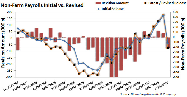
While the preparation of economic data is always a fraught business, one hopes that errors are more or less symmetrical, particularly in data series that (as is the case for some important metrics in the US, like GDP), are released on an initial basis (almost without exception the only one Mr. Market notices) and tidied up subsequently. It’s troubling when a statistical release shows a marked bias over time in corrections. It suggests at best a need for a change in methodology (something statisticians are reluctant to implement, since it means the series will not be strictly comparable over time) or at worst, political meddling (pressure to interpret legitimate ambiguities in the early findings so as to produce a prettier picture).
And employment-related data is particularly important politically.
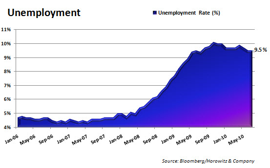
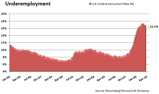
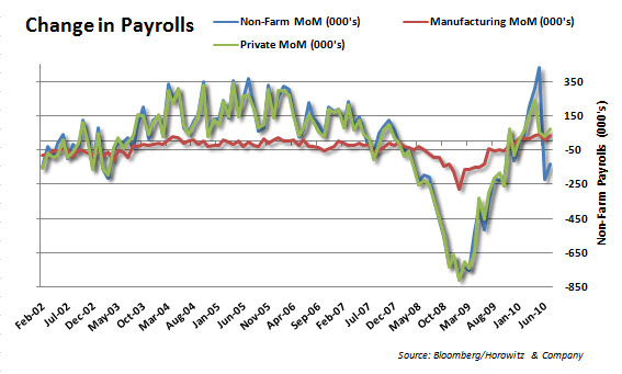
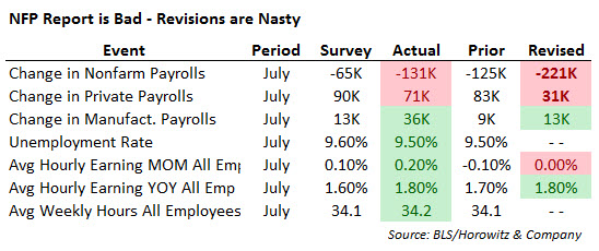
Andrew Horowitz of The Disciplined Investor sent a series of charts by e-mail, and I’ve included the ones I found most interesting below. Employment context comes first, then the pattern of revisions to non-farm payrolls.


Yes, the other shoe is about to drop.
In addition, the US employment to population worker is also plummeting — more at:
http://wjmc.blogspot.com/2010/08/us-employment-to-population-ratio.html
The US needs to refocus on creating private sector jobs rather than on retaining public jobs — the next stimulous needs to go directly to Main Street and bypass Wall Street, the states, and public employees…
These were some comments I made earlier today on this elsewhere on the web.
-131,000 jobs lost in July (initial estimate)
-221,000 revised job losses in June, up from -125,000
-181,000 decline in the size of the workforce in July
+117,000 the number of jobs needed in July to keep the unemployment number where it currently is.
Wages and hours were little changed, but these are not broken down by income level so it is not clear if there are offsetting movements in them.
What to look for next month.
Will there be a big adjustment to the July figures as there was this month for June?
There should be at least another month of job losses due to the Census winding down.
Job losses at the state and local level. How much will the $26.1 billion aid package to states offset these?
I have been writing for a while now myself about how dicey the BLS numbers have become, especially the initial numbers on jobs. But also its data collection is not really set up to track a lot of what is going on in the kind of economy we have, with erosion in the size of the workforce and, as I said above, no breaking down gains and losses in a clear cut way based on income level (to get an idea of who is and is not doing well). There is some of this but not clearly laid out.
One other point is that to date and with the numbers we have, the economy has added 640,000 jobs since the beginning of the year. A minimum of 618,000 were needed to just take up those entering the workforce with no changes to the unemployment/employment rates. If we are talking about finding jobs for every new entrant over the first 7 months of the year, 683,000-686,000 jobs would have to have been created over this period. So depending on which way you wanted to look at it, we are currently either 32,000 jobs ahead for the year or 65,000-68,000 behind. Now what is important to keep in mind is that this period marks the high point of the Obama stimulus. And the best it did was to bring us back to in or around a zero point. At the same time, not all the uptick due to the Census has been worked through and we don’t know how many jobs states and local government are going to cut. Private sector hiring remains weak. So we should see worsening employment numbers for the rest of the year, barring a new and highly unlikely stimulus package. This is more or less what I predicted in a general way last year. This is an election year. Small sporadic efforts would be made to keep the economy from tanking before the election but what we are seeing is the beginning of a slide downward.
The probability range for a critical point began last fall. It was offset by the continuation of the Fed’s ZIRP and buying of bank crap assets. There has also been an offloading of crap on to Fannie and Freddie. Geithner took off the loss limits on these to keep them from blowing up but they are showing strains and will blow up at some point.
The European crisis could have blown things up too but it has been papered over for the time being. Much the same could be said about China’s many bubbles. In our country, the calculus seems to be to get through the election. Then you have end of the year effects where profits are pumped up to justify end of the year bonuses. So it is not until the early months of 2011 before it looks like things go seriously off the rails.
This is not to say things might not blow up at any time. They could. But the period of maximum probability for the next crash is some time next year. That’s my opinion. I think the more consensus view of liberal economists is there won’t be another crash but rather a profound and prolonged muddle.
That should read 43,000-46,000 behind, not 65,000-68,000. Sorry for the error.
I think a market crash should be the least of everyone’s worries. Not that it isn’t going to happen – I just think the ultimate consequences of all this could be much, much worse.
While the census jobs correction may seem like the only remaining employment drag, the now emerging state budget crises is also likely to impact jobs in the coming months, perhaps dramatically — moreover, the unemployment numbers have some “spin” built in them that makes them misleading — consider for example that the US employment to population ratio is continuing to decline sharply through July — more at:
http://wjmc.blogspot.com/2010/08/us-employment-to-population-ratio.html
The employment picture found in the link above is perhaps a more accurate picture of the challenges facing America…
Jim Bunning and the Republican senators who voted against extending unemployment benefts look like clowns. Republicans cannot say that Republican tax cuts work to create jobs. Hope they enjoy being the minority.
Most troubling to me is the continued declines in the workforce participation rate (the size of the workforce or the denominator in the unemployment rate calculation).
If you used the average workforce participation rate for the last 10 years instead of what’s being used today, the U3 unemployment rate jumps to 11.8%. If you use the peak workforce participation rate from the last 10 years, it jumps to 13.0%. Either way, 9.5% is dramatically understating reality.
It took me a couple of minutes to decipher that last graph and the table. Graphs with two unmatched scales, yechhh.
Nonfarm data is revised in two ways. After the first estimate, in the following months there will be revisions as there are always employers in the sample who are late in reporting their employment for the month. All of the revisions for 2010 fall into this category.
The second revision comes at the end of the year, when earliers estimates are benchmarked to unemployment insurance tax returns from all employers. Since this is the universe of employers, the revised data is about as close to gold as you can get. These are the revisions before 2010. The last three quarters of 2009 will be revised again next February, along with all of 2010.
BLS was of course well off the mark in 2009. They could improve their estimates by benchmarking quarterly instead of annually (the tax returns are quarterly unemployment insurance tax reports), but seem to have no interest in doing so.
“It suggests at best a need for a change in methodology… or at worst, political meddling…”
Count my vote firmly for the latter! Truth is the enemy of our oppressors. When the sheep start panicking expect Chinese-style censorship of the Internet. Naked Capitalism, Zero hedge, et al. will no longer be indexed in any search engine if not outright blocked.
I suspect soon there will be no reliable source from which the public can gather economic data. That will get rid of those meddlesome “facts” and those bloggers who keep over-analyzing them!
there is no meddling. Revisions aren’t randomly higher or lower – the magnitude and size of the revisions are closely related to the business cycle. in recessions revisions tend to lower the payroll numbers and in growth periods they tend to add numbers.
Thanks for this.
I’m surprised that manufacturing has so little volatility, which seems like a hopeful nugget.
I’d add an addtional graph (if its available) that shows the cumulative loss (post revisions) in non manufacturing private sector jobs since 12/07. That would provide a nice (horrible) graphic to snap people to attention to the depth of the long term problem.
Since it seems like the US service economy is toast, it would be useful to know which segment of the service economy is taking the biggest hit. Is it concentrated in financial sercvices or accross the board?
I know that the construction sector was reporting 27% unemployment in March of this year. Not sure if that’s been updated. Check out the AGC website for the stat.
I’ve been out of work since February; so have many of my compatriots. Many more have taken serious pay cuts just to stay working.
So when I listened to the hemming and hawing yesterday morning on MSNBC as they covered the 25,000 job losses on Wall Street, well, I wasn’t particularly impressed. Or sympathetic. Their rate of UI is around 6%.
Check out this CNBC roundtable discussion, starting at about 8:00. After agreeing that the bank bailout was a great move for the economy, all the guests agree that the government needs to be doing much more to punish strategic defaulters. Truly contemptible. http://www.cnbc.com/id/15840232?video=1560508174&play=1
Mark Zandi is proving to be a real bankster scumbag. Not too surprising, maybe he has an eye on some plum DC appointment now that his current employer is on the ropes.
all the guests agree that the government needs to be doing much more to punish strategic defaulters.
When all you have is a hammer, everything looks like a nail.
Civil Debt rebellion , the greatest fear on Wall St. ( though they have been doing it for 100 yrs) . IMHO if someone has the guts to do it , DO IT !!!! Washington aka Wall St. is 1-2 yrs behind the ball to stop strategic defaults . The thing I like is they are now squirming . They don’t like assets they are stuck with , with no market . Good for us , bad for them . May more bad come upon them . May they richly reap what they have sown !!
New normal = 10% unemployment
Who will be the first shill economist that creates a model justifying high structural unemployment?
Any economist worth his/her morals should be organizing mass protests.
The NAIRU (Freidman) can already justify it in principle.
We’re seeing how it works in an inherently deflationary situation where all the indicators besides joblessness are goosed by various forms of kleptocratic looting, and where any thought of sane policy is met with Big Lies about threatened inflation.
As we speak the system (the administration, the MSM, and academia) is fully embarked upon a propaganda campaign to politically normalize extreme levels of unemployment and underemployment.
OOOF DAH
The bloomberg/horowitz initial vs revised chart is flawed. Until the final ‘annual revisions’ are done in the following year, we can never know the extent of bad the revision are for the preceding year until the next year. Hence what you see represented in 2010 will look dramatically different in 2011.
“It suggests at best a need for a change in methodology (something statisticians are reluctant to implement, since it means the series will not be strictly comparable over time) or at worst, political meddling (pressure to interpret legitimate ambiguities in the early findings so as to produce a prettier picture).”
Yves, for historic data (at this point in time, March 2009 and previous), there is no “methodology”, it’s just an arithmetical summing up of employment data from tax returns, plus some other “noncovered” employment data sources. For the interim estimates (April 2009 forward), the methodology does change from time to time, but this has nothing to do with the underlying definitions, and so comparability is not an issue.
The interim estimates are based on a sample of employers, plus the often-misunderstood birth-death model. Sometimes they are pretty spot on, sometimes (as in 2009) they miss significantly.
The interim estimates could be greatly improved by quarterly benchmarking. This is an easy fix, and some states already do it, and have documented the significant improvement.
As I tried to point out above and John Bougearel states squarely, the chart is flawed, and I think your implication that the estimates may be politically biased has no foundation.
Possibly interesting, although I hate graphs with all different time scales. It makes me suspicious they were chosen that way to bias the reaction. The revisions graphs is especially short and I wonder if a 10 or 20 years version of it would tell a different story.
The direct politicization of BLS estimates is highly unlikely. There are too many professionals involved to produce truly “bent” work.
The quality of their work is affected by budgeting, workforce development, or knowledge transfer problems.
Sometimes there are policy changes that alter the quality of initial data. Like at StatsCanada, where changes to information-collection activities are expected to impact the reliability of nominally separate studies (less to compare and test).