By RJS, a rural swamp denizen from Northeast Ohio, and a long-time commenter at Naked Capitalism. Originally published at MarketWatch 666.
Lambert here: rjs does what he does every weekend: Covers the most important economic releases from the previous week. Thanks, readers, for your feedback on formatting from last week; I hope you see some improvements. Don’t hesitate to make more suggestions. Also, the FRED geekery is fun.
Fedspook
The financial news of the week came as a result of the two day meeting of the Fed’s Open Market Committee, which really produced no news on its own. The statement barely changed from the statement issued after the last meeting, and Bernanke’s responses to questions at his press conference after the meeting (pdf transcript) were pretty much a reiteration of his statements in testimony before the Joint Economic Committee of Congress roughly 4 weeks earlier, i.e, that the economy was improving and they would soon be starting to taper off the from the $85 billion a month they’ve been injecting into the financial system, mostly by buying mortgage backed securities and reinvesting the interest proceeds of the Treasury bonds and MBS that they already hold on their balance sheet. However, market players must have not believed the first iterations, because as soon as the statement was released and Bernanke began to confirm what he’s already said previously, financial markets started heading south, and by the time the planet had spun once on its axis, prices in every market around the world & for most every asset class were down by 2% or more.
For those who arent refinancing their mortgages and without financial investments, it’s hard to say what the Fed has accomplished; their earlier stated targets were to lower unemployment to 6.5%, and to allow short term inflation to reach 2.5% in order to stimulate growth. Now, however, since employment hasn’t improved since 2009, they say they’ll be satisfied with 7% unemployment, and despite inflation fears accompanying the quadrupling of the Fed’s balance sheet, core PCE inflation was at a record low in April. From here, it seems they just want to get out before everyone realizes what an abject failure their policy has been.
While the Fed’s monetary policy focuses on the price index for PCE (personal consumption expenditures) from the BEA’s income and outlays report, the Consumer Price Index from the Bureau of Labor Statistics is probably the inflation measure that affects more Americans, as it’s used to determine cost of living increases for social security, federal retirees, private pension plans and food stamps. In addition, the principal of the Treasury’s Inflation Protected Securities (TIPS) are tied to the CPI. It’s also used as a deflator for other economic series, such as retail sales and weekly earnings, and to adjust the IRS tax brackets to keep tax rates from increasing due to inflation.
Consumer Price Index
So with this report, we’ll look at the Consumer Price Index for May, which the BLS released on Tuesday. It showed that the Consumer Price Index for All Urban Consumers (CPI-U) rose 0.414 from 232.531 in April to 232.945 in May, a seasonally adjusted increase of 0.1%; this was the first increase in prices since February, following a 0.4% fall in prices in April and a 0.2% decline in March. A year earlier, the index, which is based on prices 1982-84 = 100, registered 229.815, which gives us a year over year inflation rate of 1.34, which BLS rounds to 1.4% for the news release. The core CPI, which tracks all items except for food and energy, was up 0.226 to 233.462 over the month of May, which BLS rounds and seasonally adjusts to an increase of 0.2%. The one year gain of 3.860 in the core index works out to a annual increase rate of 1.68% which BLS rounds to 1.7%…

One main factor in May core consumer inflation was a seasonally adjusted 0.3% increase in the cost of shelter, which accounts for nearly a third of the overall CPI; the largest component of that, home owner’s equivalent rent, was up 0.2% for the month; but rent of one’s primary residence was up 0.3% and lodging away from home was up 1.4% in May, driving the shelter price increase. Other factors contributing to the May rise in prices were increases in the index for transportation services, which up 0.4% in May, mostly due to a 2.2% increase in airline fares, and a 0.3% increase in the recreation services index, as an 0.8% increase in prices for movies, theaters, and concerts and a 1.4% increase in admission to sporting events more than offset a 1.4% decrease in the cost of video discs and a 0.6% decrease in prices for pet services. We also saw a 0.2% increase in the apparel index, as May prices for men’s and boy’s clothing was 0.6% higher than April’s, while prices for women’s and girls clothes fell 0.2% and footwear prices rose 0.4%. Price indexes which decreased In May included medical care commodities, which fell 0.5%, as prescription drugs were 0.6% cheaper and prices medical equipment and supplies slipped 0.5% overall, and new cars, which were priced 0.2% lower. Meanwhile, new trucks sold for 0.3% more, while used cars and trucks fell 0.1% in price…
On an annual basis, rent increases averaged 2.8%, homeowner’s equivalent rent was up 2.1%, and transportation services rose 2.6%, as car insurance was up 4.1%. Recreation services, led by a 2.8% average increase in cable & satellite TV, were up 2.0%, and education and communication services increased 1.7%, with postage up 6.1% and college tuition & fees increasing by 4.5%. The cost of medical care rose 2.2% since last year as prices for medical care services rose 2.9% and hospital services rose 3.8%. while the cost of medical care commodities remained unchanged as prescription drug prices fell 0.1%. In addition, apparel prices rose 0.2% as prices for men’s and boys clothing rose 2.2% while prices for women’s and girls clothes fell 2.1%.
The energy index was up 0.4% for the month, as a 0.8% increase in the cost of electricity and a 2.4% increase in the price of natural gas more than offset the 2.9% decline in prices for fuel oil as gasoline was unchanged. On a year over year basis, the energy index was down 1.0%, with gasoline prices 4.1% lower than last May, fuel oil prices 5.8% lower, and other fuels. including propane, kerosene, and firewood, down 5.4%. Meanwhile average costs for electricity rose 1.7% over the year and natural gas was 14.2% higher.
The food index slipped 0.1% as the food at home index fell 0.3% and the food away from home index rose .0.2%. Contributing to the decline in prices for food at home were an 0.8% decrease in dairy product prices, as whole milk and ice cream were both 1.7% cheaper, while cheese products prices rose 0.5%. There was also a 1.1% decrease in prices for non alcoholic beverages. Over the year, the food index was up 1.4%, matching overall prices trends. Prices for food away from home rose 2.3%, while prices for food at home rose 0.8%, as prices for cereals and baked goods rose 0.9%, prices for meat, poultry and fish rose 1.7%, prices for dairy products rose 0.1%, prices for fruits and vegetables rose 2.1% as apples rose 12.4% and tomatoes rose 11.4%, and prices for beverages fell 1.0%. An itemized list of monthly and annual prices changes for each separate food item is here.
The pie graph from Doug Short to the above right shows the relative size of the major component indexes of the CPI. From the top, the pea green wedge represents the food and beverages index, about 15.3% of the CPI; the large turquoise section is housing, which is over 41% of the CPI; it includes shelter, utilities, furniture and appliances, and services; the orange wedge is the relative size of the apparel index, 3.6% of overall index. Next, in green, we have the transportation index. at 16.8% of the CPI; it includes prices for new and used cars, repairs & fuel, and transportation services. The red wedge is medical care, 7.2% of the CPI, which includes drugs, hospital & doctors costs, and insurance. The light green wedge is the recreation index, at almost 6.0% of the CPI; this includes everything from TVs to books and newspapers, admissions to events, toys & sporting goods, and pet expenses, while the purple slice is the education and communication component, which includes tuition, child care, IT and phones. Lastly, the light blue wedge covers items not included in an other index; at 3.4% of the CPI, this includes prices for everything from tobacco and haircuts to legal fees and financial services.
Our FRED graph below shows the price change of each of those major CPI components. Although the CPI and most of it’s components are set to have price indices over the 1982 to 1984 period equal 100, there has been some rejiggering of the components along the way, so to make for an apples to apples comparison, we have reset the the prices indexes to 100 in the chart below. In blue, we have the track of the price index for food and beverages. In red, we have the price index for housing, which you’ll note doesn’t reflect the volatility of home prices, but rather the more stable homeowners equivalent rent. In violet, we have the index for apparel, which is obviously the only index to show a net price decline over the decade. The transportation index, in brown, is showing the impact of volatile gas prices on the cost of transportation, while the index for medical care in orange has obviously risen the most over the period, although you should note a retreat in prices over the recent months. The education and communication prices are tracked in dark green, and our last price index, in bright green, is for recreation prices…
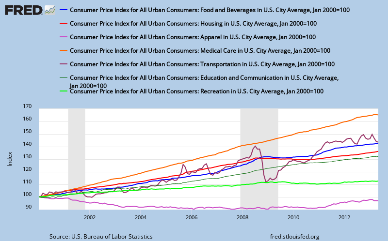
For those of you interested in seeing how these FRED graphs are created, start by clicking on the above graph, which will take you to the FRED page where that graph is archived. Below the graph you’ll see there are 7 lines, each of which describes one of the data sets on the graph. At the bottom, you can click on “add data series”, and we’ll show you how to add another line to that for the overall CPI-U index. In the search bar that appeared, type the FRED code for the Consumer Price Index for All Urban Consumers: All Items, which is CPIAUCSL, and click enter, at which time the entire CPI history from 1947 will appear…then we must set the Observation Date Range to January 2000 by typing in 01-01-2000; Units should already be set to “Index: Scale to 100 for chosen period” from the drop down menu; and the date there should also be 01-01-2000, to match the other graph lines. However, if you were starting a new graph, you’d have to set those metrics yourself. Finally, pick a color that’s different than those already on the graph (ie, black), set the line width to 2 for a thicker line, and hit the “redraw graph” button; you should now have a new graph of the above with CPI-U added in black. If you want to experiment some more, here are 91 pages of BLS consumer price index data sets to keep you busy; you can either type each data set description out or add the FRED code to add lines to the above, or start your own graph and add the data you want to track to it. It’s also pretty simple to sign up for a FRED account (name, email, password) and save the graphs you’ve created at the St Louis Fed for future reference.

New Residential Construction
There were two major housing reports released this week; the first, from the Census Bureau, was on New Residential Construction during May, which estimates the numbers of new building permits, new home starts and completions during the month. As we’ve mentioned before, this report is usually watched and widely covered for details on new housing starts, but the data has such a large margin of error due to the small sample it’s taken from as to render the monthly reports useless for any serious analysis. To collect data for this estimate, census selects a sample of building permits from a random sample of approximately 900 permit offices nationally, to be tracked monthly in person by field representatives, and further has field representatives conduct a road canvass in a sample of roughly 70 land areas not covered by building permits, to identify the start of new residential buildings. As inexact as that is, we’ll again cover what census reported & untangle it anyway, so no one can be snookered by media reports.
According to the Census Bureau, May housing starts were estimated at a seasonally adjusted annual rate of 914,000, 6.8 percent (±10.1%)* above the revised April estimate of 856,000 and 28.6 percent (±14.4%) above the May 2012 rate of 711,000; April’s figure was revised from 853,000 starts, a five month low…the asterisk leads one to a census footnote which says "it is uncertain whether there was an increase or decrease" of housing starts in May…what the numbers mean is that census took their rough estimate from field reps of 86,200 homes started in May, a figure which has a relative standard error of ±4,000, and extrapolated that into an annual estimate based on the normal relationship of May starts to annual starts…taking the margin of error into account, what that means is that Census is 90% confident that May’s housing starts, were they continued at the same pace over the year, would result in somewhere between 883,838 and 1,068,466 million homes being started over the course of a year, obviously not a figure that can be reported with any accuracy. The year over year change, 28.6% (±14.4%), has an even wider margin of error, but at least we can reasonably say that housing starts have increased by a decent number since last year…
The data on building permits is the section of this report that is more useful, to the extent that the margin of error is small enough one can get an idea of the actual activity for permits, since about half of the permit-issuing places in the US are surveyed monthly. For May, census reports that building permits issued in May were at a seasonally adjusted annual rate of 974,000, which was 3.1 percent (±0.9%) below the revised April annual rate of 1,005,000, and 20.8 percent (±1.3%) above the estimate of a 806,000 rate from last May. The annualized number was extrapolated for the May estimate of 93,400 permits and included 62,300 permits for single family homes, 2,300 permits for residences with 2 to 4 units, and 28,700 units in buildings with five units or more. 9,800 permits were issued in the Northeast, of which 5,400 were for single family homes; in the Midwest, there were 15,700 new permits, of which 11,000 were for single family homes; 46,100 permits were issued in the South, which included 32,100 single family homes, and 21,800 building permits were issued in the West, of which 13,800 were single family structures… Since 98% of housing built in the US is in areas where a permit is required, this metric gives us a reasonable idea how much housing construction is intended Of course, applying for and getting a building permit does not guarantee that construction will start. Our FRED graph above shows monthly housing starts in blue and building permits in red as reported on an annualized basis; while individual monthly figures may not be dependable, there is clearly a rising trend for both housing starts and building permits issued..
Existing-Home Sales
 The other housing report was on Existing-Home Sales for May from the National Association of Realtors (NAR). They report a 4.2% increase in seasonally adjusted existing home resales, up from an annual rate of 4.97 million in April to an annual rate of 5.18 million in May, which was the highest sales rate since the first time home buyer tax credit boosted sales in November 2009. Like the Census report, these are annualized figures extrapolated from the preliminary figure of 516,000 homes sales reported by realtors in May (pdf), and NAR reports they represent an annualized increase rate 12.9% over May last year, despite the fact that YoY actual sales have grown 15.1% from the 448,000 May total of a year ago. Single family homes sold at a seasonally adjusted annual rate of 4.60 million in May, up 5.0% from the 4.38 million rate in April, while condominium and co-op sales fell 1.7% to an annualized rate of 580,000 units in May…
Home selling prices continued to increase as well; the national median price for all housing types was $208,000 in May, up 15.4% from a year ago, while the average sales price came in at 255,300, up 11.2% from last May. That median price jump was the largest annual increase since a 16.6% year-over-year increase in October 2005, and culminated the longest string of YoY price increases since the 15 month run between March 2005 and May 2006, at the height of the housing bubble. There was quite a wide variance in regional home prices; the median price in the Northeast was $269,600, up 12.3% from last May, while the median price in the Midwest was $159,800, up 8.2% from a year ago. Meanwhile, he median price in the South was $183,300, up 15% YoY, and the median price in the West was $276,400, up 19.9% from a year earlier. The NAR continues to blame the rising prices on a limited supply of housing, showing the number of homes on the market up 3.3% from April to 2.22 million, which would be a 5.1 month supply at the current annual sales pace. Since these transactions were completed in May, those prices also benefited from the then low interest rates, which Freddie Mac had at 3.54% for a 30 year fixed mortgage…however, 30 year mortgage rates rose as high as 4.24% after the Fed’s meeting, which translates into decrease of about 8.9% in mortgage purchasing power, which should start to impact home prices going forward.
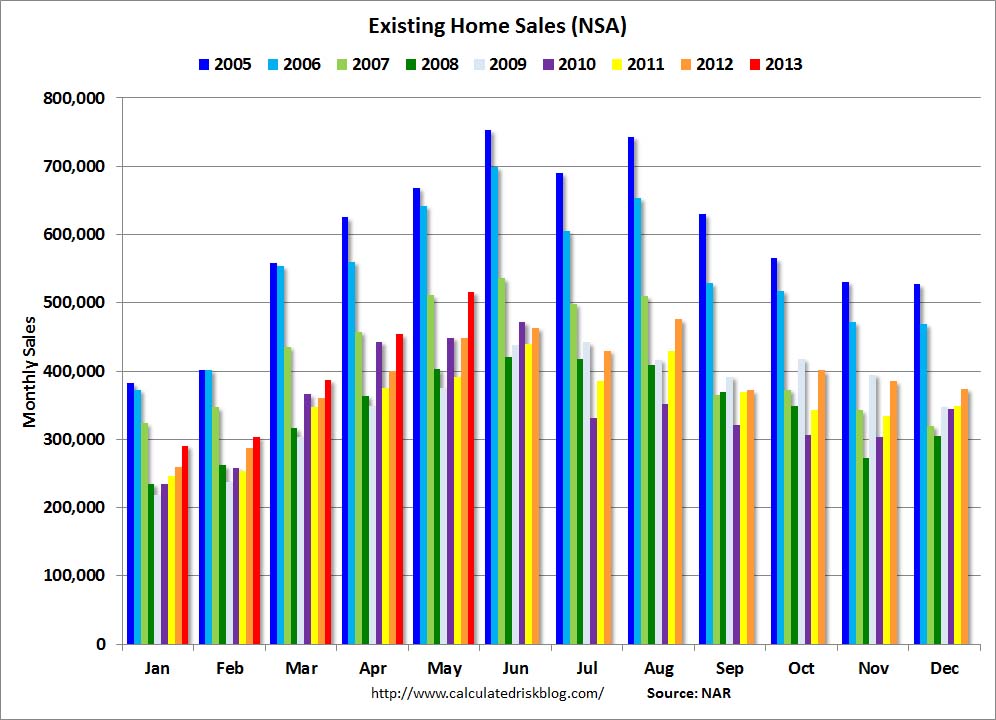
Of May’s total home sales, 11% were of foreclosures, which realtors reported sold for 15% below market value, and 7% were forced short sales, which were reportedly discounted 12%. At 18% of the total, such distressed sales were down from 25% a year ago and remained at the lowest share of homes sold since the NAR started tracking this metric in October 2008.. However, the percentage of all cash buyers continued to increase, hitting 33% of sales in May, up from 32% in April and 28% a year ago, while the percentage of first time home buyers continued to decrease, accounting for just 28% of transactions in May, down from 29% in April and 34% a year ago. In a normal housing market, first time buyers make up 40% to 45% of all homes bought. The bar graph to the above right from Bill McBride shows actual monthly home sales (not annualized or seasonally adjusted) for every month since January 2005; you can see the elevated home sales in the boom years of 2005, 2006, & 2007 in purple, blue and light green, then follow monthly sales through the five years of housing bust as colored coded above the bars (click to enlarge). This year’s monthly sales, in red, seem to indicate that the worst of the sales slump is behind us.


Everything looks ok. More robust ebb and flow of sales. Realtors driving around town, well coiffed, God blessing people or handing out cards when appropriate. Hey, it’s a living. I’d recommend a lawyer for any youngins considering buying, the NAR has no official problem with making people broke. So there it is, pouring coffee, selling cars and homes or pushing paper, we’ll leave the complicated stuff to other countries. Just think Gary Thomas was all up in the news for alleged shenanigans, now it’s days of wine and roses.
So, where’s the brackets for real estate taxes, up 10%. Health insurance, up 15%. Home owners insurance, up 12%. COntractor and shop rates, up 20%. etc etc. Or are these just imaginable costs? Seems to me all of these number tallying asses should be without a job.
Jack; Tenants’ and household insurance, up 2.6% YoY, part of shelter costs; Health insurance, up 4.3% YoY, part of the medical care services index, real estate taxes not a separate item, may be part of rent or homeowner’s equivalent rent…
i should have noted that one can click any graph for a larger image…