Yves here. This coronavirus take differs from other interpretations. Curious as to what other readers make of it.
By NewDealdemocrat. Originally published at Angry Bear
Here is the update through May 12.
I will restart giving the daily increase in infections if States that have “reopened” start to increase significantly again. The preliminary evidence is that customers are largely staying away from reopened businesses in those States.
Number of new and total reported Infections (from Johns Hopkins via arcgis.com and 91-divoc.com):
- Number: 22,080, total 1,370,016 (vs. day/day high of +36,161 on April 24)
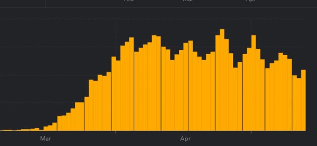
There has been a 1/3 decrease in the number of new cases in the US from peak. The US nevertheless has the worst record in the world, by far.
Number of deaths and rate of increase in testing (from COVID Tracking Project)
-
- ***Number of deaths: 1,510, total 76,617 (vs. day/day peak of +2,700 April 29)
- Seven day average of deaths: 1,616 (vs. 2,058 peak on April 21)
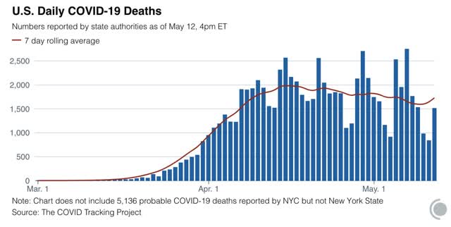
- Number of tests: 289,472 (vs. 318,720 daily peak on May 7*)
- Ratio of positive tests to total: 14.3:1 (new high* – target is 15:1)

- 7 day average of tests: 283,000* (new high)
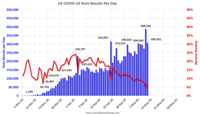
- 7 day average of positive tests to total: (11.3:1* vs. target of 15:1)
*These numbers exclude 113,489 past negative tests reported by NJ on May 11
Note several things:
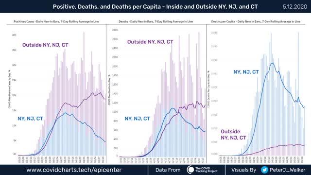
1. The number of new infections in the rest of the US increases dramatically starting on April 20, the same date that testing nationwide broke out of its 150-160,000 range and increased to nearly 300,000/day. This shows that the increased cases outside of NYC were mainly an artifact of increased testing.
2. The number of new infections in the rest of the US has *decreased* in the past week. Once we hit enough tests, the underlying trend – a slight but significant decrease in new infections – came through.
. While the NYC metro decline is the lion’s share of the nationwide decline, in absolute and even per capita terms, the NYC still has far more new cases than the rest of the country as a whole.
This clearly shows that, for the scale of outbreak, NY and NJ have been in a scale all their own, and that their huge decrease still shows them having a large number of cases.
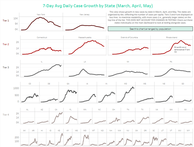
On the other hand, down at the very bottom line “Tier 4,” we see Hawaii plus 5 rural States (AK, MT, VT, WV, WY) “crushing the curve.” Based on the criteria I set forth yesterday, and including this graphic, I rate the States in the below summary.
Summary for May 6
- The number of daily new infections, adjusted for testing, appears to have peaked three weeks ago. There has been a decline of about 1/3 in new infections since then.
- The number of daily new deaths appears have peaked about 2 weeks ago.
- The trend number of daily tests has improved dramatically in the past 3 weeks to nearly 300,000. Better still, for the last 2 weeks, new infections have declined, even with higher testing – a very positive sign.
- The increase in infections in the rest of the US in late April and early May was mostly an artifact of the dramatic increase in testing in the rest of the country.
- My personal suspicion remains that the actual number of total infections in the US is about 5x the official number, or roughly 6.8 million, over 2% of the total population.
- Based on testing, a significant portion of the rest of the US outside of the NYC and other large metro areas could soon transition to a “test, trace, and isolate” regimen, but with few exceptions there is no sign whatsoever of the necessary preconditions being put in place. States’ conditions are rated below.
- Grade A” States (crushing the curve): AK, HI, MT, WY (4)
- Grade “A-“ States (close to crushing the curve): ID, WV (2)
- Grade “B” States (50%+ declines from peak, but not yet “crushing the curve”): AR, FL, LA, MI, NJ^, NY, WA (7)
- Grade “C” States (20%-49% declines from peak): CO^, CT^, IA^, MA^, MO, NV, OK, PA^, RI^, TN (10)
- Grade “D” States+DC and PR (insignificant declines from peak): DC^, DE^, GA, IL^, IN^, KS^, NH, NM, ND, OH^, OR, SC, PR^ (13)
- Grade “F” States: (failing: new highs in infections): AL, AZ^, CA, KY^, MD^, ME, MN^, MS^, NC, NE^, SD^, TX, UT, VA^, WI^ (15)
^= significant shortfall in testing, thus missing cases


Granite stater here. NH has two distinct profiles. The southern region, adjacent to the Boston area, continues to see increases in infections. The western and northern regions are seeing declines, and in more remote areas, haven’t had any cases.
But southern New Hampshire is where the lion’s share of the people live, and almost all the densely settled areas. Which I think is true for most states: the metro areas are where the people are, so those are the areas of concern.
(By the way, it is not clear that Mass. was the vector of infection for NH. Some early cases came directly to NH from international travel.)
The whole country has to have a plan for truly rural areas, like how to relax restrictions there early without them being flooded by people from the metros.
1. “A” and “A-“: mountains and oceans. Easy to self-isolate when you’re already isolated.
2. Testing is necessary but not sufficient. More False Positives than True Positives. That’d be good for assumed rates declining, but the False Negative numbers are pretty nasty, too.
3. Lag times in ecological models can cause unexpected, sometimes paradoxical effects. And in the Verhulst/logistic models, by r0=3.6, chaotic behavior has begun, and interpretation of cycles breaks down. It’s like the shift from laminar flow to turbulent behavior in fluid systems; you can get waves with laminar flow, but turbulence messes with modeled behavior. You can model the mean but not predict the outliers. And that’s a problem with individual superspreaders with r0’s in the hundreds.
Despite differentiating the states at the end, the author excises the NY area and then treats the rest of the country as a uniform field. Which it ain’t. Does he draw any conclusions from the state data except ‘look, rural!’? If not, then those charts are just window dressing.
The number of hospitalizations for Covid-19 are reported by Johns Hopkins every day for most US states. These are going up relentlessly, about 1 percent per day. This seems like the cleanest data set we have.
Teacher gave the class here an F (a passing grade, of sorts)
Tulare County has a surprisingly high rate of infection with nursing homes, a meat packing plant & a frozen Mexican food plant leading the way. The other day news came out that a couple of Target employees in Visalia (pop 136k) had tested positive, so tendrils are spreading.
The evangelicals really hold sway here, and until 2 months ago they were told the virus was a hoax, so they’re not only a little slow on the uptake, but want to be quick on the re-open, a recipe for disaster. My shopping days in Visalia are numbered, lemme tellya.
The next issue will be how Ag workers in the Central Valley are effected by Coronavirus, as most all of the employees at the aforementioned plants are Mexican-American, and its not uncommon for towns of a few thousand to 10,000 around these parts to be 85% Hispanic (read: Mexican) in population makeup.
I feel we were very early to shelter in place (SF Bay Area, then So Cal, then the state) then NY, etc, and also with mask wearing.
Any reason for the CA daily case growth graph (tier 4) still trending up, versus NY’s (tier 1)?
LA is now the epicenter of Covid-19 cases in California. Cases are increasing at ~2% per week: 35,000 cases and 1700 deaths to date in LA. Masks are now mandatory when outside the home. County Health officials do not believe the pandemic is under control. Beaches are now open; by popular demand. We’ll see.
Wukchumni
May 16, 2020 at 7:50 am
Fresno reports the number of additional cases daily (except Sunday) and the number of deaths.
For a while, I had hopes that the worst was over.
4/15 to 4/40 there were a total of 7 deaths – no increase at all for 13 days.
5/4 to 5/11 there were a total of 9 deaths – no increase at all for 7 days.
5/13 to 5/14 there were a total of 13 deaths
5/15 a total of 16 deaths.
Fresno started off slow, but there is no indication that it is going to slow down – especially in light of the fact that re-opening (albeit “controlled”) has started.
I have a dim view of humanity (which I believe is a realistic view of humanity) and until a majority know someone personally who has died of corona virus, effective counter measures won’t happen.
El Centro, 120 miles east of San Diego, also started off real slow. I thought, wow, living in the middle of nowhere finally paid off. Now the march is on and we’ve been in lockdown as long as the rest of the state. We’re up to 786 positives out of 5,224 tested 15 deaths. The number of positives seems like it’s been really accelerating the past two of weeks. It feels to me like we’re in the middle phase not the end.
the delayed effects are anxiogenic(and I like Steve’s Laminar vs Turbulent)
out here, we had no cases…then backslapping city manager spread it throughout the public workforce(when tests were still denied to asymptomatic, etc–an assumptional artifact of previous pandemic experience…and i was the only regular mask wearer.)—who then spread it to their kids/family/people the next table over(as many as 30%(anecdata) of the local positives said it was like bad allergies, to be blown off…since it was all a hoax, anyway)–a week after 5 or so folks at the city got tests and tested positive, local authority, + national guard, ramped up testing and removed most restrictions…week later, positive cases soared…which is when mask wearing became more commonplace. Now, initial city employees have completed recovery/quarantine, Texas “Opened Up”…and many people swarmed out into the cafes….maskless….as if it were Over…their most fervent wish. that was 2 weeks ago(time has never been so amorphous, even for the normally relatively Timeless Me).
as i expected, news is trickling in via jungle drum/chisme: owner of one of the two greasy spoons that serve as town halls has it…him with silicosis from the sand mine—he is gregarious…another backslapper: perhaps another variety of “superspreader”.
a nurse at the clinic(in spite of their latex fetish and bending over backwards for protocol) has it…these two exactly 11 days from “Reopen”.
I expect a wave in the coming week.
the restaurant owner’s bidness was closed down, right quick…employs maybe 30-40 people, out of county pop of 4300. I expect many of the employees to get it, as well as many of the customers(people linger there and chew the fat)
haven’t yet heard who it was at the clinic, nor what they’re gonna do.
Like with my “fieldwork”/lay anthropology/lay poli-sci…i reckon i have a pretty decent lab model out here, and will be definitely paying attention to what happens in this small, isolated place.
it won’t be necessarily correlative with larger groupings, but might be interesting any way for the granularity you can get from knowing everybody.
Nice comment.
@Amfortas the hippie
May 16, 2020 at 7:50 am
——-
Yes, Amfortas, please continue reporting on the situation there. It’s a fascinating study in small town dynamics.
And I really enjoy your writing style no matter the subject.
Amfortas the hippie
May 16, 2020 at 7:50 am
I may as well join the mob – I enjoy your writings as well
I think a key missing issue is the granularity of the data. Even in a very small and relatively homogenous country like Ireland there is a very big disparity across quite small distances. This is a key reason I think why those national/state level charts can be very deceptive. We know that once movement is opened up it can hop across regions very fast, which is why an area with seemingly low areas of infection can then cause a sudden spike. Even countries which have had good controls have found it easy to lose control – Portugal for example and even South Korea has struggled.
So I think a key problem with those nice simplified graphs, which I think are very useful most times, is that they can lead us to assume that once the curve is going downward, we are now in control. I don’t think this is the case at all – the curve only tells us that the restrictions of a few weeks ago were reasonably good at getting R0 to reduce. It can increase in an instant.
There are a lot of mysteries about this disease and how it spreads, but it seems very clear that we are not seeing simple surges and declines – its highly localised, based around individual clusters and super spreaders, which can then expand rapidly when restrictions on movements are lifted. Unfortunately this means that what matters is not that we have the curve going in the right direction, or that very low infection rates means that the virus has been defeated, but whether we have the systems in place to crush localised clusters and prevent more general spreading. This has proven to be extremely difficult, even in South Korea and China and Vietnam. I don’t think the US is remotely close to getting to that stage, because it has to be done on a national level, not State or regional, simply because there is too much movement of people within the US.
PlutoniumKun
May 16, 2020 at 7:51 am
Good and important insight. As the trope goes, the map is not the territory
Reminds me of when they talk about a forest fire as being X% contained. If it’s not 100% contained then it can spread again, as long as there’s fuel. In the pandemic case, as long as there are susceptible people. And we don’t even know if those who have had it are immune.
Yes, thanks, forest fires are a good analogy.
I was just reading this morning that Vietnam, one of the big successes in the fight against Covid, has had a major surge in cases. its a reminder that we will not really know who has been a success or a failure for many months, maybe years. I fear we will see major surges in cases all over the world right through to the rest of the year at least, and many of those could well be in ‘success’ countries. We just don’t know enough.
North Carolina here. Going out to any store you see why we are failing so badly. Employees in several stores hardly wearing masks and a random application of mitigations.
I was in a home depot and they have hand held scanners at the self service check out. I asked the woman if I had to pick up the scanner and “Yes” she said with her surgical mask under her nose, “but we sanitize them.” So I watched, and five customers used the scanners and she did nothing.
But this is hard to understand with all the elite university hospitals we have here. I think the largest amounts of cases are in the nursing homes.
I an suspecting the UNC University System to be remote learning in the fall.
Krystyn, I saw a brief TV report (very short on substance or explanation) about anti-inflammatory “lipid mediators” for calming the cytokine storm. Do you now what “lipid mediators” are?
Lipid Mediators relate to the control of the inflammatory and anti-inflammatory products of Poly-Unsaturated Fatty Acids (Omega 6 and Omega 3). So something like COX-2, produced during the metabolism of PUFAs, will play a role in heart disease. A lipid mediator like aspirin will lower COX2.
This is why I said earlier that Omega 3 might be important in outcomes. Many things are both positive and negative lipid mediators, like zinc and stress.
I remembered you mentioning the Omega oils and an imbalance between 6 and 3 (of which I’ve been vaguely aware but really unclear on) which spurred me to ask you when I saw this report… it was very brief… maybe even a scroll… think it mentioned research coming from Thailand… and apparently cannabanoids are lipid mediators too… maybe the sativa effect some have asserted?
Thanks as always for responsing!
I missed your earlier discussion of Pufas… would you mind repeating? Thanks.
Carrboro here, since the governor relaxed the rules (nonessential biz okay but not bars/rest or personal care, increase in % occupancy, gatherings of up to 10 outside, opening state parks) last Friday, this week I observed a dramatic decline in other shoppers wearing masks during my gloved, masked foray into the grocery store.
Our cases are increasing, not declining, but perhaps as per the post this is due to testing? not convinced it is necessarily so by the timing—is this one of those causality vs correlation issues? Also NC is still having a hard time ramping up testing.
Carrboro here as well!
I noticed the same thing, once the order came up people though it was over and you could do what you want.
Weaver Street Market is still the best/safest place to shop in my opinion. They still require you to wear a mask.
we should do a socially distanced mini-meetup! thanks to you, I am on a daily zinc regimen ;-)
Sure! You can reach me at my full name at proton mail
my test took 3 days before they called me…on a sunday, which is unheardof around here regarding healthcare.
stuck a giant Q-Tip all the frelling way up my nose…far enough to where i didn’t know I even HAD nose that far up.
I worried about her poking my brain.
all this in the parking lot where the ambulances used to back up to, when we still had an ER.
(all the shit’s still there, including the X-Ray Machine from the 50’s(still works, remarkably))
she in an almost hippie chick version of a Moonsuit….edges of overlapping layers, flapping in the wind.
no way i caught it from her
demeanor of a Nun….sitting out there in all that get-up, waiting for me.
and for a lift:
https://www.youtube.com/watch?v=fc98dz8Zibs
There’s a few points that are worth adding to this excellent post. The US death counts (and case counts) show evidence of being thoroughly corrupted ever since mid-April–apparently by the count-maximizing pressures from CDC plus state and local health bureaucracies, not to mention by profit-maximizing hospital managers looking to collect those Medicare $13,000/$39,000 add-ons for coronavirus-coded patients. This is more obvious from the worldometer daily death graph, which I would like to post here, but can’t. But there was a definitional change on April 14th and this has corrupted the data somewhat. On the whole. however, even with the corruption the trend is downward.
What is striking is the strong weekly cycle that started immediately after the April 7-10 peak–and that weekly cycle has its low point every Sunday thereafter. This appears to be something more than just a public healthbureaucy that doesn’t feel like filing reports on the weekend. It looks more like every Monday to Wednesday the bureaucracy is busy trying to dig up more and more cases/deaths to code (or re-code) as COVID. What’s really pointing in that direction is that the trendline of the weekly minima is decreasing considerably faster than the trendline of weekly maxima–sure makes it look like every week they’re recoding into COVID counts more and more of the massive number of excess heart attack/stroke/kidney failure/cancer deaths that are actually being caused by the panic and not by the virus.
County medical examiners, who have no financial incentive
to pump up the COVID-19 death figures, have been banned from
announcing their numbers to the public in (at least) Florida and Nebraska.
In Florida, the state’s numbers exclude nonstate residents (tourists and snowbirds).
The numbers are indeed being cooked, but in the opposite direction from what you claim.
Thanks for this. Of course those pushing the maximum danger view claim the death count is under counted. I’d say the key takeaway is that the death rate–just like almost everything to do with this situation–is uncertain. And therefore those who make confident assertions about what is happening are blowing a certain amount of smoke.
We will know what it was all about when it is over.
re: under-/over-count:
I’ll keep watching out here, in my county petri dish, but so far, out of 30-some confirmed cases(last update thurs?), only 2 have had it bad enough to get hospitalised; one, a little girl with cerebral palsy…the other, an old, already ill woman.
I’ve heard, either from the patient, themselves, or from family and acquaintance, that 10 or so of the positives have experienced “the sickest i’ve ever been”…the rest, below that level.
losing the taste and general, overwhelming fatigue are the most common complaints outside of the respiratory stuff.
around 35% of our population is over 65…12% or so is over 75.
there’s also…by official counts, bolstered by knowing a bunch of them…maybe 12% disabled/sick under 65.
usually follow on from diabetes/obesity/heart disease/kidney/etc.
all the cancer patients and others with compromised immune systems(lupus, etc) have…to my knowledge…been quarantining
My town had three days of free to all testing last week which will doubtless make our county case total go up. The above about how case and death totals go down on the weekend rings true in my state where the Sunday totals are often lower.
And I too have read that the CDC has told coroners to tag any death from Covid like symptoms as a death from Covid even though the victim may have had other ailments and may not have even been tested.
Bottom line: nothing seems very certain at this point except that the NY tri state area is the country’s major hot spot. I’ve noticed the daily NY Times dashboard has switched from deaths per 100k to the somewhat less accessible “share of population”–perhaps to make the NY area seem less bad by comparison on cursory reading. The latest for NY State would be that one person has died of Covid for every 701 people.
I suppose that for a country the size & population of the United States, the only reasonable way to deal with this pandemic there is on the State level. Because of the population characteristics of each State, the geography, the climate, etc., each State would set a minimum of measures to be taken from the full menu of responses. On the County level below them, responses could be more granular but they would have to adhere to the minimum set by the State. They could exceed these measures but they would have to adhere to the minimum.
As an example, if you had a sparsely populated State with a few major cities, the precautionary measures carried out in the cities may not be necessary in a rural setting unless clusters of infection turned up. The State may not require face masks but if Counties in that State had outbreaks, they could go full mask. If a crowded State had a face mask policy, then no County could drop that requirement.
Here in Oregon stats are now being reported out by zip code and in my own county (Lane) the
Most recent report includes a case map:
https://lanecounty.org/cms/One.aspx?portalId=3585881&pageId=16610736
The aggregate date is still a bit course and they’ve stopped reporting some other factors by zip for privacy reasons.
Two other things I’ll note – 1:) Oregon ramped up testing recently as a pre-condition to phased re-opening which may skew the data a bit and 2:) The big metro area here is Eugene and the UO closed down just before Spring Break and the students (20k +) left and did not return. If the UO reopens in the fall as planned we will see a big inflow of “outsiders”
I have a friend in Eugene who thinks it’s nuts they are opening up bars and restaurants. For the longest she couldn’t understand why Lane had so many fewer cases and deaths than the neighboring county where Salem is (which isn’t opening up).
Yesterday she told me that Lane is way behind other OR counties in testing. Plus they are opening up Eugene with no travel restrictions to prevent those from other counties coming in to take advantage of the amenities.
She ain’t planning on changing her behavior any time soon!
But honestly I doubt public universities are going to be housing students on campus this fall, or perhaps only those whose majors require lab facilities etc.
Eugene, Oregon here. Thanks for the Lane County link, I’ve been following the state site and their data since early March and it’s nice to have zipcode info handy.
I started tracking data from the state back in early March. Statewide, new daily cases peaked (70/day) back on 13 April (using a 14-day rolling average) and declined until 4 May (55/day), at which point cases started increasing back to the peak 70/day as of 12 May, which is not good news.
As noted elsewhere, this may simply be a reflection of increased testing. During the same period, testing started out flat (1,300/day) for two weeks, then slowly increased to roughly 2,000 a day starting 8 May, again using 14-day rolling average. These numbers are woefully inadequate, with a little over 2% of the population having been tested to date.
Lane County has done better, with new cases also peaking (2.1/day) back on 13 April. We are now averaging .8/day, although that number has risen as well from a low of .3/day back on 1 May. Testing has steadily increased from 52/day to 230/day.
I attribute the low number of cases here to basically Eugene having an intelligent community who reacted quickly to shelter-in-place, and are (mostly) sticking to social distancing and mask wearing protocols. That said, I see an increasing number of fools, mostly males of all ages and younger females, ignoring protocols.
In any event, it will be at least a month before the impacts of “re-opening” (whatever that means) can be assessed.
Here in Arizona, there’s quite the push to Reopen and Get Back to Normal. Well, I’m here to tell you that my fellow Tucsonans aren’t stampeding back to the bars, restaurants, and other businesses that are reopening.
It’s still very quiet on the streets — I’m loving every minute of it — and I’m not seeing that many people walking around yet.
Meanwhile, the state and the municipalities are duking it out:
https://tucson.com/news/local/pima-county-supervisors-plan-to-amend-rules-for-businesses-after-some-lawmakers-push-back/article_76f03cc6-bd91-560d-a348-1d04718d010f.html
Methinks that we will see a second wave very soon.
And Az not getting good grades anyway… daughters family in Tucson, so I pay attention.
Send her my socially distant greetings.
I think the author is a bit too sanguine. If we look at what Jerri-Lynn posted yesterday about Hong Kong, contact tracing will be most effective with _very few_ infections, i.e. huge numbers of tests for a very small number of infections. This appears to be part of the South Korea formula, too.
As long as we’re at 20K infections per day (down from about 25K the previous 5-6 weeks–so I’d call that a 16% decline BTW not a one-third decline), contact tracing will still be very difficult.
“If I were king” so to speak, I’d be obsessing every day in the media and any outlet about confirmed cases per day and trying to get that under 7-day average under 1,000. Only when we hit that mark do I think we have half decent control over the disease.
Looking at the NYC curves (and that of many countries, e.g. Spain and Italy) the rate of decline after the peak is much slower than the rise to the peak. So, this is going to be a long haul.
The U.S. was tracking Italy very closely in terms of new cases per 1 million population until about two weeks ago, at which time Italy started to come down much more rapidly than the U.S. (death rate is much lower in the U.S., however).
Guess which European country the U.S. tracks most closely with now? The U.K. But Ireland is doing much better, more like Italy. So, it does seem that cultural factors are important.
Has Boris finally stopped uncontrolled arrivals to U.K. via air from the Continent? After Brexit, I would have thought “island isolation” would have been among his first priorities. Trump restricted crossings from Mexico and Canada very early on. Domestic U.S. travel continues without much restriction, but at your own risk (and everyone else’s).