By Pavlina Tcherneva, Assistant Professor of Economics at Bard College. Originally published at New Economic Perspectives
The New York Times made waves this week with another piece on inequality, saying that it has not risen since 2007. The article was based on this paper by GWU’s Stephen Rose.
The article also suggests that expansions are not a good way of looking at trends in inequality (as I have done in the past, also covered by the NYT). Instead, one needs to look at the business cycle. It also concludes that, thankfully, because of government tax and transfer policies, inequality has not been “that bad” over the last few years and governments can clearly do something about it.
So what’s wrong with this picture?
Here is the graph that appeared in the NYT (I’ve reproduced it below showing only the bottom 90% and top 10% of families using the same Saez data).
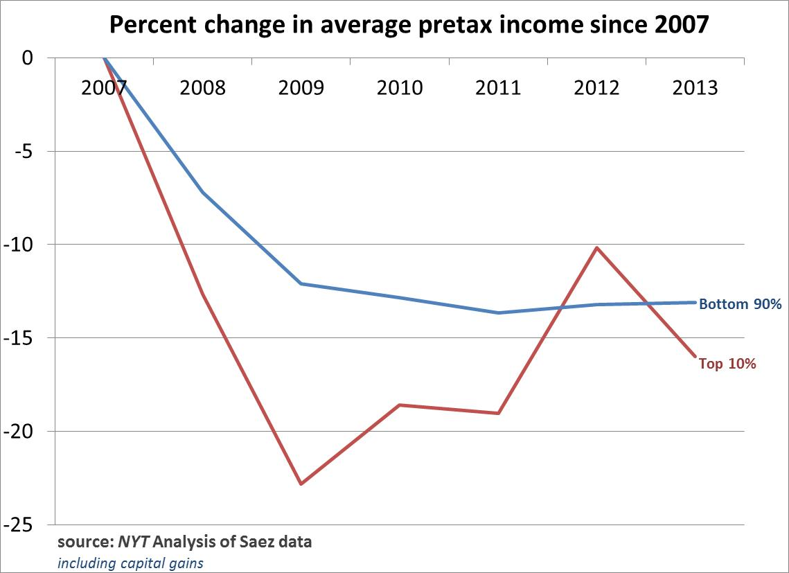
Now let’s reproduce the exact same graph, using the same data but excluding capital gains. The trends reverse. The bottom 90% of families have lost proportionately more than the top 10% since 2007.
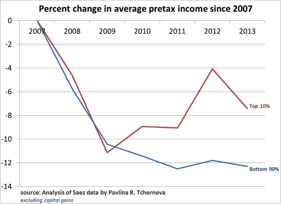
Now, I am not fond of excluding capital gains (I am in favor of annuitizing them), because they are very important to income dynamics, but still, one can glean some insights from that data.
At first these results may seem counterintuitive. Without capital gains, the incomes of the bottom 90% fall faster than with them. It turns out that even though the bottom 90% of families get a very small share of their income from capital gains (less than 2%), for them capital gains are the difference between rapidly falling income and barely falling income. In other words, with capital gains, the bottom 90% didn’t experience as drastic a decline from the 2007 highs, but without them, incomes fell proportionately more than those of the wealthy.
In any case, if we include the top 1% and the 0.01% in the above two charts, one would find that they do lose proportionately more including or excluding capital gains.
However, the bottom line is this: this exercise gives an extremely narrow look at income distribution trends, based on a very incomplete picture. As Nick Bunker from the Washington Center for Equitable Growth put it:
“Reasonable people can disagree about the best benchmark. But what isn’t reasonable is using a peak as a benchmark to claim inequality hasn’t increased over an incomplete business cycle.”
So let’s look at complete business cycle data. The following chart shows how the distribution of income growth has evolved from one peak to another.
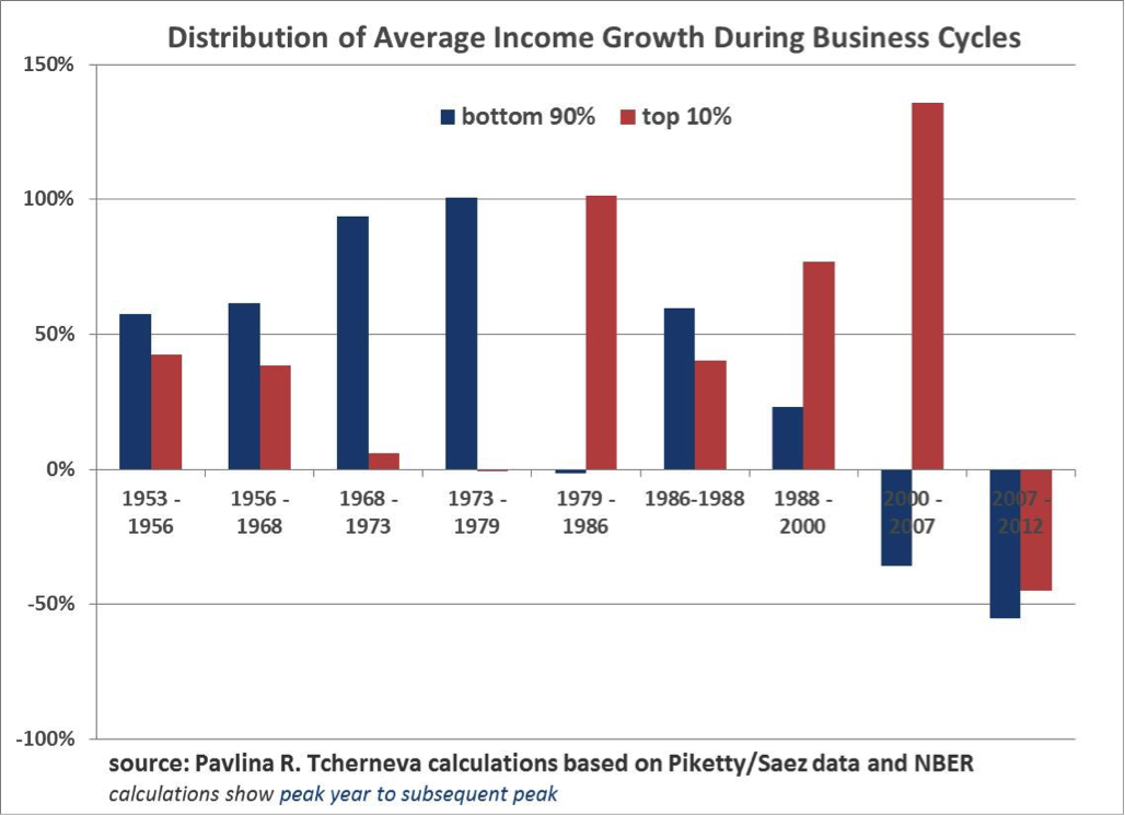
There is a clear shift in trend after the 80s. During 3 out of the last 4 complete business cycles, the wealthy 10% have gotten a proportionately greater share of the growth. And in the last full business cycle (2000-2007), they got all of the growth, while incomes of the bottom 90% fell. Yes, since 2007, both groups shared the losses about equally, but why should we be surprised that the top 10% shouldered 45% of the decline? (Again, this is not a complete business cycle yet!)
We live in a casino economy driven by serial asset bubbles, where the incomes of the wealthy (and not just their capital gains) are increasingly tied to stock market performance.
So when the biggest bubble in human history popped, the wealthy families lost a ton of income. At the same time middle class households fell into poverty, lost their decent jobs and pay, and got unemployment insurance or food stamps from the government. Can one really conclude from this that inequality is not “that bad”?
As an example, inequality will not be “that bad” if one person in the US earned 100% of all the national income, and then the ‘evil government’ (or ‘benevolent dictator’; take your pick) decided to tax most it and then gave transfers to the rest. But is this the kind of ‘better’ income distribution that we are aiming for? Aren’t we all talking about an economy where most people have decent jobs, decent wages, decent salary growth prospects, and decent chance to participate and share in that growth?
There are many ways to slice and dice this data.
I have looked at expansions because they answer a very specific question: Once the economy returns to some normalcy and promises to deliver prosperity, to whom does it keep its promise? And the answer is, increasingly to the top 10%.
The problem with the NYT article is not the inequality chart, even though it shows an incomplete and thus misleading business cycle picture. The problem is the conclusion: that ‘taxes’ and ‘transfers’ are the solution to the deep structural economic problems that are causing the generation and distribution of incomes to be so inequitable from the very outset.
So the next time someone tells you that “a rising tide lifts all boats”, you can respond “no, increasingly it sinks most”.


“At first these results may seem counterintuitive. Without capital gains, the incomes of the bottom 90% fall faster than with them. It turns out that even though the bottom 90% of families get a very small share of their income from capital gains (less than 2%), for them capital gains are the difference between rapidly falling income and barely falling income. In other words, with capital gains, the bottom 90% didn’t experience as drastic a decline from the 2007 highs, but without them, incomes fell proportionately more than those of the wealthy.”
Actually, I don’t see this. The y-axis in the first graph is considerably more bunched than in the second, which skews the presentation. In fact, it looks to me that the blue lines in both graphs are virtually identical. The surprising thing to me is the red line. I would have expected capital gains to drop dramatically as a result of the crash, so the first graph is not so very surprising. However, the top 10% incomes fell even excluding capital gains. On the other hand, my general impression of the Saez et al. data over the last couple of years is that the real gains over that period have gone to the top 1% and 0.1%. It wouldn’t surprise me at all to find that incomes of people in the range of 90-99% haven’t recovered.
Income is ephemeral, wealth rarely is (or takes a long time to burn through if you are inept). The reason the wealthy are powerful is not their income. The Koch brothers don’t hold the sway they do because of their income. It is because of their wealth and the wealth they command as owners and controllers of capital (corporations, banks, insurance companies, brokerage houses). If Lloyd Blankfein was paid a dollar a year, he’d still be enormously powerful. And wealth is a cushion, a life preserver, a hedge against the future that income never is. So the whole enterprise of Saez et al. is disingenuous, to say the least. It completely misses the point of why we are unequal.
Who are the 10% and how consistently do individuals remain there? Move the line to the top 15%,to make the point clearer. Many of those employed in the technical fields or who reach a certain level in a business organization may find themselves in the top 15% for a number of years only to suddenly find themselves in a much lower percentile following unemployment. In technical fields a form of planned obsolescence combined with relentless off-shoring and out-sourcing of technical jobs almost guarantees a sudden drop in income, often a decade or two before retirement. Both technical people and middle managers are grist for the mill when the company they work for is bought up or sold off to larger companies or large holding companies. Then there is the two-income trap. Most of the people I know, mostly people in the lower 80% live right up to and sometimes a little past their incomes. Almost all of them have time payments on their primary assets, such as they are, theirs houses and cars if you can consider a car an asset. These assets are lost or must be sold at a loss when they lose their income. Their savings are depleted as they attempt to carry on with their life as before and continue hoping for the best.
This seems like a reprise and variation on the destruction of organized labor and the looting and dismantling of manufacturing. How many union employees were relatively well off up to a point in their lives, and dashed to the ground as the companies they worked for closed and moved overseas, or to the American South as a way-point along their exit from this country.
I suggest a refinement of your observation. The wealth of the less than wealthy, those whose wealth is their house, and possibly some form of savings, bank accounts, IRAs, 401K plans, is ephemeral in contrast to the wealth of the wealthy — as you keenly observed. The wealth of the less than wealthy, wealth supported on their income, is also ephemeral.
Pavlina doesn’t say so, but one way to create equitable income distribution from the bottom up is to have businesses where the employees own the company. Pay disparities do occasionally crop up in worker co-ops, but not nearly to the degree found in capitalist businesses. GRITtv recently released a great mini-documentary for anyone interested in forming their own co-op:
Own the Change: Building Economic Democracy One Worker Co-op at a Time
We have some very effective co-ops here in Berkeley. Anecdotally, my experience at those co-ops is starkly different vs. other business I visit. More engaged workers and low employee turnover, which leads to better service; the employees are all in it together and take great pride in business planning and working toward longer term projects together; and the business are extremely busy.
@Diptherio … *smiles*
WRT @James_Levy … The visible income is a lovely playground for the academics. The much harder, if not impossible, analysis is the actual ratios of wealth/power among some real boundaries. There is a very small group of people who control the “investments” that make up the bulk of the ownership positions in most of the largest multinationals. Apple, as an example is 62% held by “Institutions” according to Yahoo finance this morning. Institutions. Banks, Mutual Funds, Pensions. Not the 0.01% and not the 99.99% but zombie representatives controlled by people who wield the power such “ownership” confers. Think Carl Icahn or Lloyd Blankfein. It is likely that “Institutional” holdings increased as a percentage of Property Ownership at a different and probably greater rate than Paulina’s or Picketty’s analyses indicate. I’m not expecting that work to be done any time soon.
No, I have not read Pickety’s “Capital” … guilty of extrapolation from critiques.
Yves, TRhank you for the sound analysis. As I see it, however there is another large fundamental flaw to the work: the derivative does not matter if the gulf is already wide.
The primay flaw I see is that it treats the relative changes side-by-side as if that matters but if the top 10% are an ocean apart from the rest then it doesn’t really matter if the rate changes all that much over such a short period as it would take decades to make up the difference.
Centuries, with the high levels we’re starting from. Very good point.
This is a fine article, but you have used the wrong graph from Tcherneva. Notice the cycle peaks are not US business cycle peaks. Tcherneva did prepare a graph – which is actually better for your point – of US business cycle peaks.
Even with the correct Tcherneva graph, it is not “peak to peak” for the current cycle since it ends in 2012. 2012 was just after the 2011 trough (see here: http://www.advisorperspectives.com/dshort/updates/Median-Household-Income-Update.php) for real median household income. Real per capita adjusted gross income also bottomed in 2010 or 2011.
To make it apples-to-apples for the current expansion, you would need to measure 5 years after each cycle peak, or 3 1/2 years after each cycle bottom. Finally, since retirements cuts income drastically, you need to account for Boomer retirements, or measure with just the prime working age.
Again, I don’t have a problem with the article as a whole, just the use and description of that particular graph.
The final graph is not for US business cycle peaks. There is one, I don’t know why you didn’t use it. Also, since it ends at 2012, it is not accurate to say that it is measuring peak-to-peak, including the current expansion. It is pretty clear from Sentier Research’s monthly updeates of real median household income (see http://www.advisorperspectives.com/dshort/updates/Median-Household-Income-Update.php) (a slightly different measure) that the trough in real incomes was in 2011 or 2012.
Additionally, since income falls dramatically upon retirement, and massive amounts of Boomers have been retiring, unless it adjusts for demographics, it is very vulnerable to that criticism.
I don’t dispute the overall point of this article, but the correct graph should be used, noting its limitations.