He found the nodal points. Sometimes, falling asleep in Santa Monica, he wondered vaguely if there might be a larger system, a field of greater perspective. –William Gibson, Idoru
Representation is the essence of social engineering. –Fred Brooks, adapted
By Lambert Strether of Corrente.
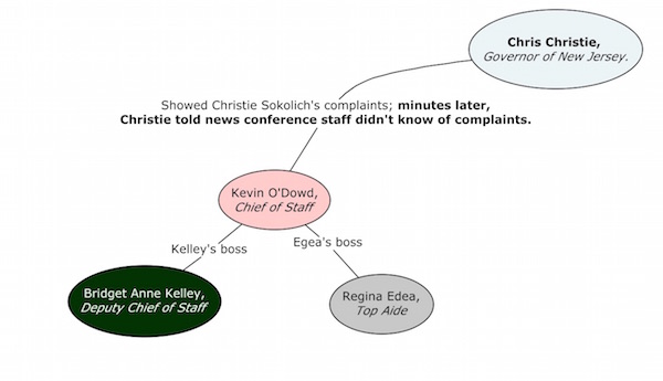
Last April, I was enchanted by a diagram of the “web of corruption” surrounding New Jersey Governor and Republican Presidential candidate Chris Christie, which the New York Times coyly labels “the Lane Closings,” but which you and I know as BridgeGate. I encourage you to go view the original article at full size, and spend a little time reading it. This is the diagram, created by Bill Marsh and Kate Zernike:
Figure 1: Christie’s Web of Corruption
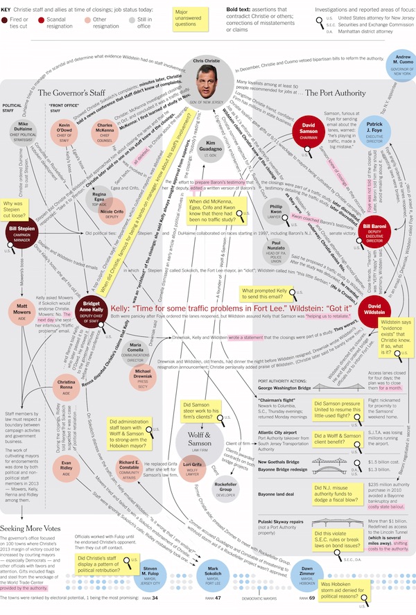
You can see how it would be interesting and even useful to map the webs of corruption surrounding Jebbie, or Hillary Clinton, or even Donald Trump; each of these candidates has a different type of corruption within our typology of corruption, and presumably one would expect that a proper visualization of each candidate’s “social network” would show differing patterns, rather like different species of spider can be classified by the geometries of the webs they weave.
That strikes me now; what struck me in April would be how useful it would be, for Naked Capitalism readers, if Richard Smith’s narratives of incredibly intricate international scams could be visualized using a similar technique, and so I set out do determine it was possible to support that use case. (Spoiler: Very possibly, depending on requirements.)
Before I go on, I should introduce some simple — really! — terminology. In the diagram, Christie is a node. Nodes — Christie and his colleagues and minions — are connected together by lines called arcs. Both nodes and arcs can have labels (“Chris Christie,” “Many loyalists among at least 50 people recommended for jobs,” respectively). The entire set of nodes and arcs is called a graph; that is, Figure 1 (above) is a graph. Generally, I call a subgraph of nodes and arcs within a complete graph a relation; Christie and his Chief Staff, Kevin Dowd, have a relation. Caveat: People also use “graph” to mean “chart.” Not only is this confusing, it makes graphing software hard to search for (especially as Google is increasingly abandoning its hitherto core search function and degenerating into a meta-shopping cart, ka-ching). Caveat: Graph theory has a powerful mathematical grounding, so but and different schools of thought have adopted different terminologies; for example, “edge” for “arc.” This is a second factor that makes for confusion and poor search results. (Given the quality of the NC commentariat, there’s probably a reader out there right now who’s aching to set me straight on this stuff; that’s one reason I left comments open.)
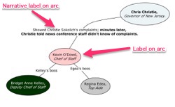
With that detour out of the way, let me introduce the detail image at left to show why I enjoyed the Times graph so much:
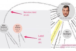
Why is this graph different from all others? What I call narrative labels. Most graphs and graphic software use symbols, letters, or simple phrases for labels, like Ω,, or “A”,” or at most (as in Figure 1 at top left) “Egea’s boss.” However, in Marsh and Zernike’s diagram, we have labels like “Long-time Christie friend, confidant. Firm has millions in state business” (the arc between Christie and David Samson, Chair of the Port Authority), or “Samson, furious at Foye for sending email about the lanes, warned ‘He’s playing in the traffic, made a big mistake” (the arc between Samson and Patrick J. Foye, Executive Director of the Port Authority). To trace the relationships mapped on the graph is to tell a story; that’s the value to readers that narrative arcs deliver, and why I found Figure 1 so uniquely enchanting. Further, the narrative labels are much more informative than simple phrases; they can support more powerful analysis. (We might pause for a moment to consider that Figure 1 shows only one set of relations that Christie is involved in; imagine the scale of a graph that showed all of them. And now imagine what graphs for Jebbie and Clinton would look like; this is the sort of information our elites carry around in their heads, or have people to carry for them. Now think of private equity squillionaires.)
So, I got in touch with Marsh and Zernike, and determined that Figure 1 was drawn by hand in a graphics program. (That is, considered as data, it was only bits or vectors or something; in other words, their graph was not data driven. Well, obviously at NC we aren’t going to be spending days drawing graphs by hand; we’re not artists, and with the size of crew we have, we don’t have the time. So, in order to satisfy Richard’s use case, I formulated the following set of requirements:
- Be generated algorithmically from data I control. That is, a workflow where Richard (say) would build a spreadsheet of players and their relations, export it to CSV, the CSV would be converted into a data format appopriate for graphs, and then fed to software that would display the graph automagically.
- Have narrative labels on curved arcs. See above for the rationale for narrative labels. The arcs must be curved, as the arcs in Figure1 are curved, to fit the graph within the smallest possible (screen) space.
- Be pretty. There is an entire literature devoted to making “pretty” graph, starting with making sure arcs don’t cross each other. In essence, though, it’s down to the algorithm, and we know it when we see it. A hairball, for example, is not pretty.
So now I’m going to take you on my serindipitous journey through the wonderful world of graphing software to see if I can find anything that meets my requirements. One reason I’m not jumping straight to the conclusion (although you may) is that the graphing world seems very siloed; combine that with Google’s wretched search function, and there are almost certain to be technical alternatives I didn’t consider, so readers, please correct me. Further, two of these tools, at least — Muckety and LittleSis (opposite of Big Brother) — may be useful to you in your own research.
So first let’s look at Muckety, “the place for tracking people and organizations with power and influence.” Here’s what Muckety’s graph of Christie looks like; handily, they enable embedding, so I’ll include the live, interactive version. (Here’s the link if you don’t have Flash.)
Figure 2: Muckety
So this is neat, but Muckety fails Requirement #2: The labels are not narrative and they are not on curves. The detail image:
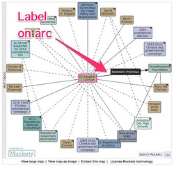
A second failing, at least in my view, is that labels only appear when you hover over them; you cannot, as with Marsh and Zernike, get a comparative and synoptic view of all relations at the same time. Muckety also fails — unless, I think, one licenses the software — Requirement #2: Although the graph is algorithmically generated, I don’t control the data.
Next, let’s look at software from the world of mathematical typesetting, since graph theorists need to generate images of graphs for their papers. To me, that means the formidable TEX typesetting package, which includes a (very cool) library called Tikz (examples; documentation). I downloaded it and did some typesetting, and it will produce diagrams like this:
Figure 3: Tikz
(This is, of course, static, like Figure 1, and unlike the dynamic Figure 2; no hovering or dragging about of nodes. (Dynamic graphs are not a requirement for me, because my first priorities are representation and social engineering; see the epigraphs.)
Tikz meets Requirement #1 (TEX generated the file from my data) and arguably meets Relequirement #3 (it is pretty) but it fails Requirement #2: It does not permit narrative labels. My hope was that somehow TEX could be cajoled into treating arcs as baselines, along which the text fo the labels would run, following the curve if the arc curved, but Tikz does not do that, and try as I might, I couldn’t find another package that did. The TEX world wants, it seems, to put a short snippet of text in a box and stick the box near the label. The detail image:
Finally, in phase one of my quest, I looked at the concept mapping world and found Cmap, which “empowers users to construct, navigate, share and criticize knowledge models.” (Here’s a gallery.) There is not yet a Cmap of Chris Christie’s web of corruption, so I made a small test map:
Figure 4: Cmap
As we can see from this detail image, Cmap meets Requirement #2, at least as stated: It supports narrative labels, and arcs can be curved:
Further, Cmap meets Requirement #1: It supports importing data from a spreadsheet, and it generates the graph algorithmically.
However, in my opinion Cmap fails Requirement #3: The maps are not pretty. To be fair, there are many formatting tools available (that’s why the text in the labels can be bold and italic, as in Figure 1) but it’s way too much work to make the graph look good, and I think the narrative label text really should follow the baseline.
So there the matter rested; Cmap seemed like the best I could do. If we ever needed a graph of relationships that could be generated from spreadsheet data, there was a tool for it.
The matter rested until the following from Edward Tufte came across the Twitter. Note the narrative labels; narratives always include verbs:
Think verbs, interactions ⇒ show verbs, interactions ⇒ annotate all linking lines http://t.co/Vmo5CGz95r #UXdesign pic.twitter.com/mP73CeurtE
— Edward Tufte (@EdwardTufte) July 19, 2015
(See this link for Tufte’s thoughts on what “pretty” means.)
Tufte’s posts recalled me — and how could I have forgotten? — to Mark Lombardi’s hand-drawn “narrative structures” of power relationships, which are wall-sized and hang in fine art galleries:
Figure 5: Lombardi
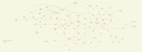
The full image can be seen here at Socks, which describes it:
A nodal point in Mark Lombardi’s oeuvre was the 1999 “George W. Bush, Harken Energy and Jackson Stephens, ca 1979–90″ (also shown in dOCUMENTA 13), which described the alleged connections between James Bath, the Bush and bin Laden families, and business deals in Texas and around the world.
Gorgeous, isn’t it? Clearly, this meets Requirement #3; it’s pretty. However, Lombardi fails to meet Requirement #2, as this detail image shows:
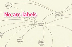
Lombardi does not use labels, let alone narrative labels, and so his “description” (as Socks would have it) is not nearly thick enough. It’s not enough to draw an arc between the node for “George W. Bush” and the node for “Arbusto Energy,” because absent a label, the relationship has no type? Father-son, as the relation between the nodes “George W. Bush” and “George H.W. Bush”? Ownership? Employment? We just don’t know. So Lombardi’s graphs, though beautiful art, are weak analytical tools.
Note that Robert Tolksdorf’s Lombardi Networks site, in a highly laudable effort, is converting the Lombardi images to structured data in GraphML, XGMML, and JSON formats. From the FAQ:
Q: So you want to scan all Lombardi works?
A: No, the works shall not be scanned as images. The networks depicted shall be represented as a datastructure. In it, nodes are connected by edges. The format of choice for this representation is called GraphML and a variety of tools for editing such networks is available.
Q: So you want to generate Lombardis drawings by computers?
A: No. Although there are tools to draw graphs and there is even a thing called “Lombardi Graphs” [Christian A. Duncan, David Eppstein, Michael T. Goodrich. Lombardi Drawings of Graphs. Journal of Graph Algorithms and Applications. Vol. 16, no. 1, pp. 37-83 (2012)], the intention is to provide the data structures and to do analysis on them. Their visualization is not in the scope of this project.
Well, I want to “do analysis on them,” and “vizualization” too! However, vizualization inevitably involves tooling, and Tolksdorf recommends Cytoscape, which I tried in the first phase of this effort, but couldn’t get it to meet my requirements. And if any readers know of a GraphML tool that will, I’d love to hear about it!)
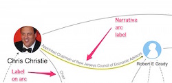
Tolksdorf’s site, however, linked to and reminded me of the LittleSis site — and I’d also been seeing some small LittleSis graphs float by on the twitter, so I went there and found this. It’s not of Christie, but at least it’s a New Jersey pension “pay to play” scandal.
Figure 6: LittleSis
So far as I can tell, LittleSis meets my requirements:
- LittleSis graphs are generated algorithmically from data I control. True, there’s a web interface for data entry. But the data is under my control, and the graph is generated algorithimcally. (Whether I could import an entire graph as CSV, in the spreadsheet workflow, I don’t yet know.)
- LittleSis has narrative labels on curved arcs. See the detail shot below
- LittleSis is reasonably pretty. I’m seeing some arcs running into each other, but they don’t cross each. The graph is certainly not a hairball!
Here is the detail image, showing the narrative label on a curved arc:
Now, whether it’s possible for me to set up a LittleSis operation on my own machine… And set up that spreadsheet-driven workflow… I don’t yet know.
(At this point, I should mention that both LittleSis and Muckety are encouragingly free — at least as I poke around their sites — of funding sources that make my neck hairs rise. It’s almost like the elites don’t want their power relation examined too closely, isn’t it?
But– But– Why are you telling me all this? For several reasons:
First, look at Naked Capitalism’s motto: “Fearless commentary on finance, economics, politics and power.” Images like those in Figures 1, 2, and 6 can surely assist in commentary. Whether in finance, economics, politics, or power, we are dealing with highly complex and interacting systems, and graph representations — especially those that meet my requirements :-) — are suitable for visualizing them.
Second, one of my takeaways from our Greek coverage is that we have many technical readers. We may not always agree with them, but technical they are! It’s possible that graph visualizations will speak to such readers — who may be familiar with UML or dataflow diagrams, for example — more clearly than prose alone (subject to the condition, expressed in Requirement #1, that the graph visualizations are data-driven and algorithmically generated; we aren’t going to be tweaking illustrations manually to make them prettier than possible).
Third, there’s is a tremendous variety of discussion on what we call “the left” about the relations between “finance, economics, politics and power” as expressed in the (dread word) intersections between class, race, gender, and so forth. In a perfect world, which I am not clever or powerful enough to bring about, discussions for “the nodal points” among social engineers — perhaps we should think about replacing that word “activist” — would be enhanced by a common visualization that could be whiteboarded (as opposed to bullet points on flip charts, say). I think that graph theory is the place to look for such a visualization, and Muckety and LittleSis (as well as Lombardi) may be pointing the way toward this. Such a visualization would appeal to people as disparate the activist community, and as separated in culture and cohort as node.js and COBOL programmers.
Comments are open!


Tufte is the master of such visualizations, so you’re on the right track. Network analysis among sociologists, which has existed for quite a long time, covers what you’re talking about, so they may have developed visualization techniques that could improve this effort.
I was going to mention Edward Tufte, who makes a more general point, also.
Tufte says
(The actual quote is from Tufte’s talk on iPhone resolution.)
That’s what’s going on with the narrative labels on the arcs in the graphic that lambert finds so enchanting. The labels add just enough relevant detail to make the information, which otherwise might be a chaotic mess, much more accessible—it helps the person looking at the graphic “make sense” of what he or she is seeing.
Very interesting indeed! I have had the privilege of some rather rigorous training in the techniques of prosopography by some competent classicists and medievalists. Applying prosopographical techniques of analysis– to present-day movers and shakers in politics and finance– would certainly provide plenty of grist for this intriguing mill that you are keen to construct.
https://en.wikipedia.org/wiki/Prosopographical_network
Went to this last year. Tufte is indeed the master of visual data reduction /presentation.
http://www.fnal.gov/pub/tufte/
Its a funny story how this exhibition was put together. Tufte had built some Feynman diagrams as object de art and they were on display at a friends NYC art gallery in a window. A director from Fermi was in town and walking down the street said gallery and did a “wait a second what’s this about??”
The gallery employee didn’t have a clue what a Feynman diagram was, “hey, its art”, let me put you in touch with the artist (Tufte) who, in this case was less so an artist and more of a craftsman (truly Feynman was the artist). Based on that chance observation and subsequent discussions with Tufte, the exhibition was put together.
Not sure that this is what you’re exactly looking for, but Michael Albert has written about economics, culture, kinship, and polity as four spheres of society that interrelate and co-reproduce in one another. You’d probably want to look for his (and Robin Hahnel’s) Socialism in Theory and Practice two-volume set from a few decades ago (published by South End Press). I believe the full text is available online somewhere (for free) as well, at this point.
Anyway, the work is quite good. You may or may not agree with all of it, but it will give one much to consider.
This graphing system is pretty far out of date for giving results, but at one time it was pretty useful, although admittedly a bit confusing with all the lines that get produced.
http://mapper.nndb.com/start/?id=162983
From an analysis point of view, once you have nodes and links, you can have link “weights” determining the strength of the tie; and then there’s a lot of work on determining “centrality” measures to weigh the importance of the various nodes.
Even if you don’t have a good measure of strength, I bet a centrality analysis of, say, donor/candidate networks, would yield some interesting (and surprising) names. Or of, say, corporate-board networks. (Where a link means “serves on a board with”).
I bet there’s a whole world of interesting network analysis to be done with data one might scrape from opensecrets.org and EDGAR.
Intriguing idea. I envision a graph which displays the weight of nodes in 3 dimensions, looking something like those visualisations of the effect of large body gravity in spacetime, where the 2D surface plunges around the object to represent the power of its attraction.
Added benefit would be all that extra room for arcs not to run into each other. In fact to be linked to each other without criss-cross.
‘I bet a centrality analysis of, say, donor/candidate networks, would yield some interesting (and surprising) names. Or of, say, corporate-board networks… I bet there’s a whole world of interesting network analysis to be done with data one might scrape from opensecrets.org and EDGAR’
Oh yes. I would add finance-capital networks; from TBTF banks to hedge funds to central banks to Eurocrats to TPP corporate lawyers to offshore havens to military/intel shopfronts to Davos to the wealthiest families in the world.
I bet there would be evidence suggestive of not just obvious large bodies like planets, but of previously unseen black holes.
Not that I’m foily! Could untangle a few hairballs though…
Weighting to indicate significance seems important.
That could be evaluated re: financial/capital flows, as you suggest. Equally important, is a way of indicating the potential value of those flows to 3rd parties. (E.g., a campaign contribution of 5 figures conferring impact on legislation could yield a benefit of 7 figures to a third party such as a finance or real estate company and their executives)
Another form of weighting could be impact for impacting framing / PR (e.g. direct or indirect power to manipulate media and control public discussion)
Thank you, I love this!!! I’m kind of obsessed with the idea of expressing power relations spatially rather than verbally. Will need a couple of days to read and digest it
Bill Marsh is a maestro btw
Interesting. I think these kinds of visualizations can really add to discussions and analysis. I’m a scientist by training, and there’s a lot of specialized software out there to analyze and visualize gene and protein interaction data and networks. I wonder if some of the open-source tools or add-ons could be co-opted, substituting finance, politics etc nodes for genes. This isn’t something I do a lot of myself (that’s what the computational biologists help with, plus I’m no longer in the lab), but I’ll ask around. There must be R packages that let one do the sort of thing you’re talking about.
:)
You may already know the site, but ZenPundit is deep into the narrative constructions surrounding power, expecially with its intersection with religion given the moral force of middle-east fundamentalism. There’s an aspect of his method (tip hat to Hesse) involving counterpoint or antithesis which strikes a fundamental chord of narrative: compared to what?
Another aspect of what you’re doing is that the power relations run in different dimensions than straight through the obvious alliances. The more we see it, the clumsier the execution, so it’s selecting out the deepest players. By definition, those are hard to get set down as nodes, but for a start I’d look at where their kids went to school.
Really glad you’re doing this, Lambert.
What I don’t know is far more than what I do. There seem to be a lot of laborers in this vineyard, but few of them are in touch with each other. It’s a large and challenging field, which is why I welcome links.
Power relations in different dimensions would be hard. One thinks of a legend, and controls as with a geographical map to filter on layers.
And of course, in a perfect world, the software would have a time dimension, so we could see the graph evolve…
However, whiteboarding is also very important!a
Ian McHarg was mentioned in the earlier post on water, he was a pioneer on overlays, and how things would pop when the right set intersected.
How to get edges to pop, something like cluster analysis. When Gates and Buffet joined in on the bomb train line, Gates indirectly donated to XL pipeline foes, which inhibited the competition. You have Gates and Buffet literally owning nodes and edges, then applying antithesis to the pipeline, trackable through a Gates donation through a college.
Cory Morningstar traces that narrative, but her website appears inactive. Inhibiting the competition is also part of which third parties get donations in political races. And the best information usually comes from those cut out of the deal, those who’ve been excluded and antithesized (see Deep Throat, Watergate).
Got any links on that material? (I’m certainly getting the kind of commentary I wanted!)
Looks like Counterpunch reprinted, here’s a start:
counterpunch.org/2013/04/12/keystone-xl-the-art-of-ngo-discourse/
Hi,
thanks for referring to my work at lombardinetworks.net.
Lombardis networks do in fact use labels, either explicitly for financial transactions (showing the amount transferred), or implicit by typing. The arcs do have types, they are distinguished by the visual form. Sometimes, they depend on the type of node linked, the linkage between two year nodes means succession in time. So the one-headed arrow means “influence on” and the double headed arrow means “association”. This is, of course a very broad type, but at least there is one.
During digitizing the currently 17 works, I came across 12 types – if I count correctly – that you find formalized in the ontology at http://www.lombardinetworks.net/wp-content/uploads/2012/11/lombardi.owl. You are right, of course, that the types are not well characterized and are hard to use for analysis.
So a next step would be to look at whatever relation are around in the mentioned approaches and to try to build an ontology fro them, to link into characterizing concepts found elsewhere (eg. dbpedia) and then to link to the existing approaches with sameas- or seealso-relations to help to integrate them. In the end, one would have a powerrelations ontology that is openly linked to existing data and would be enabling to do quite good analysis.
Thank you. (I looked for a legend and if it was there, missed it.)
Out of curiosity, since it seems like you would know… Is there an engine that uses GraphML and meets my requirements?
There is a legend in the Global Networks catalogue, but it only covers 5 or 6 types of relations.
Cytoscape could im- and export in the 2.8. version. With version 3 there is only import. In the version, GraphML shall be back, the developers told me. I have no idea why one should drop GraphML. However, it is simple to convert XGMML to GraphML and vice-versa. The prettyness in Cytoscape can be well adjusted, I do have a simple “lombardi” style for Cytoscape. It is not fully implemented in the exported visualizations on my site, so I hope for the next versions.
Robert
This is cool, beautiful and interesting.
Radical (and other) activists use this kind of power-mapping to come up with strategies for individual campaigns: e.g. SumOfUs getting Lowe’s to stop selling bee-killing pesticides. Switching idiom from their (our, actually) “pillars of support” concept, the idea is to go through the various network edges/arcs connecting the target with its supporting nodes (power bases, customers, audiences, constituencies, co-conspirator-“strategists”, whatever), find the weakest strategic link, and disrupt it.
Now if you could come up with something wildly user-friendly with off-the-shelf software that would allow you to display weight for network edges/arcs you would beat the h*ll out of whiteboards, make some friends among deserving organizers, and maybe do the Movement (excuse the expression) some good too.
I think the whiteboard part is important. A notation that works in that context goes far beyond people (like me, I admit) who carry digital devices around with them at all times. We need a notation people that’s as close as possible to being able to scratch in the dirt with a stick. (Rather like football plays, come to think of it.)
Lambert, it seems you should hook up with Joe Firestone on this. He has long been into things like Topic Maps, RDF, and similar machine-processable graph-knowledge structures. For my money, search engines are a superior research tool, but there are certainly times when one wishes “a relation” (i.e. “subgraph”) could be extracted with simple, list-like labels. Of course the MOTU are using Palantir…
Figure one could hang on a writer’s wall and be a fantastic basis for a novel. This is what “fiction” writers intuitively do, and it’s fascinating to see it mapped out like this. I see the “thinking” function at work here perhaps. Not the arts’ strong suit, but interesting.
This interests me greatly; (well-constructed) visualizations are an incredibly powerful tool for communicating the most important information.
It’d be even more awesome if LittleSis let you replace the arrows, as much as possible, with the narrative text itself; that seems to be what both Tufte and the NYT have done. But just having it automagically generated from data is an incredibly powerful thing.
Unfortunately, the Oligrapher project (the code that seems to generate graphs from LittleSis’ data) is written in JavaScript, which is not the greatest choice you could make for a technical application (but seems to be the only thing the Cool Design Kids can wrap their heads around these days). The plus side, of course, is that JavaScript runs in your browser, so you shouldn’t really need anything to get it going other than a page that pulls in all the appropriate libraries. So it should be possible for you to set up your own tool, and rewrite the functions that pull in LittleSis data to point to a well-formed spreadsheet instead… maybe.
I don’t have a whole lot of time right now, but if I can be of service, I assume you can see my email…
If you want to get something done, ask a busy person….
Ah, requirement #2! That is the killer. Embarassed to admit how many years I’ve worked with data flow graphs and yet never thought of having the text flow along (and replace) the connecting line.
Rqt 2 is worth getting out of bed to read. Will be checking out LittleSis.
Thanks for this post.
Have you looked at FreeMind? http://freemind.sourceforge.net/
It may meet all your requirements and is exportable in html, pdf, xhtml, openoffice, etc. although I’m not sure what the importing capabilities are. I’m running an older version (on OS X and linux – java based, runs on MS, too) but they add new features all the time… and it’s opensource software.
Do a google search for mind mapping software, there are quite a few good ones out there that easily meet requirements #2 and #3, just not sure about #1. Some others are MindManager (mindjet) and TheBrain (this one has some import capabilites)
Apparently Sourceforge has been having problems this week, here is another (good) link to freemind at sourcefourge: http://sourceforge.net/projects/freemind/?source=directory
Thanks for the thoughtful comments!
The US Army uses graphical network representations to visualize their unit force structures and equipment allocations. The group I worked with used a tool called netViz until sales and support for that tool fell victim to corporate politics following a large merger and the consolidation of the corporate software portfolio. Our group tried other tools substituted for netViz, including Visio and UML based architecture tools, but very poorly in my opinion. None of these other tools could replace the touch and simplicity of working with netViz.
One feature netViz had you would want for your network tool is a “catalog” of node symbols/images and an associated catalog of connectors/arcs. A user can position and attach arbitrary descriptor fields around a node-type or connector-type.
Another especially nice feature of netViz was its’ interface with csv files. However, after working with several different approaches to automatically generating network diagrams over period of a few years I slowly came to believe visualization networks were best created semi-automatically. Though this is slower than full automation, the placement, sizing and visual spacing between nodes, and the direction, color, curvature, turning points and thickness of connectors are all part of a complex visual language of inestimable value for understanding the a complex netork representation.
An algorithm can generate all these things. But humans must understand the visualization. Until much more is known about how that understanding takes place the programming complexity grows rapidly as you might imagine and quickly reaches a point of diminishing returns. In my opinion, a semi-automated approach which lets the program select and make preliminary placement of nodes and connectors — something a program can do much more easily than humans — followed by a careful re-layout of the network diagram by hand more than repays the time and work invested in that restructuring. For very complex diagrams I found I could only understand them as I organized and manipulated their visualizations.
I believe InkScape might be modified to add the features necessary to re-implement capabilities netViz possessed, although InkScape seems to lack some of the responsiveness between mouse and image that I find crucial to the facile manipulation of a network diagram.
The Domhoff site “Who Rules America” includes several links to ongoing efforts to diagram various power structure networks, http://www2.ucsc.edu/whorulesamerica/links.html. However I cannot claim specific knowledge of what they have in the works — LittleSis — is linked there.
Sankey diagrams offer another kind of diagramming technique which might be combined with a node and connections representation. Sankey diagrams are popular for representing flows in corporate reports. I recall seeing a link to a beautiful Sankey diagram from one of the links in NakedCapitalism some years ago but I cannot locate that link. The famous diagram representing the manpower, temperature and location of Napoleon’s Army as it marched into and retreated from Russia.
The justly famous network diagram for the London Underground illustrates several principles of good design. The visual representation shows the topology of the London Underground laid out with colors, spacing and line to beautifully represent this complex transportation network in a form which can be readily understood and remembered, by humans. I will not claim it is impossible to write a program which could make a reasonable start at representing the London Underground — but no program I know could have come up with the representation rules the human designer created as he worked and re-worked this diagram.
Lambert referred to and posted the famous graphic of Napoleon’s invasion of Russia by French civil engineer and cartographer Joseph Charles Minard in this comment. A high resolution version can be found on Wikimedia here.
Martin Nöllenburg tackled this problem in 2005 for his Master’s degree thesis “Automated Drawing of Metro Maps” and concluded “Our experiments with real-world metro networks show that we have succeeded in drawing these networks [by automated methods] in a quality comparable to maps drawn by graphic designers.” I think the maps might be “comparable” but I agree—they probably still would not match those carefully worked and reworked by someone like Harry Beck who designed the London Underground map. (Dr Nöllenburg’s PhD dissertation, incidentally, was on the topic of network visualizations and he’s done some work on Lombardi graph drawings—his publications are listed and available online here.)
Thank you for the links to the papers on drawing Metro maps and the Lombardi graphs. I recall hearing about the map labeling problem and also saw several studies of that problem on the site you referenced. … Although the Lombardi graphs are pretty, I am not sure how well they convey the meaning of the data they represent.
The diagrams of the London Underground and Napoleon’s march are two of my favorite graphic diagrams. I have prints of each of them.
You’re welcome!
I think—but I am not sure—that some application combining (1) fast, responsive vector graphics, (2) direct manipulation of the graphic (e.g., dragging the nodes/arc), (3) a catalog of node/arc types, and (4) various algorithms of the type that have been developed would be as good as, if not better than, something like netViz.
Xara (for PCs) and Affinity Design (for Macs), to name just two examples, satisfy the first two (and a catalog of shapes), at least—not surprising since some of the developers for the former are now developing for the latter—but they’re more general graphic design applications, not graph or network graphing apps. It seems like those on the data-driven graphing side of things and those who have come up with excellent and flexible solutions on the purely graphic design side of things have not (yet) met up. Maybe it’s partly an issue of path-dependence—for example, it seems like all genealogy software that I’ve used (on rare occasions, thankfully), another kind of “networking” software utilizing nodes and arcs, is stuck in the 1990s or earlier, perhaps the era when it was first developed, full of awkward dialog boxes and not a more directly manipulable interface—or maybe the data-driven side of things (getting things to “look right” with a given data set) has been challenging enough, not allowing focus on the other aspects of usability. (This part of my comment is directed as much to those people developing the software as it is to you—hey, there seems to be an opportunity here!)
The London Underground diagram has come under fire in recent years—its lack of geographical accuracy may cause as many as 30% of passengers to take a longer route than needed, one study says—but, even granting the criticism, it and the graphic of Napoleon’s march are still masterpieces of information visualization design. They’re two of my favorites, too!
Excellent thread… Thank you so much…
Dear Lambert,
I think you are on to something very valuable here, especially for an election season.
To encourage you further in this pursuit, I would like to attract your attention to GEOGRAM software, which is used in family systems analysis and provides symbols for denoting dysfunctional and other unproductive relations among members of the system. Why no one has ever thought of applying it (or a modification of it) to politicians and the cesspools of networks before is curious.
Keep up the good work!
p.s. Do you think it was it only a coincidence that Google posted a billion dollar surplus the same week China markets posted trillions lost?
This will sound frivolous at first but maybe political artists can do something with it. For simple power-political ecosystems, how about 3-D models? Perhaps a Calder Mobile of power players? Perhaps a Cat’s Cradle with labeled nodes and connectors?
Then too, animated charts looking like live-action wiring diagrams . . . showing current moving between nodes-under-study.
Hi Lambert,
This is really great work and very fascinating for a political scientist like myself. A number of thoughts occur on the effort.
First, this is fundamentally a question of measurement, using network relations to get a more precise grasp of the degree to which a network is hierarchical and therefore the extent of the power of the person or people at the center of a network over the other participants in it. To me, that observation suggests a number of further thoughts.
— The data used to define the network relations is crucial. Data on social and transactional relations are related to power relations, but social relations data doesn’t by itself define power relations, even when considered from the viewpoint of networks of such relations. Power is a more abstract idea and there are many bases for power that contribute to networks of power relations. So, when we construct graphs from flow data, we have the problem of justifying why the flow data we are using, when assembled into a network structure, constitutes a network hierarchy of power.
— If we can give a compelling explanation for why this is true then we can more on to decide on measures of concentration in such networks. Such indexes have been available since the 1960s.
Second, I note that you want to say more than we can say now about power relations in political/economy networks, and you think this can be done by adding narrative to graphical networks to provide more meaning to the visualizations, I agree that this will improve our ability to understand power relations in particular parts of the political system and is really worth doing.
Third, on tools, I knew more about RDF, XML topic maps and related matters in the years from 1998 – 2008, than I know now, so Torsten gives me too much credit. He must have read my book on portals where I have a chapter on XML topic maps or perhaps a later paper I did with Richard Vines on interoperability in semantic networks.
In any event, the best I can do now, without refreshing myself on today’s tools is to suggest that you go further into the literature on cognitive maps since a few years back, that was the best work I was seeing on network structures accompanied by semantic tools.
Fourth, have you looked TheBrain software and its network structuring capabilities lately? Last time I looked, it seemed to have a pretty extensive labeling capability.